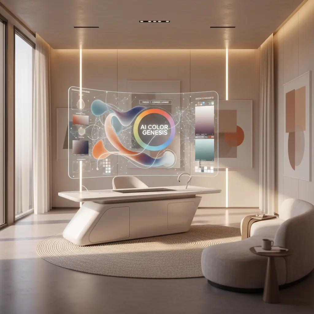
Paletas de Colores con IA: Creando Esquemas de Color Perfectos para Interiores
Cómo funcionan los generadores de paletas de colores con IA, las mejores herramientas disponibles y un flujo de trabajo práctico para traducir paletas generadas por IA en decisiones reales de diseño de interiores.
Cómo la IA Comprende la Armonía del Color: Más Allá del Círculo Cromático
La teoría del color tradicional ofrece marcos fundamentales: complementarios, análogos, triádicos, monocromáticos y más. Aunque es esencial, aplicar estas reglas abstractas a espacios interiores reales puede ser sorprendentemente complejo. Elegir tres colores de un círculo cromático es una cosa; visualizarlos como un color dominante en la pared, una tela de tapicería secundaria y un acento sutil en un cojín decorativo es otra muy distinta. Aquí es donde los generadores de paletas de colores con IA sobresalen, yendo más allá de la teoría simple hacia la aplicación práctica.
Estas sofisticadas herramientas no solo están programadas con reglas básicas de color. Se entrenan con vastos conjuntos de datos que comprenden millones de fotografías de interiores profesionales, catálogos completos de productos y diversas carteras de diseño. Este entrenamiento extensivo les permite aprender más que solo qué colores "combinan". Entienden los intrincados matices de qué combinaciones evocan estados de ánimo específicos (p. ej., tranquilidad, energía, sofisticación), se adaptan a tipos de habitaciones particulares (p. ej., un dormitorio sereno frente a una sala de juegos vibrante) y funcionan de manera óptima bajo diversas condiciones de iluminación.
El resultado es una IA que entiende el contexto y el impacto emocional de una manera que la teoría del color simple no puede. Cuando le pides a un generador de paletas de IA una "sala de estar cálida y acogedora", no solo devuelve un puñado de tonos cálidos. En cambio, produce una paleta equilibrada, que generalmente presenta un neutro dominante para asentar el espacio, un acento cálido para agregar carácter, un tono oscuro para dar profundidad y un color de realce para atraer la vista. Crucialmente, estos colores se proporcionaron y sugirieron de una manera que refleja cómo los diseñadores profesionales realmente aplican el color en los espacios habitables, a menudo adhiriéndose a principios como la regla 60-30-10 (que exploraremos en breve). Este procesamiento inteligente permite un nivel de precisión y conciencia contextual que agiliza significativamente las etapas iniciales del diseño de interiores.
La Psicología del Color, Informada por la IA
El color no se trata solo de estética; impacta profundamente nuestro estado de ánimo, percepción e incluso respuestas fisiológicas. La IA, a través de sus capacidades de aprendizaje profundo, está comenzando a descifrar y aplicar esta compleja psicología del color con una precisión sin precedentes. Por ejemplo, la IA puede aprender que los azules y verdes más fríos a menudo se asocian con la tranquilidad y la concentración, haciéndolos ideales para dormitorios y home offices, mientras que los rojos y amarillos más cálidos evocan energía y apetito, adecuados para áreas de comedor o espacios creativos.
Al analizar cómo los diferentes esquemas de color se correlacionan con las preferencias del usuario, las etiquetas emocionales en las descripciones de diseño e incluso las señales visuales dentro de las imágenes (como la presencia de luz natural o estilos de mobiliario específicos), la IA puede recomendar paletas que no solo son visualmente agradables, sino también psicológicamente apropiadas para el espacio previsto y la atmósfera deseada. Esta profunda comprensión permite que las herramientas de IA sugieran colores que podrían, por ejemplo, aumentar la sensación de amplitud en una habitación pequeña o crear una sensación acogedora e íntima en un área grande de planta abierta. Esta integración de principios de diseño y psicología humana es un cambio de juego para la selección de colores interiores.
Explorando las Mejores Herramientas de Paletas de Colores con IA Disponibles
El mercado de herramientas de diseño impulsadas por IA está evolucionando rápidamente, con varias plataformas que ofrecen enfoques únicos para la generación de paletas de colores.
**Coolors** sigue siendo uno de los generadores de paletas de uso general más populares y versátiles. Su modo IA sugiere inteligentemente combinaciones armoniosas, permitiendo a los usuarios "bloquear" colores individuales que les gusten mientras regeneran el resto de la paleta hasta quedar satisfechos. Su velocidad e interfaz intuitiva lo convierten en un favorito para exploraciones rápidas.
**Adobe Color** (anteriormente Adobe Kuler) se integra a la perfección con la suite Adobe Creative Cloud, lo que lo convierte en una herramienta de referencia para los diseñadores que ya están en ese ecosistema. Más allá de sus sólidas herramientas de teoría del color, ofrece una potente extracción de paletas de imágenes, una característica útil para capturar inspiración de una fotografía o una obra de arte. También sugiere paletas basadas en tendencias, ayudando a los diseñadores a mantenerse actualizados.
**Khroma** adopta un enfoque único de aprendizaje automático. En lugar de reglas predefinidas, aprende tus preferencias haciéndote seleccionar cientos de colores que te gustan o no. Con el tiempo, construye una comprensión personalizada de tu estética y genera un flujo infinito de paletas adaptadas específicamente a tu gusto. Este nivel de personalización es increíblemente valioso para desarrollar un lenguaje de diseño consistente.
Para casos de uso específicos de interiores, las herramientas de diseño de habitaciones con IA como **Habitas** están ampliando los límites. Cuando generas una variante de habitación en un estilo particular usando Habitas, la herramienta crea y aplica implícitamente una paleta de colores coordinada. Esto significa que puedes usar la imagen generada como una referencia de color sofisticada, incluso si no replicas el diseño exactamente. Muchas de estas herramientas de diseño también cuentan con extracción de paleta, lo que te permite identificar fácilmente los códigos de color exactos (HEX, RGB) utilizados en los diseños generados, simplificando la transición del concepto digital a la implementación física. Comprender [cómo funciona el diseño de interiores con IA](/blog/ai-interior-design-how-it-works) revela la profundidad de estas capacidades integradas.
De la Paleta a la Habitación Real: El Desafío de la Traducción y la Regla 60-30-10
Tener una hermosa paleta de cinco colores mostrada en una pantalla es simplemente el primer paso. El verdadero desafío radica en traducir esas muestras digitales en decisiones de diseño tangibles y del mundo real: qué color se convierte en la pintura expansiva de la pared, cuál se transforma en la atractiva tela del sofá, cuál aparece en los cojines decorativos y cuál se reserva para pequeños acentos impactantes.
Los diseñadores profesionales comúnmente emplean la **regla 60-30-10** como principio rector para la distribución del color en un espacio:
- **60 por ciento Color Dominante:** Este es el color principal que cubre las superficies más grandes. Piensa en paredes, alfombras grandes o piezas de mobiliario importantes como un sofá. Establece el ambiente y el tono general de la habitación. - **30 por ciento Color Secundario:** Este color se utiliza para elementos de tamaño mediano, proporcionando contraste e interés visual sin dominar al color principal. Los ejemplos incluyen tapicería en sillas auxiliares, cortinas, ropa de cama o una obra de arte significativa. - **10 por ciento Color de Acento:** Este es tu "toque" de color, utilizado con moderación en pequeños accesorios. Piensa en cojines decorativos, objetos de adorno, lámparas o flores frescas. Este color añade personalidad y se puede cambiar fácilmente para renovar el aspecto de la habitación.
Las paletas de IA pueden sugerir estas proporciones, pero aplicarlas con habilidad sigue siendo un arte. Por ejemplo, si tu paleta de IA presenta un suave verde salvia, un cálido crema y un terracota profundo, podrías designar el crema para el 60% (paredes), el verde salvia para el 30% (sofá, cortinas) y el terracota para el 10% (cojines, jarrón). Este enfoque estructurado asegura un esquema equilibrado y armonioso. Para más ideas sobre combinaciones de colores, explora nuestra guía de [esquemas de colores para salas de estar](/blog/color-schemes-for-living-rooms).
El Impacto del Material, el Acabado y la Textura en la Percepción del Color
Uno de los aspectos más críticos que consideran los diseñadores es cómo el material y el acabado alteran fundamentalmente la forma en que se percibe un color en un espacio. El mismo código de color azul grisáceo puede aparecer completamente diferente cuando se aplica como:
- **Pintura de pared mate:** Absorbe la luz, creando una apariencia más suave y tenue. - **Azulejo brillante:** Refleja la luz, haciendo que el color parezca más brillante y vibrante, a menudo añadiendo un toque de dramatismo. - **Tejido de lino trenzado:** La textura y el tejido introducen variaciones sutiles en la reflexión de la luz, dando al color una sensación más suave, a menudo más natural u orgánica. - **Metal cepillado:** El brillo metálico y la textura le darán al color un toque sofisticado e industrial, y su apariencia puede cambiar significativamente con la luz ambiental.
Las paletas de IA te dan el tono de color puro, pero tu trabajo como diseñador es seleccionar el material y el acabado apropiados para cada aplicación. Comienza con las superficies más grandes (paredes, muebles grandes) y avanza hacia los acentos más pequeños (objetos decorativos, molduras). A medida que seleccionas materiales, compáralos continuamente con la paleta elegida bajo la iluminación real de la habitación. Un sorprendente **78% de los diseñadores de interiores informan que las muestras de materiales y acabados son esenciales para las aprobaciones de los clientes**, destacando su importancia en la visualización precisa del color.
¿Qué Limitaciones Siguen Teniendo los Generadores de Paletas de Colores con IA?
Si bien son increíblemente potentes, los generadores de paletas de colores con IA no son infalibles. Comprender sus limitaciones es clave para usarlos de manera efectiva.
### La Discrepancia de la Iluminación: Por Qué la Luz Artificial Importa
Los generadores de paletas de IA suelen presentar colores en una pantalla, bajo una iluminación digital ideal y uniforme. Sin embargo, las condiciones de iluminación específicas de tu habitación son muy diferentes y pueden alterar drásticamente cómo se perciben los colores. Una paleta que se ve cálida y cohesiva en tu monitor puede verse completamente diferente en una habitación orientada al norte con luz diurna fría e indirecta, versus una habitación orientada al sur inundada de luz solar cálida e intensa por la tarde. La iluminación artificial también juega un papel enorme. Diferentes fuentes de luz tienen temperaturas de color variables (medidas en Kelvin):
- **Blanco cálido (2700K-3000K):** Realza los rojos, naranjas y amarillos, haciendo que una habitación se sienta acogedora. - **Blanco frío (4000K-5000K):** Resalta los azules y verdes, haciendo que un espacio se sienta más brillante y moderno. - **Luz diurna (5000K-6500K):** Imita la luz natural del día, ofreciendo una verdadera representación del color, pero a veces puede sentirse austera.
Este fenómeno se conoce como **metamerismo**, donde los colores parecen coincidir bajo una fuente de luz, pero no bajo otra. Siempre prueba los colores de la paleta con muestras físicas (muestras de pintura, retazos de tela) en tu habitación real, observándolos durante todo el día y bajo luz natural y artificial antes de comprometerte con las compras.
### Tamaño de la Habitación y Percepción del Color: Escala y Saturación
El tamaño de la habitación también afecta profundamente la percepción del color. Los colores oscuros y altamente saturados que se ven dramáticos y sofisticados en una sala de estar espaciosa y de planta abierta pueden sentirse opresivos, claustrofóbicos y abrumadores en un dormitorio pequeño o un tocador. Por el contrario, los tonos claros y fríos que crean una sensación de calma y amplitud en un baño grande tipo spa pueden hacer que un tocador diminuto se sienta clínico o poco acogedor.
Al usar paletas de IA, considera las dimensiones de tu habitación. En espacios más pequeños, es posible que necesites seleccionar versiones más claras o menos saturadas de los colores sugeridos por la IA para evitar que la habitación se sienta apretada. Para habitaciones más grandes, podrías tener más flexibilidad para introducir tonos más audaces y profundos. Utiliza las paletas de IA como puntos de partida inteligentes, luego ajusta la saturación y la luminosidad de los colores sugeridos según las dimensiones específicas de tu habitación y la exposición a la luz natural.
### Adaptación a las Tendencias de Diseño en Evolución
Si bien la IA se entrena con datos de diseño históricos y actuales, su capacidad para predecir y adaptarse a tendencias verdaderamente emergentes y de nicho a veces puede quedarse atrás. El diseño es un campo en evolución, con nuevos estilos y combinaciones de colores que ganan popularidad constantemente. La IA sobresale en el reconocimiento de patrones, pero la verdadera innovación a menudo proviene de la creatividad humana. Por lo tanto, si bien la IA puede mostrarte [los mejores colores de pintura de 2026](/blog/best-paint-colors-2026) basándose en datos existentes, es posible que no capte inmediatamente el próximo color "de moda" antes de que llegue a la conciencia general.
Un Flujo de Trabajo Práctico: Generar, Probar, Visualizar, Comprometerse
Integrar herramientas de color con IA en tu proceso de diseño puede ahorrar tiempo y prevenir errores costosos. Aquí tienes un flujo de trabajo completo que combina la generación con IA con la validación práctica:
1. **Genera Múltiples Paletas con una Visión Clara:** Comienza usando tu herramienta de IA preferida (Coolors, Khroma, Adobe Color o una plataforma como Habitas). Sé específico en tu entrada: describe el ambiente que deseas lograr ("sala de estar acogedora de estilo campestre", "dormitorio moderno minimalista", "comedor ecléctico vibrante") o sube una imagen de inspiración que te encante. Genera varias paletas (3-5) para darte opciones. No temas experimentar con ligeras variaciones.
2. **Refina y Selecciona:** De tu lote inicial, reduce a dos o tres paletas candidatas que realmente resuenen con tu visión. Considera la sensación general de cada una y qué tan bien se alinea con tu estética deseada. Este paso se trata de la intuición combinada con la consideración práctica inicial.
3. **Visualiza con Herramientas de Diseño de Habitaciones con IA (Paso Crítico):** Aquí es donde la IA lleva tu paleta de muestras abstractas a un concepto tangible. Sube una foto real de tu habitación a una herramienta de diseño de habitaciones con IA como Habitas. Luego, genera rediseños utilizando cada una de tus paletas seleccionadas. Ver los colores aplicados a la geometría real de tu habitación (en las paredes, muebles y textiles dentro de una renderización de IA) es mucho más informativo que simplemente mirar muestras aisladas. Presta atención a cómo el color dominante llena el espacio, cómo interactúan los colores secundarios y cómo resaltan los acentos. Este paso te permite probar conceptos rápidamente. ¿Sabías que usar la IA para la visualización puede reducir el proceso de toma de decisiones de diseño de semanas a solo minutos? [Aprende más sobre cuán realistas son los diseños de habitaciones generados por IA](/blog/ai-generated-room-designs-realistic).
4. **Solicita Muestras Físicas:** Una vez que hayas identificado una paleta y una visualización con IA que te encanten, es hora de unir los mundos digital y físico. Solicita muestras físicas de pintura (las muestras adhesivas más grandes o los botes de muestra son lo mejor), y recolecta muestras de tela para cualquier tapicería, cortinas o elementos textiles importantes. No confíes únicamente en pequeñas fichas de pintura. Muchos propietarios subestiman el costo de volver a pintar; un trabajo de repintado típico para una sala de estar promedio puede oscilar entre **$500 y $2,000**, lo que convierte la prueba de muestras en una inversión inteligente.
5. **Prueba de Muestras Físicas In Situ:** Este es quizás el paso de validación más crucial. Pega muestras de pintura directamente en tus paredes en varias ubicaciones alrededor de la habitación. Coloca muestras de tela cerca de las ventanas, en las esquinas y junto a los muebles existentes. Vive con ellas durante unos días, observando cómo cambian bajo diferentes condiciones de iluminación: luz de la mañana, sol de mediodía, luz ambiental de la tarde y bajo la iluminación artificial de tu habitación. - **Verifica los subtonos:** ¿Ese "greige" se ve realmente gris, o tiende al verde o al púrpura con ciertas luces? - **Evalúa la intensidad:** ¿El color es demasiado brillante o demasiado tenue para el espacio? - **Evalúa el ambiente:** ¿Todavía evoca la emoción deseada que buscabas con la IA?
6. **Comprométete con Confianza:** Este proceso de tres pasos – generación de paleta con IA, visualización de habitación con IA y prueba de muestras físicas – detecta la mayoría de los errores de color antes de que se conviertan en errores costosos. Al combinar el poder de la IA con una validación reflexiva y del mundo real, puedes comprometerte con tu esquema de color con una confianza inigualable, sabiendo que lucirá fantástico en tu espacio único.
Preguntas Frecuentes
### ¿Qué tan precisas son las paletas de colores con IA para interiores reales?
Las paletas de colores con IA son muy precisas como puntos de partida, basándose en vastos conjuntos de datos de diseños exitosos para sugerir combinaciones armoniosas. Sin embargo, su precisión para _tu habitación específica_ depende de factores como la luz natural, la iluminación artificial, el tamaño de la habitación y las elecciones de materiales. La IA proporciona la paleta teórica perfecta; la prueba de muestras físicas en tu espacio real es crucial para confirmar la precisión en el mundo real.
### ¿Puede la IA reemplazar a un consultor de color humano para mi hogar?
Las herramientas de IA agilizan significativamente las etapas iniciales de la selección de colores y pueden producir excelentes paletas adaptadas a tus preferencias. Pueden ahorrar tiempo y prevenir errores comunes. Sin embargo, la IA no puede reemplazar completamente la comprensión matizada del estilo personal de un consultor de color humano, la intuición inmediata sobre los desafíos únicos de un espacio (como una característica arquitectónica inusual) o la capacidad de interpretar profundamente los deseos no expresados de un cliente. Piensa en la IA como un asistente increíblemente poderoso que proporciona una base sólida, permitiendo a los diseñadores humanos centrarse en el refinamiento y la personalización. Para una inmersión más profunda, explora [IA vs. Diseñador de Interiores Humano](/blog/ai-vs-human-interior-designer).
### ¿Cuál es la mejor manera de usar una herramienta de color con IA para la remodelación de mi hogar?
El mejor enfoque es un flujo de trabajo de varios pasos: primero, genera varias paletas con IA basándote en el ambiente y estilo deseados. Segundo, usa una herramienta de diseño de habitaciones con IA como Habitas para visualizar estas paletas en fotos reales de tu habitación. Esto te ayuda a ver cómo aparecerán los colores en tu espacio único. Finalmente, solicita muestras físicas de pintura y tela para probarlas en tu habitación bajo diferentes condiciones de iluminación antes de realizar cualquier compra. Esta combinación de pruebas digitales y físicas minimiza el riesgo.
### ¿Las paletas de colores con IA tienen en cuenta mis muebles o decoración existentes?
Muchos generadores avanzados de paletas de colores con IA, especialmente aquellos integrados en plataformas completas de diseño de interiores con IA, _pueden_ considerar los muebles y la decoración existentes. Al subir fotos de tu habitación actual, estas herramientas analizan los colores, estilos y texturas de tus piezas existentes y recomiendan paletas que las complementan, asegurando un aspecto cohesivo en lugar de empezar desde cero. Esta característica es particularmente útil para rediseños conscientes del presupuesto.
### ¿Cómo puede la IA ayudar específicamente con la elección de colores de pintura?
La IA se destaca en sugerir combinaciones armoniosas de colores de pintura, teniendo en cuenta factores como el ambiente deseado, el estilo de diseño e incluso las tendencias históricas. Algunas herramientas pueden extraer esquemas de color directamente de imágenes de inspiración, proporcionando códigos de pintura exactos. La IA también ayuda visualizando estos colores de pintura en tus paredes de forma virtual, permitiéndote ver cómo se verá una habitación completa antes de comprometerte a comprar y aplicar la pintura real. Esto reduce drásticamente las conjeturas y el potencial de repintados costosos.