Color Drenching 2026: The Immersive Painting Trend You Need to Try
Everything you need to know about color drenching — painting walls, ceiling, trim, and doors the same color for an immersive, modern effect.
What is Color Drenching? The Immersive Painting Technique Explained
Color drenching, sometimes referred to as monochromatic painting or single-color immersion, is the definitive painting technique for 2026. It involves applying a single, consistent hue across every surface in a room: walls, ceiling, trim, doors, and often even built-in shelving or radiators. The intention is to eliminate visual breaks and create an unbroken canvas of color that completely envelops the space. Forget the traditional white ceiling or contrasting trim; color drenching demands total commitment to one continuous shade, turning a mere room into an experience.
The resulting effect is both striking and profoundly impactful. In a conventionally painted room, the eye naturally registers distinct boundaries—where the wall meets the crisp white ceiling, or where the wall transitions to a contrasting trim. Color drenching meticulously dissolves these architectural distinctions. Corners soften, the ceiling recedes into the overall scheme, and the overwhelming sensation is one of being utterly immersed within the chosen color, rather than observing it from a distance. It's the difference between wearing a colored shirt and stepping inside a colored room—a complete sensory shift towards total immersion. This technique creates a cohesive and unified aesthetic, offering a departure from the visual fragmentation that can make a room feel busy or disconnected. It’s a bold statement that speaks to a desire for intentionality and sophisticated simplicity in modern interior design.
Why Does Color Drenching Work So Effectively?
The efficacy of color drenching lies in its power to eliminate visual fragmentation and stimulate a more serene aesthetic. In a standard room, your eye is constantly processing micro-contrasts: a white ceiling, a colored wall, a white baseboard, a different wall, a doorframe. This ceaseless visual bouncing, while often subconscious, contributes to a sense of "visual noise" that can prevent the eye from truly resting. Drenching removes this cacophony entirely. With nothing competing for attention, the eye relaxes, allowing the room itself to become a serene backdrop. This intentional simplicity allows the carefully chosen furniture, art, and objects within the space to emerge as the true focal points, shining against a harmonious canvas. Design psychology studies suggest that reducing visual clutter can decrease cognitive load by up to 20%, contributing to a calmer and more focused environment.
Beyond its psychological benefits, color drenching also has a remarkable and often counterintuitive effect on a room's perceived proportions. The traditional white ceiling, while a classic choice, invariably creates a distinct horizontal line that draws attention to the ceiling height. When the ceiling matches the walls, this boundary dissolves, causing the eye to travel upwards uninterrupted, often making the room feel considerably taller than it actually is. Similarly, contrasting trim creates vertical and horizontal interruptions on walls, segmenting the space. Removing these visual breaks allows walls to feel wider and more expansive. Paradoxically, color drenching can make a room feel larger and more open, rather than smaller or claustrophobic, precisely because it erases the visual markers that traditionally define and constrain a room's edges. For rooms with [awkward room shapes or challenging architectural features](/blog/awkward-room-shape-solutions), this technique can be a revelation, unifying disparate elements into a cohesive whole.
Interior designers have long utilized this sophisticated technique in high-end residential and hospitality projects, appreciating its ability to create a sense of refined luxury and seamless continuity. Its entry into mainstream awareness in 2026 is largely fueled by its prevalence on social media, where its dramatic "before and after" transformations capture significant attention, aligning with a broader cultural shift towards bolder, more intentional, and deeply personalized color usage in homes.
Which are the Best Colors for a Drenched Room?
Choosing the right color is paramount for successful drenching, as the chosen hue will define the entire atmospheric envelope of your space.
**Deep Blues: The Unfailingly Sophisticated Choice** Rich, deep blues remain the most popular and forgiving color for drenching. A classic navy, such as Farrow & Ball's Hague Blue or Benjamin Moore's Hale Navy, instantly conjures a sophisticated, library-like atmosphere. These hues work beautifully in bedrooms, formal dining rooms, and studies, creating a sense of gravitas and enclosure that is both dramatic and profoundly calming. Blue drenching is remarkably versatile; it’s nearly impossible to make a well-chosen navy look bad, making it a relatively low-risk, high-reward option for those new to the technique. The depth of these blues absorbs light beautifully, creating a shadowy depth that enhances the immersive feel.
**Warm Whites: The Subtle Power Move** For those who appreciate minimalist aesthetics but crave warmth, drenching a room in a creamy, off-white is a sophisticated strategy. Crucially, this isn't about using a stark, pure white. Instead, opt for hues like Benjamin Moore's White Dove or Farrow & Ball's Pointing—colors with subtle warm undertones (think greige, beige, or soft yellow) that prevent them from feeling cold or sterile. This approach elegantly solves the common problem of white walls meeting a slightly different white ceiling, or trim that doesn't quite match. The result is a seamless, gallery-like space that feels incredibly modern, serene, and infinitely livable. It's the safest and most understated entry point into color drenching, offering a quiet luxury that focuses on texture and form. For more nuanced white schemes, see our guide on [all-white room design tips](/blog/all-white-room-design-tips).
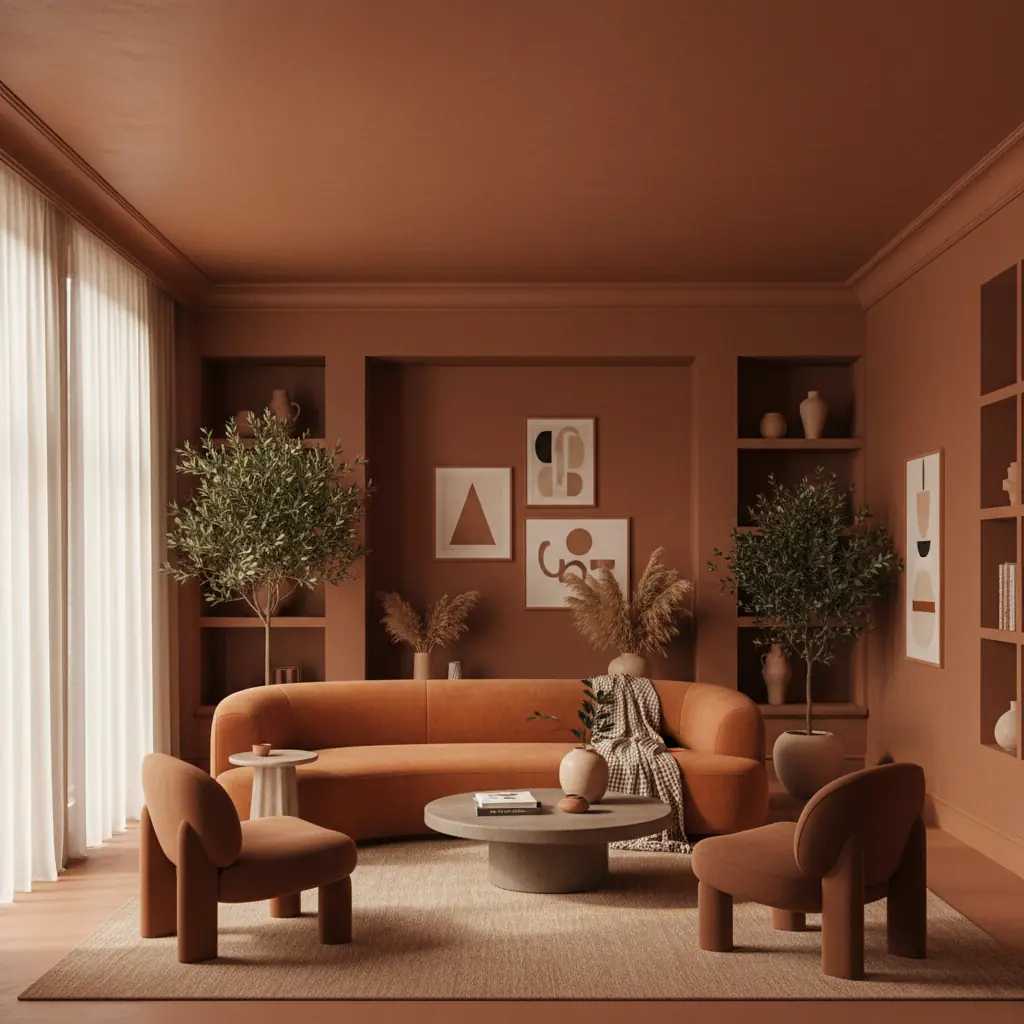
**Sage Green & Muted Terracotta: The 2026 Standouts** These two colors are poised to dominate the drenching trend in 2026, offering contemporary appeal with timeless roots.
- **Sage Green Drenching**: Creates rooms that feel like a tranquil garden pavilion—calm, natural, and endlessly inviting. Its inherent connection to nature fosters a sense of biophilic design, promoting relaxation and well-being. It's particularly effective in bedrooms, sunrooms, or cozy reading nooks. - **Muted Terracotta Drenching**: Offers a warmer, bolder statement, creating spaces with an earthy, sun-baked, Mediterranean character. This hue is fantastic for dining areas or living rooms where you want to inject warmth and a touch of exoticism without overwhelming the senses.
Both sage green and muted terracotta possess enough gray or earthy undertone to prevent them from feeling overwhelming when applied across an entire room. They offer depth and character while maintaining a sense of sophisticated restraint. When selecting your hue, consider the natural light of the room and its intended function. For specific recommendations, explore our curated list of the [best paint colors for 2026](/blog/best-paint-colors-2026).
Which Rooms Best Suit Color Drenching?
While the allure of color drenching is widespread, certain rooms lend themselves more naturally to this immersive technique, maximizing its impact and livability.
**Small Powder Rooms: The Ideal Starting Point** Compact powder rooms are unequivocally the ideal canvas for your first color drenching experiment. Their small scale ensures that the drenching feels intentional and impactful rather than accidental or overwhelming. Often windowless, powder rooms offer complete control over lighting, allowing you to curate the exact mood you desire. Furthermore, guests typically spend only a few minutes inside, making bold color choices feel exciting and memorable rather than potentially exhausting for prolonged exposure. A deep green or rich blue powder room, fully drenched from floor to ceiling, is one of the most consistently impressive and talked-about design moves you can make for a relatively low investment—often for under $50 in paint. This small space serves as a perfect design "jewel box."
**Bedrooms: Your Personal Sanctuary** Bedrooms are the second-best candidate for color drenching, especially given how these spaces are typically used. You primarily experience the bedroom in the evening and morning, when warm, ambient lighting can make drenched colors glow with incredible richness and depth. A deep blue drenched bedroom, complemented by crisp white linen bedding and subtle textures, evokes the feeling of sleeping in a luxurious boutique hotel. Similarly, a sage green or muted plum can create a deeply comforting and restorative environment. Research from the University of Texas suggests that cohesive color schemes can enhance feelings of comfort and relaxation by 15-20% in residential spaces, making the bedroom a prime candidate for this unifying approach.
**Libraries and Home Offices: Fostering Focus and Calm** These spaces benefit immensely from the cocooning effect of color drenching. By eliminating visual distractions and creating an enclosed atmosphere, drenching helps to foster concentration and a sense of focused calm. A rich burgundy, a charcoal gray, or a deep forest green can transform a home office into a sophisticated retreat, allowing for deeper work without external visual interruptions. This technique creates a dedicated zone that feels both formal and intimate, perfect for productivity or quiet contemplation.
**Large, Open-Plan Living Rooms: Proceed with Caution (or Strategic Zones)** Large, open-plan living areas require a more considered approach. Drenching works best in defined spaces with clear architectural boundaries. An expansive living-dining-kitchen area drenched in a single, intense color can sometimes feel monotonous or overwhelming, especially if not carefully balanced with furniture and accents. If you wish to incorporate drenching into an open-plan layout, consider applying the technique to a specific zone, such as just the living area, stopping at a natural architectural break—like a structural beam, a column, a change in ceiling height, or even a half-wall. Then, use a complementary or lighter approach in the adjacent spaces to maintain visual flow without sacrificing impact. This "zone drenching" can help define functional areas within a larger space.
How to Execute Color Drenching for a Flawless Finish
Achieving a perfectly drenched room is a meticulous process that combines careful planning with precise execution. The technical aspects are straightforward but demand attention to detail to ensure a truly seamless finish.
**1. Preparation is Key:** Begin by thoroughly cleaning all surfaces—walls, ceiling, trim, and doors—to remove dust, grime, and cobwebs. Patch any holes or imperfections in the drywall, sand smooth, and wipe clean. Apply painter's tape to protect any areas you absolutely do not want painted (e.g., windows, light fixtures, outlets). A good quality primer is crucial, especially if you're painting over a drastically different color or using a very deep hue, as it ensures uniform absorption and a richer final color. This initial prep work, though time-consuming, ensures a professional-grade finish.
**2. The All-Important Color Test:** Before committing to gallons of paint, purchase a single quart or gallon of your chosen color for testing. Paint a generous swatch (at least 3x3 feet) on a wall that receives varied light throughout the day. Crucially, also paint a test patch directly on the ceiling. Colors appear differently on horizontal versus vertical surfaces due to how light hits and reflects off them. Observing the color on both planes under various lighting conditions (natural daylight, evening lamp light) is essential to confirm it works perfectly in your space. This step is non-negotiable. If you're unsure, tools like [Habitas can generate realistic AI-powered room designs](/blog/ai-generated-room-designs-realistic) to visualize your chosen color across all surfaces before you even buy a sample.
**3. Choosing the Right Finish:** For maximum immersion and the most unified look, use the _same paint finish_ throughout the entire room.
- **Eggshell or Satin**: These are generally the best choices. They offer a subtle sheen that is forgiving on walls and provides durability for high-touch areas like trim and doors, without being overly reflective. - **Matte**: While fashionable for walls, matte finishes tend to show scuffs and marks more readily on trim and doors, which receive more wear. They can also create too much texture difference between surfaces. - **Semi-Gloss/Gloss**: Using semi-gloss or gloss on all surfaces will create a highly reflective room, which can feel intense and highlight every imperfection. If used only on trim, the visible sheen difference between walls and ceiling will undermine the "one surface" effect that defines drenching. Some designers do use a matte finish on walls and an eggshell on trim/doors. This adds a subtle, sophisticated dimension by playing with light reflection without breaking the monochrome. If opting for this, ensure the difference is subtle.
**4. Painting Technique:** Paint all trim, crown molding, baseboards, door frames, and doors the exact same color. Do not skip the ceiling—it is arguably the most important surface for achieving the true drenching effect, as it eliminates the most prominent visual break. Apply thin, even coats, allowing adequate drying time between each. For a typical room, a DIY color drenching project can be completed for under $500 in materials, though it will likely take 2-3 full days of dedicated work, including prep and drying time, compared to professional painting which might cost between $2,000 to $6,000 for a similar space.
Beyond Paint: Accessorizing a Drenched Room
Once your room is drenched in color, the next exciting step is to layer in textures, furniture, and accessories. The beauty of a color-drenched backdrop is that it allows other elements to truly pop without competing.
- **Texture is King:** With a monochromatic color scheme, texture becomes your primary tool for adding depth and interest. Think plush velvet sofas, chunky knit throws, linen curtains, woven rugs, and raw wood furniture. These varied textures prevent the single-color room from feeling flat. - **Strategic Contrasts:** While the paint is monochromatic, your furnishings don't have to be. Introduce contrasting colors through accent pillows, artwork, or decorative objects. A vibrant emerald green accent chair against a deep navy-drenched room, or a set of rust-colored ceramics in a sage green space, can be incredibly impactful. - **Metallic Accents:** Metallics add instant glamour and sophisticated contrast. Gold, brass, matte black, or brushed nickel hardware, light fixtures, and decorative items will shine against the enveloping color. - **Greenery:** Plants bring life and a fresh organic touch to any drenched room. The natural greens of foliage will provide a beautiful contrast and soften the intensity of a bold color.
Addressing Common Concerns: Will it make my room feel too small or dark?
This is perhaps the most frequent concern regarding color drenching, and it's a valid one. However, the answer is often surprising: no, not necessarily.
As discussed earlier, by eliminating visual boundaries, color drenching can actually make a room feel _larger_ and more expansive because the eye isn't stopping at artificial lines created by contrasting elements. The feeling of "smallness" often comes from a room's physical dimensions being emphasized by these contrasts, not from the color itself.
Regarding darkness, it largely depends on the chosen color and the room's natural light.
- **Deep Colors:** Yes, deep blues, charcoals, or forest greens will absorb more light and create a moodier, more intimate atmosphere. This is often the desired effect, contributing to a cozy, sophisticated "cocoon" feel, perfect for bedrooms, studies, or powder rooms. - **Light Colors:** Drenching in a warm white, pale gray, or light sage green will maintain a bright and airy feel while still benefiting from the seamless flow. These options are excellent for spaces where brightness is paramount, but you still want the sophisticated, continuous look. - **Lighting Strategy:** Regardless of the color, a well-planned lighting scheme is crucial for a drenched room. Layered lighting—including ambient, task, and accent lighting—can transform how the color appears throughout the day and evening, preventing any sense of oppressive darkness. Dimmer switches are your best friend, allowing you to adjust the mood effortlessly.
Ultimately, trust your test swatches. See how the color behaves on all surfaces under different light conditions. If a deep color feels too intense, consider a slightly lighter shade from the same color family, or introduce more reflective surfaces through mirrors and metallics to bounce light around.
The Transformative Impact: Before and After Color Drenching
The most common reaction to a color-drenched room is one of surprise at its profound difference compared to the same color used only on walls with white trim and ceiling. The standard approach typically reads as "a room with blue walls," where the color is simply applied _to_ the surfaces. The drenched approach, however, reads as "a blue room," where the color _is_ the environment. This distinction, while subtle in words, is dramatically apparent in person—it is the difference between color as an accent and color as an immersive environment.
The shift is from merely decorating a space to truly designing an atmosphere. It’s a move towards a more sophisticated, intentional, and cohesive aesthetic that many homeowners are embracing. Users who visualize their designs with AI tools like Habitas report being 3x more confident in their design choices before starting a project, significantly reducing costly mistakes and ensuring their vision comes to life. Properties featuring unique, well-executed design elements like color drenching can see an increase in perceived value of 5-10% and attract more buyer interest, according to recent real estate trends in design-forward markets.
If you are considering color drenching but find it difficult to picture the final result, use Habitas to generate a preview. Simply upload a photo of your existing room and describe the drenching effect you envision—whether it's deep navy on all surfaces or a calming sage green extending across the ceiling. Seeing your actual space fully drenched in your chosen hue is far more informative and confidence-boosting than any mood board, offering the clarity you need before opening a single paint can. It’s an invaluable step in bringing your boldest design visions to life.
Frequently Asked Questions
### What is the main difference between color drenching and an accent wall?
Color drenching is the opposite of an accent wall. An accent wall draws attention to a single feature by using a contrasting or bold color on one wall, while keeping others neutral. Color drenching aims to dissolve all architectural boundaries by painting all surfaces (walls, ceiling, trim, doors) in a single, continuous color, creating an immersive, enveloping effect where the room itself becomes a single hue rather than having focal points created by color differences.
### Does color drenching only work with dark colors?
No, color drenching works effectively with both dark and light colors. While deep blues, greens, or grays create a moody, sophisticated, and cocoon-like atmosphere, lighter hues like warm whites, pale grays, or soft pastels can create a serene, expansive, and gallery-like feel. The key is the monochromatic application across all surfaces, which unifies the space regardless of the color's depth.
### Can I use different paint finishes for color drenching?
For the most seamless and immersive effect, it's generally recommended to use the same paint finish throughout the room (e.g., eggshell or satin for everything). This ensures a consistent sheen and light reflection, preventing visual breaks. Some designers opt for a very subtle variation, such as matte on walls and eggshell on trim, to add a hint of dimension without disrupting the overall monochrome. However, significantly different finishes (like matte walls with semi-gloss trim) can counteract the drenching effect by highlighting boundaries.
### How do I make a color-drenched room feel less monotonous?
To prevent a color-drenched room from feeling monotonous, focus on layering textures, incorporating varied lighting, and introducing thoughtful accents. Use textiles like velvet, linen, wool, and natural wood for furniture. Integrate metallic elements, mirrors, and artwork to add reflective surfaces and visual interest. Plants and subtle contrasting accessories can also break up the single-color scheme while maintaining harmony. The monochromatic backdrop actually makes these curated elements stand out more powerfully.
### Is color drenching a passing trend or a timeless technique?
While color drenching is currently a prominent trend for 2026, the underlying principles it utilizes—creating visual unity, enhancing spatial perception, and cultivating specific moods—are timeless design techniques. Interior designers have used monochromatic schemes for decades. Its current popularity indicates a broader shift towards bolder, more intentional color use in homes. While specific color choices may evolve, the technique of enveloping a room in a single hue is likely to remain a sophisticated and impactful design option.