Dominando Interiores con Carácter: Colores Oscuros Sin Reducir Visualmente Tu Espacio
Descubre los secretos para diseñar con colores oscuros sin que las habitaciones se sientan pequeñas. Explora tonalidades, consejos de equilibrio, ideas para habitaciones y usa Habitas AI para previsualizar tu diseño.
Por qué los interiores oscuros están en auge
Durante una década, la narrativa dominante en el diseño de interiores fue "opta por lo claro". Paredes blancas, maderas pálidas, todo luminoso y aireado. Tenía sentido como reacción a los interiores recargados de madera oscura de principios de los 2000, que a menudo se sentían anticuados y abarrotados. Pero los péndulos oscilan, y para 2025 la habitación completamente blanca comenzó a sentirse genérica y estéril, un lienzo en blanco que, paradójicamente, no mostraba personalidad. Muchos propietarios, después de años de minimalismo brillante, anhelaban algo con más profundidad y carácter, alejándose de lo que parecía una estética dictada por los anuncios inmobiliarios en lugar del estilo personal. Si buscas redefinir tu espacio más allá de las omnipresentes tendencias claras, puedes encontrar inspiración en nuestra guía de [consejos de diseño para habitaciones completamente blancas](/blog/all-white-room-design-tips) para ver lo que estás dejando atrás.
Los interiores oscuros ofrecen lo que las habitaciones blancas no pueden: atmósfera. Una sala de estar verde profundo se siente como un club privado. Un dormitorio azul marino se siente como un capullo. Un comedor color carbón hace que la luz de las velas sea el doble de dramática. Los colores oscuros crean intimidad, dramatismo y una sensación de estar envuelto en algo intencional en lugar de inacabado. La tendencia no se trata de hacer las habitaciones más oscuras por sí mismas, sino de usar el color para crear ambiente y carácter. En una encuesta reciente de una publicación de diseño líder, casi el **60% de los propietarios expresaron interés en incorporar paletas de colores más oscuras y con más carácter** en sus hogares el próximo año, un salto significativo en comparación con hace cinco años, lo que indica un claro cambio en las preferencias estéticas hacia la profundidad y la sofisticación. Esto no es solo una tendencia pasajera; es una revaluación profunda de cómo el color impacta nuestras vidas diarias y nuestro bienestar emocional dentro de nuestros espacios personales.
¿Cuáles son los mejores colores oscuros para interiores en 2026?
Aunque "oscuro" puede evocar imágenes de espacios lúgubres, la verdad es que los mejores colores oscuros para 2026 son profundamente matizados, ricos y sorprendentemente versátiles. No son solo colores; son creadores de ambiente, aportando una sofisticada solidez a cualquier habitación.
**Verde Bosque Profundo:** Esta es la estrella indiscutible de los interiores con carácter este año. Tonos como Benjamin Moore Essex Green, Farrow & Ball Studio Green o Sherwin-Williams Rookwood Dark Green crean espacios que se sienten simultáneamente sofisticados y orgánicos. El verde es el color oscuro más fácil de usar porque es intrínsecamente natural: nuestros cerebros lo asocian con paisajes exuberantes, bosques serenos y una sensación de calma en lugar de oscuridad inminente. Combina maravillosamente con materiales naturales como madera cruda, ratán y terracota, así como con acentos metálicos como el latón y el oro, que realmente destacan contra su profundidad. Consíderalo para un estudio o una sala de estar inspirada en la naturaleza para una sensación inmediata de tranquilidad arraigada.
**Azul Marino Clásico:** El azul marino sigue siendo un clásico por una buena razón, ofreciendo una elegancia atemporal que se siente familiar y refinada. Es universalmente favorecedor, funciona a la perfección con colores de acento cálidos y fríos, y se percibe elegante sin esfuerzo. Dependiendo de sus matices, el azul marino puede evocar la calma costera o una profunda seriedad intelectual. Imagínalo con molduras blancas impolutas para un toque náutico, o con ricos tonos joya como esmeralda y rubí para un efecto más opulento y dramático. Es especialmente efectivo en salas de estar formales o dormitorios, proporcionando un telón de fondo sereno que fomenta el descanso y la contemplación.
**Gris Carbón Sofisticado con Matices Cálidos:** Para algo más contemporáneo que el negro puro (que puede sentirse opresivo y austero sin una aplicación cuidadosa), prueba un gris carbón intenso con matices cálidos. Piensa en un gris intenso, casi negro, como Benjamin Moore Wrought Iron, Farrow & Ball Railings o Sherwin-Williams Peppercorn. Estos tonos proporcionan el dramatismo del negro sin su dureza, ofreciendo una intensidad más suave y acogedora. El gris carbón sirve como un fondo increíblemente chic para obras de arte vibrantes o muebles escultóricos. Su calidez lo hace adaptable a estilos industriales, modernos o incluso de transición, especialmente cuando se combina con piedra natural, elementos de concreto o telas texturizadas.
**Marrón Chocolate Emergente:** Siguiendo la ola del minimalismo cálido y la estética del "lujo discreto", el marrón chocolate es el color oscuro emergente para 2026. Rico, cálido y profundamente reconfortante, combina maravillosamente con crema, camel y latón, creando un ambiente acogedor y envolvente. Es el color oscuro que se siente menos "dramático" y más naturalmente acogedor, como estar envuelto en una manta de cachemira o acurrucado en un estudio acogedor y con encuadernación de cuero. El marrón chocolate funciona excepcionalmente bien en espacios donde la comodidad y la calidez son primordiales, como salas de estar informales, bibliotecas o salones familiares, creando un retiro sofisticado. Armoniza maravillosamente con terciopelos texturizados, cueros suaves y maderas oscuras pulidas.
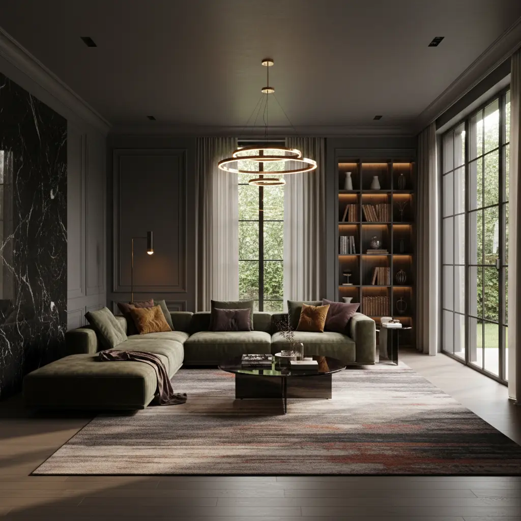
Cómo equilibrar paredes oscuras y evitar que una habitación se vea pequeña
La regla número uno para habitaciones oscuras que se sienten amplias en lugar de parecidas a una cueva es simple: **contrasta con intención.** Las paredes oscuras necesitan contrapuntos más claros: un sofá crema, una mesa de centro de mármol blanco, pisos de roble claro o una alfombra pálida. El ojo necesita puntos de anclaje que reflejen la luz y eviten que el color oscuro absorba toda la energía visual. Piénsalo como pintar un lienzo; necesitas tanto oscuros como claros para crear profundidad y dimensión. Este contraste puede provenir de muebles grandes, detalles arquitectónicos como molduras de techo y zócalos pintados en un tono más claro, o incluso obras de arte audaces con paspartú blanco.
**Uso Estratégico de Metálicos:** Los acentos metálicos son esenciales en habitaciones oscuras. El latón, el oro y el cobre capturan y reflejan la luz de maneras que los acentos blancos no pueden, dispersando la luminosidad y añadiendo un toque de glamour. Una lámpara de pie de latón, un espejo con marco dorado, una lámpara colgante de cobre o incluso sutiles hilos metálicos en cojines decorativos crean puntos de calidez y brillantez contra las paredes oscuras. Es por eso que los interiores con carácter a menudo se sienten lujosos: la combinación de metal sobre oscuro se percibe intrínsecamente elevada y refinada. No temas mezclar metales para un aspecto aún más rico y curado.
**La Iluminación por Capas es Imprescindible:** Las habitaciones oscuras demandan más fuentes de luz, no necesariamente más brillantes. Aplica iluminación de tonos cálidos a múltiples alturas para crear profundidad y eliminar esquinas oscuras:
- **Luz Ambiental:** Luminarias de techo como plafones o candelabros que proporcionan iluminación general. - **Luz de Tarea:** Lámparas de mesa y de pie que ofrecen luz focalizada para leer o trabajar. Considera integrar bombillas inteligentes que te permitan ajustar la temperatura del color y el brillo. - **Luz de Acento:** Apliques de pared a la altura de los ojos, luces para cuadros o incluso velas que crean puntos focales y realzan el ambiente.
Evita las bombillas de luz fría (5000K+) en habitaciones oscuras: chocan con los colores cálidos de las paredes y crean un contraste inquietante, casi clínico. Opta por 2700K-3000K para una sensación cohesiva, acogedora e íntima. Estudios sugieren que los esquemas de iluminación diseñados profesionalmente pueden **reducir el consumo de energía hasta en un 30%** en comparación con configuraciones básicas y sin capas, haciendo que una iluminación adecuada no sea solo estética sino también energéticamente eficiente. Para más información sobre cómo combinar tecnología y diseño, explora cómo un [generador de paletas de colores con IA](/blog/ai-color-palette-generator) puede ayudarte a armonizar tu iluminación con los colores de pintura elegidos.
**Abraza la Textura y la Profundidad:** Las habitaciones oscuras se benefician inmensamente de una variedad de texturas. Sin texturas variadas, un espacio oscuro puede sentirse plano. Introduce materiales como terciopelo felpa, lino suave, mantas de punto grueso, ratán tejido, ladrillo expuesto o madera pulida. Estos elementos táctiles absorben y reflejan la luz de manera diferente, añadiendo interés visual y profundidad que evita que la habitación se sienta unidimensional. Una pared oscura y profunda puede cobrar vida de repente con el juego de luces sobre una alfombra texturizada o un sofá de terciopelo. Esta interacción de luz y sombra en diferentes superficies es lo que hace que una habitación oscura sea verdaderamente dinámica y acogedora.
¿Qué habitaciones funcionan mejor con colores oscuros?
Si bien la versatilidad de los colores oscuros significa que pueden funcionar en casi cualquier espacio con el enfoque adecuado, algunas habitaciones son particularmente adecuadas para adoptar una paleta con carácter.
**Dormitorios: Tu Refugio Personal:** Los dormitorios son el ajuste más natural para los colores oscuros. Usas el dormitorio principalmente por la noche, cuando los colores oscuros lucen mejor bajo una iluminación cálida y por capas. Un dormitorio azul marino o verde bosque profundo con ropa de cama de lino blanca impoluta, acentos de madera natural y lámparas de noche de latón es una de las aplicaciones de color oscuro más consistentemente exitosas: crea una atmósfera de retiro que realmente mejora el sueño al indicarle a tu cerebro que el espacio es para el descanso y la relajación. Los colores más oscuros pueden reducir las distracciones visuales y crear una sensación de encierro que promueve la calma. Si estás considerando una renovación completa de tu dormitorio, consulta nuestra guía sobre un [desglose de costos de rediseño de dormitorio](/blog/bedroom-redesign-cost-breakdown) para planificar tu presupuesto de manera efectiva.
**Tocadores y Baños Pequeños: Joyeros de Diseño:** Los tocadores y los baños pequeños son, contraintuitivamente, excelentes candidatos para los colores oscuros. Debido a que son pequeños y típicamente sin ventanas, ya se sienten cerrados; aprovechar eso con un color oscuro audaz transforma lo "estrecho" en una "caja de joyas". Un tocador verde oscuro con accesorios de latón, un lavabo de pedestal elegante y una lujosa encimera de mármol se siente intencionalmente opulento y de alta gama, en lugar de parecer accidentalmente pequeño. Los colores oscuros pueden hacer que estos pequeños espacios se sientan más grandiosos y deliberados. Este enfoque ofrece una oportunidad para ser audaz sin comprometerse con un área grande y de alto tráfico. Para más inspiración, consulta nuestras [ideas para remodelar el baño](/blog/bathroom-remodel-ideas).
**Comedores: Intimidad para Reuniones:** Los comedores funcionan maravillosamente oscuros porque la mayoría de las cenas ocurren por la noche, bajo iluminación controlada. Las paredes oscuras hacen que los arreglos de mesa sean más dramáticos, las velas más atmosféricas y la conversación más íntima. Un comedor color carbón o marrón chocolate profundo crea un telón de fondo sofisticado que invita a la sobremesa y a conversaciones profundas. El rico telón de fondo también hace que la comida y el vino parezcan más vibrantes y apetitosos. Combina con un impresionante candelabro y arte de tonos cálidos para una experiencia culinaria verdaderamente memorable.
**Salas de Estar: Procede con Diseño Reflexivo:** Las salas de estar pueden optar por el color oscuro, pero procede con más cautela que con un dormitorio o un tocador. Suelen ser la habitación más grande y la que se utiliza a todas horas. Si deseas una sala de estar oscura, asegúrate de que tenga buena luz natural de al menos una ventana grande y usa un color de techo más claro para evitar que el espacio se sienta recargado en la parte superior. Alternativamente, prueba una pared de acento oscura detrás del sofá en lugar de las cuatro paredes, o considera aplicar el color oscuro solo hasta un riel para sillas, pintando la parte superior en un tono más claro. Los espejos grandes también pueden ayudar significativamente a reflejar la luz y expandir el espacio visualmente.
**Home Offices y Estudios: Cultivando el Enfoque:** Para aquellos que buscan un espacio dedicado a la concentración, un home office o estudio oscuro puede ser increíblemente efectivo. Los azules o verdes profundos pueden evocar una sensación de calma académica y profesionalismo, minimizando las distracciones y fomentando la concentración. El color rico y envolvente puede hacer que el espacio se sienta como un cubil privado, fomentando la creatividad y la productividad. Combina con muebles de madera oscura, detalles de cuero e iluminación de tarea focalizada para un espacio de trabajo verdaderamente sofisticado y funcional.
Miedos comunes sobre los colores oscuros — desmentidos
Adoptar los colores oscuros a menudo viene acompañado de un conjunto de ansiedades comprensibles. Abordemos las preocupaciones más comunes de frente.
**"Los colores oscuros hacen que las habitaciones se sientan más pequeñas."** Este es quizás el mito más persistente. No exactamente. Los colores oscuros hacen que las habitaciones se sientan más íntimas y envolventes, lo cual es diferente de sentirse más pequeñas. De hecho, una pared oscura a veces puede difuminar los bordes de una habitación, haciéndola sentir menos definida y sorprendentemente espaciosa, especialmente si hay suficiente reflexión de luz. Una habitación oscura con iluminación estratégica, muebles más claros y un uso juicioso de espejos puede sentirse tan espaciosa y con mucho más carácter que una habitación blanca y austera; simplemente tiene una personalidad diferente. El tamaño percibido de una habitación depende mucho más de la escala de los muebles, la distribución, las fuentes de luz y lo bien diseñado que esté el espacio que del color de la pared por sí solo. Usar elementos verticales como estanterías altas o papel tapiz a rayas también puede dirigir la vista hacia arriba, mejorando la sensación de altura.
**"Me cansaré de él."** Esta es una preocupación válida, y la respuesta es matizada. Es más probable que te canses de un color de moda y altamente saturado (como el rosa fuerte o el azul eléctrico) que de un tono oscuro clásico y sofisticado. El verde bosque, el azul marino, el gris carbón y el marrón chocolate no son colores novedosos; son bases atemporales que los diseñadores han utilizado durante siglos, a menudo vistos en interiores clásicos europeos o bibliotecas tradicionales. Su atractivo perdura porque son profundos, complejos y combinan bien con una amplia gama de colores de acento y estilos. Si aún te preocupa, comienza con una habitación que puedas repintar fácilmente, como un dormitorio, un tocador o un home office. Alternativamente, considera una pared de acento o sumergir en color una característica arquitectónica más pequeña antes de comprometerte con una habitación completa. Para obtener orientación sobre cómo seleccionar colores con longevidad, consulta nuestras recomendaciones para los [mejores colores de pintura 2026](/blog/best-paint-colors-2026).
**"Será demasiado oscuro para ver algo."** Solo si ignoras la iluminación. Una habitación oscura bien iluminada es dramáticamente hermosa; una habitación oscura con poca luz _es_ una cueva. La solución no es evitar los colores oscuros, es invertir en una iluminación adecuada y por capas. Como se discutió anteriormente, integra iluminación ambiental, de tarea y de acento a varias alturas, optando siempre por bombillas de tonos cálidos (2700K-3000K). Considera los reguladores de intensidad para un control máximo sobre el ambiente y la funcionalidad del espacio. Presupuesta un extra de $200-$400 para accesorios de iluminación adicionales y controles de iluminación inteligentes al planificar un diseño de habitación oscura, y nunca te sentirás con poca luz. Esta pequeña inversión garantiza que tu habitación oscura no solo sea funcional, sino que realmente brille, ofreciendo flexibilidad desde actividades diurnas brillantes hasta un ambiente nocturno íntimo.
Usando IA para previsualizar colores oscuros antes de comprometerte
La mayor barrera para elegir colores oscuros es el miedo a lo desconocido. Las muestras de pintura pegadas a una pared blanca no te dan casi ninguna información útil sobre cómo se sentirá una habitación entera pintada de oscuro. Tu cerebro no puede extrapolar con precisión de una muestra de 5x5 cm a cuatro paredes, un techo y cómo estos colores interactuarán con tus muebles y la iluminación existentes. Este salto de fe es precisamente lo que disuade a muchos de experimentar con tonos audaces y oscuros.
Aquí es donde las herramientas de visualización con IA como **Habitas** cambian completamente la ecuación, democratizando el acceso a previsualizaciones de diseño de nivel profesional. Con Habitas, puedes subir una foto de tu habitación actual —tus muebles, tu iluminación, tus ventanas, tus detalles arquitectónicos únicos— y verla renderizada instantáneamente en verde profundo, azul marino, gris carbón o cualquier color oscuro que estés considerando. La IA simula con precisión cómo la luz interactuará con el nuevo color, cómo tus muebles existentes destacarán (o se suavizarán) y dónde podrían ser necesarias fuentes de luz adicionales o acentos más claros.
Puedes comparar múltiples opciones una al lado de la otra, experimentar con diferentes colores de acento e incluso visualizar nuevos muebles contra paredes oscuras. Esto elimina las conjeturas y el riesgo financiero significativo que históricamente ha impedido que las personas prueben los colores oscuros. Las consultas de diseño tradicionales solo para la selección de colores pueden costar más de **$200-$500 por unas pocas horas**, mientras que las herramientas de IA como Habitas ofrecen visualización instantánea y completa por una fracción de ese costo, o incluso gratis para previsualizaciones básicas. Es una inversión en confianza, no solo en diseño. Para comprender más sobre cómo esta tecnología hace su magia, profundiza en [diseño de interiores con IA: cómo funciona](/blog/ai-interior-design-how-it-works) o compara su rentabilidad con la de diseñadores tradicionales con [diseño de interiores con IA vs. costo de contratar](/blog/ai-interior-design-vs-hiring-cost). Habitas te empodera para diseñar con audacia, eliminando el miedo al compromiso y permitiendo que tu creatividad florezca.
Preguntas Frecuentes
### ¿Cómo hago que una habitación oscura se sienta más luminosa sin volver a pintar?
Para iluminar una habitación oscura sin volver a pintar, concéntrate en maximizar la reflexión de la luz y añadir contraste. Incorpora espejos grandes, especialmente frente a las ventanas, para que la luz natural rebote por el espacio. Elige muebles, alfombras y textiles de colores claros (como un sofá crema o cortinas de lino blancas) para crear anclas visuales brillantes. Introduce acentos metálicos (latón, oro, plata) que reflejan la luz de manera más efectiva que las superficies mate. Aplica iluminación por capas con accesorios ambientales, de tarea y de acento, asegurándote de que todas las bombillas sean de tonos cálidos (2700K-3000K). Finalmente, opta por superficies reflectantes como mesas de centro de cristal o cerámicas de alto brillo.
### ¿Qué color de techo debo usar con paredes oscuras?
Para paredes oscuras, el color de techo más común y efectivo es un blanco nítido o un blanco muy pálido, casi crema. Esto crea una ruptura visual, evita que la habitación se sienta "encerrada" y ayuda a reflejar la luz hacia abajo, haciendo que el espacio se sienta más alto y aireado. Si deseas un aspecto más cohesivo y envolvente, especialmente en un dormitorio o comedor, puedes intentar pintar el techo del mismo color oscuro que las paredes (una técnica llamada "inmersión de color"). Sin embargo, esto requiere una iluminación muy deliberada y muebles más claros para evitar que se sienta demasiado oscuro. Para la mayoría de las aplicaciones, un techo claro es la opción más segura y efectiva.
### ¿Son adecuadas las paredes oscuras para espacios pequeños?
Sí, las paredes oscuras pueden ser sorprendentemente efectivas en espacios pequeños, especialmente tocadores, baños pequeños o salas de estar acogedoras. En lugar de hacer que la habitación se sienta más pequeña, pueden crear una sensación de intimidad y sofisticación, transformando un espacio "estrecho" en una "caja de joyas". La clave es abrazar el encierro en lugar de luchar contra él. Usa abundante iluminación (incluyendo superficies reflectantes como espejos y metálicos) e incorpora acentos más claros para proporcionar contraste. Los colores oscuros también pueden difuminar los bordes de una habitación pequeña, haciendo que sus límites sean menos definidos y, a veces, dando la ilusión de profundidad.
### ¿Qué tipo de piso combina bien con paredes oscuras?
Con paredes oscuras, generalmente se recomiendan opciones de pisos más claros para crear equilibrio y evitar que la habitación se sienta demasiado pesada o abrumadora. Maderas de colores claros (como roble claro, arce o abedul), azulejos gris pálido o blancos, o alfombras de color crema pueden proporcionar una base luminosa que ancla la habitación y ofrece un contraste llamativo. Sin embargo, los pisos oscuros también pueden funcionar si introduces suficientes elementos más claros a través de alfombras, muebles y decoración de pared. El objetivo es siempre el equilibrio y el contraste intencional. Para una sensación verdaderamente lujosa, un piso de concreto pulido o madera oscura de tablones anchos con un sutil brillo también pueden complementar maravillosamente las paredes oscuras.
### ¿Cómo elijo el color de pintura oscuro adecuado para mi hogar?