Paletas de Cores de IA: Criando Esquemas de Cores Perfeitos para Interiores
Como funcionam os geradores de paletas de cores de IA, as melhores ferramentas disponíveis e um fluxo de trabalho prático para traduzir paletas geradas por IA em decisões reais de design de interiores.
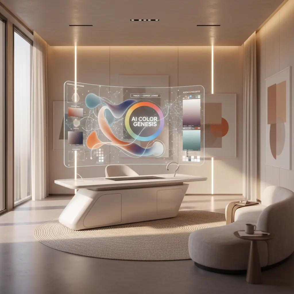
Como a IA Entende a Harmonia das Cores: Além do Círculo Cromático
A teoria tradicional das cores fornece estruturas fundamentais: complementares, análogas, triádicas, monocromáticas e outras. Embora essencial, aplicar essas regras abstratas a espaços interiores reais pode ser surpreendentemente complexo. Escolher três cores de um círculo é uma coisa; imaginá-las como uma cor de parede dominante, um tecido secundário para estofamento e um toque sutil em uma almofada é bem diferente. É aqui que os geradores de paletas de cores de IA se destacam, indo além da teoria simples para a aplicação prática.
Essas ferramentas sofisticadas não são apenas programadas com regras básicas de cores. Elas são treinadas em vastos conjuntos de dados, compreendendo milhões de fotografias profissionais de interiores, catálogos completos de produtos e diversos portfólios de design. Este treinamento extenso permite que elas aprendam mais do que apenas quais cores "combinam". Elas entendem as nuances intrincadas de quais combinações evocam humores específicos (por exemplo, tranquilo, energético, sofisticado), adequam-se a tipos de cômodos específicos (por exemplo, um quarto sereno versus uma sala de jogos vibrante) e têm um desempenho ideal sob várias condições de iluminação.
O resultado é uma IA que entende o contexto e o impacto emocional de uma forma que a teoria das cores simples não consegue. Quando você pede a um gerador de paletas de IA para uma "sala de estar quente e convidativa", ele não retorna apenas um punhado de tons quentes. Em vez disso, ele produz uma paleta equilibrada, tipicamente apresentando um neutro dominante para ancorar o espaço, um toque quente para adicionar caráter, um tom escuro para profundidade e uma cor de destaque para atrair o olhar. Crucialmente, essas cores são proporcionadas e sugeridas de uma forma que espelha como os designers profissionais realmente aplicam a cor em espaços de convivência, muitas vezes aderindo a princípios como a regra 60-30-10 (que exploraremos em breve). Esse processamento inteligente permite um nível de precisão e consciência contextual que simplifica significativamente os estágios iniciais do design de interiores.
A Psicologia das Cores, Informada pela IA
A cor não é apenas estética; ela impacta profundamente nosso humor, percepção e até mesmo respostas fisiológicas. A IA, através de suas capacidades de deep learning, está começando a decifrar e aplicar essa complexa psicologia das cores com uma precisão sem precedentes. Por exemplo, a IA pode aprender que azuis e verdes mais frios são frequentemente associados à tranquilidade e ao foco, tornando-os ideais para quartos e home offices, enquanto vermelhos e amarelos mais quentes evocam energia e apetite, adequados para áreas de jantar ou espaços criativos.
Ao analisar como diferentes esquemas de cores se correlacionam com as preferências do usuário, tags emocionais em descrições de design e até mesmo pistas visuais dentro das imagens (como a presença de luz natural ou estilos de mobiliário específicos), a IA pode recomendar paletas que não são apenas visualmente agradáveis, mas também psicologicamente apropriadas para o espaço pretendido e a atmosfera desejada. Essa profunda compreensão permite que as ferramentas de IA sugiram cores que podem, por exemplo, aumentar a percepção de amplitude em um cômodo pequeno ou criar uma sensação aconchegante e íntima em uma grande área de plano aberto. Essa integração de princípios de design e psicologia humana é um divisor de águas para a seleção de cores de interiores.
Explorando as Melhores Ferramentas de Paleta de Cores de IA Disponíveis
O mercado de ferramentas de design impulsionadas por IA está evoluindo rapidamente, com várias plataformas oferecendo abordagens únicas para a geração de paletas de cores.
**Coolors** continua sendo um dos geradores de paletas de uso geral mais populares e versáteis. Seu modo de IA sugere inteligentemente combinações harmoniosas, permitindo que os usuários "bloqueiem" cores individuais que gostam enquanto regeneram o resto da paleta até a satisfação. Sua velocidade e interface intuitiva o tornam um favorito para explorações rápidas.
**Adobe Color** (anteriormente Adobe Kuler) se integra perfeitamente ao conjunto Adobe Creative Cloud, tornando-o uma escolha para designers já nesse ecossistema. Além de suas robustas ferramentas de teoria das cores, oferece poderosa extração de paletas de imagens – um recurso útil para capturar inspiração de uma fotografia ou uma peça de arte. Ele também sugere paletas baseadas em tendências, ajudando os designers a se manterem atualizados.
**Khroma** adota uma abordagem única de machine learning. Em vez de regras predefinidas, ele aprende suas preferências fazendo você selecionar centenas de cores que você gosta ou não gosta. Com o tempo, ele constrói uma compreensão personalizada de sua estética e gera um fluxo infinito de paletas adaptadas especificamente ao seu gosto. Esse nível de personalização é incrivelmente valioso para desenvolver uma linguagem de design consistente.
Para casos de uso específicos de interiores, ferramentas de design de ambientes de IA como **Habitas** estão expandindo os limites. Quando você gera uma variante de ambiente em um estilo específico usando Habitas, a ferramenta cria e aplica implicitamente uma paleta de cores coordenada. Isso significa que você pode usar a imagem gerada como uma referência de cor sofisticada, mesmo que não replique o design exatamente. Muitas dessas ferramentas de design também apresentam extração de paleta, permitindo que você identifique facilmente os códigos de cores exatos (HEX, RGB) usados em designs gerados, simplificando a transição do conceito digital para a implementação física. Entender [como o design de interiores com IA funciona](/blog/ai-interior-design-how-it-works) revela a profundidade dessas capacidades integradas.
Da Paleta ao Ambiente Real: O Desafio da Tradução e a Regra 60-30-10
Ter uma bela paleta de cinco cores exibida em uma tela é apenas o primeiro passo. O verdadeiro desafio reside em traduzir essas amostras digitais em decisões de design tangíveis e do mundo real: qual cor se torna a extensa pintura da parede, qual se transforma no convidativo tecido do sofá, qual aparece em almofadas decorativas e qual é reservada para pequenos e impactantes detalhes.
Designers profissionais comumente empregam a **regra 60-30-10** como um princípio orientador para a distribuição de cores em um espaço:
- **60 por cento Cor Dominante:** Esta é a cor principal que cobre as maiores superfícies. Pense em paredes, grandes tapetes ou peças de mobiliário principais como um sofá. Ela define o humor e o tom geral do cômodo. - **30 por cento Cor Secundária:** Esta cor é usada para elementos de tamanho médio, proporcionando contraste e interesse visual sem sobrecarregar a cor dominante. Exemplos incluem estofamento em cadeiras de destaque, cortinas, roupas de cama ou uma peça de arte significativa. - **10 por cento Cor de Acento:** Este é o seu "toque" de cor, usado com moderação em pequenos acessórios. Pense em almofadas, objetos decorativos, luminárias ou flores frescas. Esta cor adiciona personalidade e pode ser facilmente alterada para renovar o visual do ambiente.
As paletas de IA podem sugerir essas proporções, mas aplicá-las com habilidade ainda é uma arte. Por exemplo, se sua paleta de IA apresenta um verde sálvia suave, um creme quente e um terracota profundo, você pode designar o creme para 60% (paredes), o verde sálvia para 30% (sofá, cortinas) e o terracota para 10% (almofadas, vaso). Essa abordagem estruturada garante um esquema equilibrado e harmonioso. Para mais ideias sobre combinações de cores, explore nosso guia de [esquemas de cores para salas de estar](/blog/color-schemes-for-living-rooms).
O Impacto do Material, Acabamento e Textura na Percepção das Cores
Um dos aspectos mais críticos que os designers consideram é como o material e o acabamento alteram fundamentalmente a forma como uma cor é percebida em um espaço. O mesmo código de cor azul-cinza exato pode parecer totalmente diferente quando aplicado como:
- **Tinta de parede fosca:** Absorve a luz, criando uma aparência mais suave e discreta. - **Azulejo brilhante:** Reflete a luz, fazendo com que a cor pareça mais brilhante e vibrante, muitas vezes adicionando um toque de drama. - **Tecido de linho trançado:** A textura e a trama introduzem variações sutis na reflexão da luz, dando à cor uma sensação mais suave, muitas vezes mais natural ou orgânica. - **Metal escovado:** O brilho metálico e a textura darão à cor um toque sofisticado e industrial, e sua aparência pode mudar significativamente com a luz ambiente.
As paletas de IA fornecem a tonalidade pura da cor, mas seu trabalho como designer é selecionar o material e o acabamento apropriados para cada aplicação. Comece com suas maiores superfícies (paredes, grandes móveis) e trabalhe até os menores detalhes (objetos decorativos, acabamentos). Ao selecionar materiais, compare-os continuamente com sua paleta escolhida na iluminação real do ambiente. Impressionantes **78% dos designers de interiores relatam que amostras de materiais e acabamentos são essenciais para aprovações de clientes**, destacando sua importância na visualização precisa das cores.
Que Limitações os Geradores de Paletas de Cores de IA Ainda Têm?
Embora incrivelmente poderosos, os geradores de paletas de cores de IA não são infalíveis. Entender suas limitações é fundamental para usá-los de forma eficaz.
### A Discrepância da Iluminação: Por Que a Luz Artificial Importa
Os geradores de paletas de IA geralmente apresentam cores em uma tela, sob iluminação digital ideal e uniforme. No entanto, as condições de iluminação específicas do seu quarto são vastamente diferentes e podem alterar dramaticamente a percepção das cores. Uma paleta que parece quente e coesa em seu monitor pode ser lida de forma completamente diferente em um quarto voltado para o norte com luz do dia fria e indireta, versus um quarto voltado para o sul inundado por um sol da tarde quente e intenso. A iluminação artificial também desempenha um papel enorme. Diferentes fontes de luz têm temperaturas de cor variáveis (medidas em Kelvin):
- **Branco quente (2700K-3000K):** Realça vermelhos, laranjas e amarelos, tornando um cômodo aconchegante. - **Branco frio (4000K-5000K):** Realça azuis e verdes, fazendo um espaço parecer mais claro e moderno. - **Luz do dia (5000K-6500K):** Imita a luz natural do dia, oferecendo representação de cores verdadeira, mas às vezes pode parecer muito nítida.
Este fenômeno é conhecido como **metamerismo**, onde as cores parecem corresponder sob uma fonte de luz, mas não sob outra. Sempre teste as cores da paleta com amostras físicas (amostras de tinta, retalhos de tecido) em seu ambiente real, observando-as ao longo do dia e sob luz natural e artificial antes de se comprometer com as compras.
### Tamanho do Cômodo e Percepção das Cores: Escala e Saturação
O tamanho do cômodo também afeta profundamente a percepção das cores. Cores escuras e altamente saturadas que parecem dramáticas e sofisticadas em uma sala de estar espaçosa e de plano aberto podem parecer opressivas, claustrofóbicas e avassaladoras em um quarto pequeno ou lavabo. Por outro lado, tons claros e frios que criam uma sensação de calma e amplitude em um grande banheiro tipo spa podem fazer um minúsculo lavabo parecer clínico ou pouco convidativo.
Ao usar paletas de IA, considere as dimensões do seu quarto. Em espaços menores, você pode precisar selecionar versões mais claras ou menos saturadas das cores sugeridas pela IA para evitar que o cômodo pareça apertado. Para cômodos maiores, você pode ter mais flexibilidade para introduzir tons mais ousados e profundos. Use as paletas de IA como pontos de partida inteligentes, depois ajuste a saturação e a luminosidade das cores sugeridas com base nas dimensões específicas do seu cômodo e na exposição à luz natural.
### Adaptação às Tendências de Design em Evolução
Embora a IA seja treinada em dados de design históricos e atuais, sua capacidade de prever e se adaptar a tendências verdadeiramente emergentes e de nicho pode, às vezes, ficar para trás. O design é um campo em evolução, com novos estilos e combinações de cores ganhando popularidade constantemente. A IA se destaca no reconhecimento de padrões, mas a inovação genuína geralmente vem da criatividade humana. Portanto, embora a IA possa mostrar as [melhores cores de tinta de 2026](/blog/best-paint-colors-2026) com base em dados existentes, ela pode não captar imediatamente a próxima "cor da moda" antes que ela atinja a consciência mainstream.
Um Fluxo de Trabalho Prático: Gerar, Testar, Visualizar, Comprometer-se
Integrar ferramentas de cores de IA em seu processo de design pode economizar tempo e evitar erros caros. Aqui está um fluxo de trabalho abrangente que combina a geração de IA com a validação prática:
1. **Gerar Múltiplas Paletas com uma Visão Clara:** Comece usando sua ferramenta de IA de escolha (Coolors, Khroma, Adobe Color ou uma plataforma como Habitas). Seja específico em sua entrada: descreva o humor que você deseja alcançar ("sala de estar aconchegante estilo fazenda," "quarto moderno minimalista," "espaço de jantar eclético vibrante") ou faça upload de uma imagem de inspiração que você ama. Gere várias paletas (3-5) para ter opções. Não tenha medo de experimentar pequenas variações.
2. **Reduzir e Refinar:** Do seu lote inicial, reduza para duas ou três paletas candidatas que realmente ressoam com sua visão. Considere a sensação geral de cada uma e quão bem ela se alinha com sua estética desejada. Este passo é sobre intuição combinada com consideração prática inicial.
3. **Visualizar com Ferramentas de Design de Ambientes de IA (Passo Crítico):** É aqui que a IA leva sua paleta de amostras abstratas a um conceito tangível. Faça upload de uma foto real do seu ambiente para uma ferramenta de design de ambientes de IA como o Habitas. Em seguida, gere redesenhos usando cada uma das suas paletas selecionadas. Ver as cores aplicadas à geometria real do seu ambiente – nas paredes, móveis e têxteis dentro de uma renderização de IA – é vastamente mais informativo do que simplesmente olhar amostras isoladas. Preste atenção em como a cor dominante preenche o espaço, como as cores secundárias interagem e como os detalhes se destacam. Este passo permite que você teste conceitos rapidamente. Você sabia que usar IA para visualização pode reduzir o processo de tomada de decisão de design de semanas para meros minutos? [Saiba mais sobre quão realistas são os designs de ambientes gerados por IA](/blog/ai-generated-room-designs-realistic).
4. **Pedir Amostras Físicas:** Depois de identificar uma paleta e uma visualização de IA que você ama, é hora de unir os mundos digital e físico. Peça amostras de tinta física (as maiores amostras adesivas ou potes de amostra são as melhores) e colete amostras de tecido para qualquer estofamento, cortinas ou elementos têxteis importantes. Não confie apenas em pequenos pedaços de tinta. Muitos proprietários subestimam o custo de repintura; um trabalho de repintura típico para uma sala de estar média pode variar de **$500 a $2.000**, tornando o teste de amostras um investimento inteligente.
5. **Teste de Amostras Físicas In Loco:** Este é talvez o passo de validação mais crucial. Cole as amostras de tinta diretamente nas suas paredes em vários locais do ambiente. Coloque as amostras de tecido perto de janelas, nos cantos e ao lado de móveis existentes. Viva com elas por alguns dias, observando como elas mudam em diferentes condições de iluminação – luz da manhã, sol do meio-dia, luz ambiente da noite e sob a iluminação artificial do seu ambiente. - **Verifique os subtons:** Aquele "greige" parece realmente cinza, ou puxa para o verde ou roxo em certas luzes? - **Avalie a intensidade:** A cor é muito brilhante ou muito suave para o espaço? - **Avalie o humor:** Ainda evoca a emoção desejada que você buscou com a IA?
6. **Comprometa-se com Confiança:** Este processo de três etapas – geração de paleta de IA, visualização de ambiente de IA e teste de amostras físicas – captura a maioria dos erros de cor antes que se tornem caros. Ao combinar o poder da IA com uma validação cuidadosa e no mundo real, você pode se comprometer com seu esquema de cores com confiança incomparável, sabendo que ficará fantástico em seu espaço único.
Perguntas Frequentes
### Quão precisas são as paletas de cores de IA para interiores do mundo real?
As paletas de cores de IA são altamente precisas como pontos de partida, baseando-se em vastos conjuntos de dados de designs bem-sucedidos para sugerir combinações harmoniosas. No entanto, sua precisão para _seu ambiente específico_ depende de fatores como luz natural, iluminação artificial, tamanho do ambiente e escolhas de materiais. A IA fornece a paleta teórica perfeita; o teste de amostras físicas em seu espaço real é crucial para confirmar a precisão no mundo real.
### A IA pode substituir um consultor humano de cores para minha casa?
As ferramentas de IA simplificam significativamente os estágios iniciais da seleção de cores e podem produzir excelentes paletas adaptadas às suas preferências. Elas podem economizar tempo e evitar erros comuns. No entanto, a IA não pode substituir totalmente a compreensão matizada de um consultor humano sobre o estilo pessoal, a intuição imediata sobre os desafios únicos de um espaço (como uma característica arquitetônica incomum) ou a capacidade de interpretar profundamente os desejos não expressos de um cliente. Pense na IA como um assistente incrivelmente poderoso que fornece uma base sólida, permitindo que os designers humanos se concentrem no refinamento e na personalização. Para uma análise mais aprofundada, explore [IA vs. Designer de Interiores Humano](/blog/ai-vs-human-interior-designer).
### Qual é a melhor forma de usar uma ferramenta de cores de IA para a reforma da minha casa?
A melhor abordagem é um fluxo de trabalho de várias etapas: primeiro, gere várias paletas com IA com base no humor e estilo desejados. Segundo, use uma ferramenta de design de ambientes de IA como o Habitas para visualizar essas paletas em fotos reais do seu ambiente. Isso ajuda você a ver como as cores aparecerão em seu espaço único. Finalmente, peça amostras físicas de tinta e tecido para testar em seu ambiente sob diferentes condições de iluminação antes de fazer qualquer compra. Essa mistura de testes digitais e físicos minimiza o risco.
### As paletas de cores de IA consideram meus móveis ou decoração existentes?
Muitos geradores avançados de paletas de cores de IA, especialmente aqueles integrados em plataformas completas de design de interiores de IA, _podem_ considerar móveis e decoração existentes. Ao fazer upload de fotos do seu ambiente atual, essas ferramentas analisam as cores, estilos e texturas de suas peças existentes e recomendam paletas que as complementam, garantindo um visual coeso em vez de começar do zero. Este recurso é particularmente útil para redesenhos com orçamento limitado.
### Como a IA pode ajudar especificamente na escolha de cores de tinta?
A IA se destaca em sugerir combinações harmoniosas de cores de tinta, levando em consideração fatores como o humor desejado, o estilo de design e até mesmo as tendências históricas. Algumas ferramentas podem extrair esquemas de cores diretamente de imagens de inspiração, fornecendo códigos de tinta exatos. A IA também ajuda a visualizar essas cores de tinta em suas paredes virtualmente, permitindo que você veja como um ambiente completo ficará antes de se comprometer a comprar e aplicar a tinta real. Isso reduz drasticamente as suposições e o potencial de repinturas caras.