Mastering All-White Room Design: Warm, Inviting, Not Sterile
Design stunning all-white rooms that feel warm, layered, and inviting, not sterile. Expert tips on paint undertones, essential textures, strategic lighting, and Habitas AI visualization.
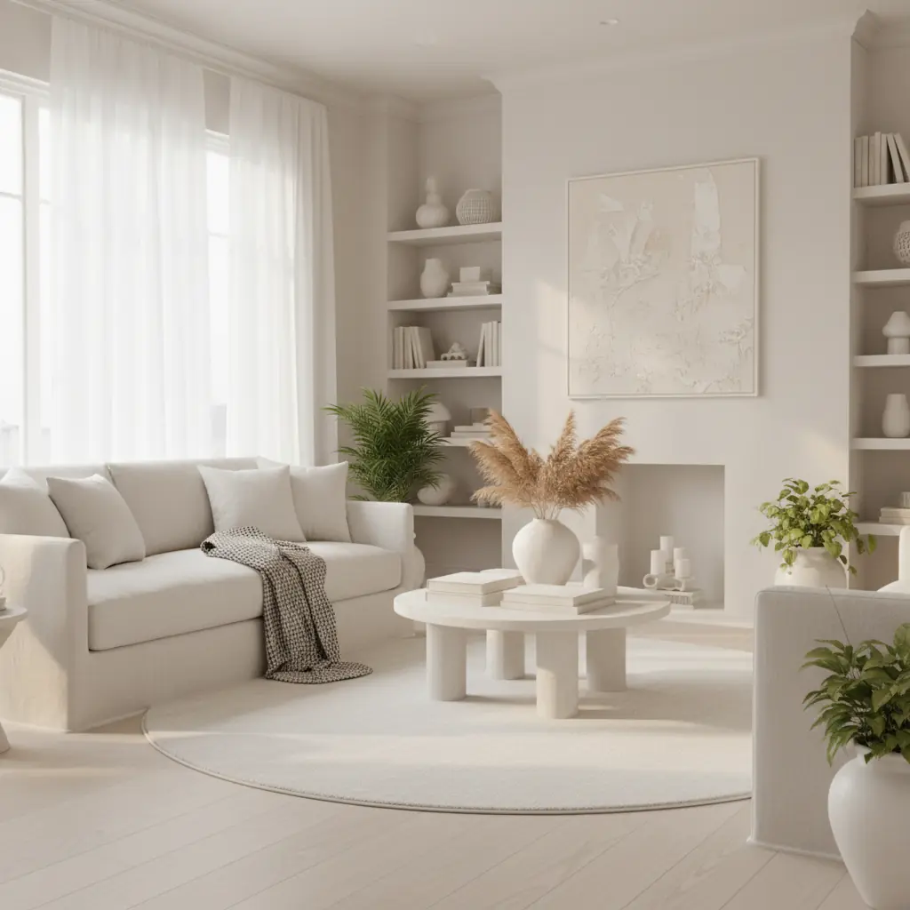
The white room pitfall: why magazine whites fail in real life
All-white rooms look effortlessly beautiful in design magazines — bright, airy, sophisticated, serene. Then you paint your walls white, buy a white sofa, and discover your room looks like a hospital waiting area. This is the white room pitfall, and it catches thousands of homeowners every year. The disconnect between photographed white rooms and lived-in white rooms comes down to three critical factors that magazines rarely explain: the specific white chosen, the variety of textures meticulously layered within the room, and the quality and warmth of the lighting.
Professional photographers also "cheat" in the best possible way. They use specific lighting setups, often employing warm fill lights, that make whites glow warmly and create soft shadows. They style rooms with dozens of subtle texture variations that create visual interest without the distraction of color. And crucially, the white itself has been carefully selected to have the right undertone for the specific lighting conditions of the shoot, a nuance often lost on the viewer. None of this meticulous staging is immediately visible in the final image — you just see "a white room that looks gorgeous" and assume any white will produce the same result. The reality is that creating this illusion of effortlessness requires significant expertise and deliberate choices.
The good news is that all-white rooms CAN work beautifully in real life. But they require more thought and more deliberate choices than a colored room. Ironically, the simplest-looking aesthetic is often the hardest to execute well. Every imperfection shows, every wrong choice is exposed, and there is no bold wall color to distract from spatial or lighting problems. This guide will equip you with the advanced strategies Habitas designers use to craft truly inviting all-white spaces.
Choosing the right white: why undertones matter enormously
There is no such thing as "just white." Benjamin Moore alone offers over 200 whites, and the differences between them are subtle but enormously significant. The most important decision is undertone: understanding whether a white has a cool base (blue, gray, or green) or a warm base (yellow, pink, or peach).
**Cool whites** often look crisp, clean, and modern. They can be stunning in rooms with abundant warm, natural light (like south-facing rooms) where they maintain their brightness without feeling stark. However, in north-facing rooms or spaces with cooler artificial lighting, cool whites can easily lean towards feeling icy, clinical, or even drab. A white with a blue undertone might feel refreshing in a bright bathroom, but chilling in a dimly lit living room.
**Warm whites** feel softer, more inviting, and traditional. They counteract cooler lighting conditions, bringing a subtle coziness to a space. The challenge with warm whites is finding one that offers just enough warmth without looking dingy, yellowish, or like a muted cream, especially in rooms with less natural light. Too much warmth, and your "white" room can start to read as off-white or beige.
### The paper test and environmental considerations
The best initial test for choosing the right white is the paper test. Hold your white paint swatch against a piece of bright white printer paper. The printer paper acts as a true, neutral white. Against it, you will immediately perceive your swatch's undertone — is it pinkish? Yellowish? Grayish? Greenish? This tells you exactly what you are working with.
However, the paper test is just the beginning. The light quality in your actual room is paramount.
- **North-facing rooms:** Receive cooler, bluer light throughout the day. Opt for a warm white with a yellow or pink undertone to balance this coolness. - **South-facing rooms:** Bathed in abundant, warm light. You have more flexibility here; a crisp, slightly cool white can maintain its vibrancy, or a warm white will feel extra cozy. - **East-facing rooms:** Get bright, warm morning light, then cooler light in the afternoon. A balanced warm white often performs well. - **West-facing rooms:** Receive intense, warm afternoon light. Whites here can look very warm, sometimes even yellow. Consider a more neutral white or one with a slight gray undertone to temper the afternoon sun.
For most rooms in 2026, a warm white with just enough warmth to be visible in the paper test — but not so much that it reads as cream — is the sweet spot for achieving a soft, inviting ambiance. While choosing paint can feel overwhelming with the sheer number of options, _over 80% of interior designers agree that selecting the correct white paint is one of the most nuanced and challenging decisions in a project_. Don't rush this step.
### Habitas Pro Tips for White Paint Selection:
The safest warm whites that consistently perform well include Benjamin Moore White Dove (OC-17), Sherwin-Williams Alabaster (SW 7008), and Farrow & Ball Pointing (No.2003). These are versatile whites that carry just enough warmth to avoid starkness.
For a slightly cooler white that still avoids the clinical trap, Benjamin Moore Simply White (OC-117) or Sherwin-Williams Extra White (SW 7006) work beautifully in rooms with abundant warm natural light. They offer a clean, bright feel without being overly cold.
Avoid pure, stark whites like Sherwin-Williams High Reflective White (SW 7757) for large wall surfaces – they belong on trim, ceilings, or as a crisp accent rather than main wall color, as they lack the depth needed for a livable all-white room. If you're struggling to choose, consider using an [AI color palette generator](/blog/ai-color-palette-generator) to get suggestions based on your room's photos and desired mood.
Texture as the savior of white rooms
In a room without color variation, texture becomes your primary design tool. Variety of texture creates visual interest, depth, and warmth in a way that prevents a white room from reading as flat or empty. The rule is simple: the fewer colors in a room, the more textures you need. An all-white room should have a minimum of five to six different textures to feel alive and layered. Think of it as painting with materials rather than pigments.
Start with the large surfaces. A smooth, matte white wall paired with a subtly textured white ceiling (even a subtle knockdown or plaster finish) creates an initial, often overlooked, variation. A plush white wool rug against smooth white-painted hardwood or pale concrete floors adds another significant layer.
Then build through furniture and textiles:
- **Upholstery:** A boucle sofa (nubby, dimensional, soft to touch), linen armchairs (slightly rough, light-catching, organic drape), or a faux shearling pouf (luxuriously soft). - **Window Treatments:** Sheer linen curtains (filtering light gently), thick raw silk drapes (subtle sheen, heavier drape), or woven bamboo blinds (natural, linear texture). - **Throws & Cushions:** A chunky knit throw (three-dimensional, cozy), cotton canvas cushions (smooth but matte), a velvet pillow (soft sheen, inviting). - **Hard Surfaces:** A ceramic vase (glossy against matte textiles), a brushed concrete planter (industrial, porous), a polished marble side table (cool, reflective).
### Harnessing Natural Materials
Natural materials are essential in white rooms because they bring organic variation that synthetic materials cannot fully replicate. They introduce subtle imperfections, natural patterns, and inherent warmth.
- **Wood:** Light wood tones – white oak, birch, maple, or ash – add warmth without introducing overt color. Consider a white oak coffee table, a light wood flooring, or birch shelving. Even distressed white-washed wood can add rustic texture. - **Fibers:** Rattan, cane, jute, and woven straw bring dimensional texture and an earthy, organic feel. Think of a rattan pendant light, a cane armchair, or a jute rug. Wool, linen, cotton, and silk offer different tactile experiences and light reflection. - **Stone & Ceramics:** Natural stone in pale tones (white marble, travertine, limestone, alabaster) adds subtle pattern and color variation within the white palette. Ceramic pieces, whether matte or glossy, introduce a handcrafted element. - **Glass & Metal:** Frosted glass, ribbed glass, or clear glass can add transparency and reflection. Matte metals like brushed steel or iron offer industrial contrast, while polished brass or gold introduce warmth and shine.
A white room that relies entirely on smooth, synthetic materials and painted surfaces will always feel more sterile than one rich in natural materials. Incorporating varied textures also contributes to the psychological perception of a space; studies show that _homes rich in diverse textures and natural elements are perceived as 15-20% more comfortable and inviting_.
Lighting: the make-or-break factor in white rooms
White rooms are more sensitive to lighting than any other color scheme. A white room lit primarily with cool 5000K LED bulbs looks like an office or a hospital. The same room lit predominantly with warm 2700K bulbs looks like a cozy Scandinavian retreat. This is not a subtle difference — it is the profound difference between a room you want to spend time in and a room you instinctively want to leave.
### Understanding Kelvin Temperature
Kelvin (K) is the unit used to measure the color temperature of light.
- **2200K-2700K (Warm White):** Emits a soft, yellowish glow, similar to incandescent bulbs or candlelight. Ideal for living rooms, bedrooms, and dining areas where coziness is desired. This is your go-to for all-white rooms. - **3000K-3500K (Soft White/Neutral White):** A balance between warm and cool, often used in kitchens and bathrooms where a brighter, more natural light is preferred but still retains some warmth. Can work in white rooms but requires careful layering. - **4000K-5000K (Cool White/Daylight):** Emits a crisp, bluish-white light. Best for task lighting in workshops, offices, or commercial spaces. Generally to be avoided in an all-white residential setting, as it will highlight starkness.
### Layer Your Lighting Strategically
Layer your lighting with at least three types of light source in every white room. In a white room, the shadows created by layered lighting ARE the visual interest — they provide the contrast that color would otherwise supply.
1. **Ambient Light:** Provides general illumination. This might come from overhead fixtures like recessed lights with warm dimming capabilities, a diffused pendant, or a chandelier. Crucially, ambient light should never be the only source. 2. **Task Lighting:** Creates pools of warm light for specific activities, adding depth and shadow. Think table lamps next to a sofa, reading lights by an armchair, or under-cabinet lighting in a kitchen. Dimmers on all fixtures are non-negotiable in a white room, allowing you to adjust the mood. 3. **Accent Lighting:** Adds drama, highlights architectural features, or draws attention to art and objects. Picture lights, wall sconces, candles, and uplights behind plants or furniture create intriguing light play. _Investing in quality, layered lighting can increase the perceived value and comfort of a home by as much as 30%_, making it a wise investment for any design.
### Natural Light: The Ultimate Ally
Natural light is the ultimate ally of white rooms. South-facing and west-facing rooms with generous windows are the rooms that do all-white best — sunlight streaming across white surfaces creates the bright, warm, magazine-quality look that inspired the scheme in the first place. Large windows, skylights, and even strategically placed mirrors to bounce light around are invaluable.
North-facing rooms with limited windows are the hardest rooms to execute all-white successfully because they receive cooler, more consistent indirect light. In these spaces, you may be better served by adding at least one warm accent color or incorporating more deeply saturated warm neutrals to prevent the room from feeling flat or chilly. Even in naturally bright rooms, remember that light changes throughout the day, so observe your chosen white at various times before committing.
Adding depth without color: advanced techniques
Achieving a sophisticated, non-sterile white room requires a nuanced approach to depth and contrast, even without introducing traditional colors.
### Layered Neutrals: The Professional Secret
Layered neutrals are the professional secret to white rooms that feel rich rather than sparse. Instead of one uniform white, use three or four whites and near-whites, each with a slightly different undertone or depth: a warm white on walls, a slightly creamier white on trim, an ivory-toned upholstery fabric, and a crisp white linen on curtains. These are not dramatically different; they should all look "white" at first glance, but the subtle variations create depth, visual interest, and a sense of luxury that a single white cannot achieve. This technique adds an almost imperceptible richness to the space.
### Metallic & Matte Accents
Metallic accents bring life and sparkle to white rooms without introducing overt color.
- **Warm Metals:** Brass, gold, and copper add warmth, sophistication, and catch light beautifully, creating dynamic points of interest. A brass table lamp, a gold-framed mirror, copper decorative objects, or subtle gold threading in a throw create sophisticated focal points that guide the eye through the room. - **Cool Metals:** Chrome, polished nickel, or stainless steel can add a sleek, modern edge. Use them sparingly to maintain warmth, perhaps for a lamp base or a subtle piece of hardware. - **Matte Black:** Matte black is another powerful option for a modern, graphic contrast. A black iron light fixture, matte black cabinet hardware, or a slim black frame on a piece of art creates sharp definition against white surfaces, grounding the space and preventing it from feeling ethereal.
### Incorporating Subtle Patterns and Forms
Don't shy away from pattern in an all-white room. The key is to keep it subtle and texture-driven. Tone-on-tone patterns in wallpaper (e.g., a white damask with a raised texture, a subtle geometric relief), white-on-white striped fabrics, or even abstract patterns in a rug can add visual intrigue. Consider sculptural elements too: a uniquely shaped white vase, a curved piece of furniture, or an abstract white art piece can add significant visual weight and interest.
### The Power of Negative Space
In an all-white room, negative space (the empty areas around and between objects) becomes a powerful design element. Embrace minimalism where appropriate, allowing key pieces to breathe and stand out. Strategic placement of furniture and objects creates pathways for the eye and mind, contributing to the serene and uncluttered feeling often sought in white interiors. For ideas on furniture placement, exploring an [AI furniture arrangement tool](/blog/ai-furniture-arrangement-tool) can provide fresh perspectives on optimizing your white space.
### Habitas: Visualizing Your White Room Before You Commit
If you are on the fence about whether your room can support an all-white scheme, or which specific whites and textures to combine, test it before committing. Habitas lets you apply various white-on-white palettes and texture combinations to photos of your actual room. You can instantly evaluate how the natural light, proportions, and existing elements interact with a white scheme. This powerful AI visualization tool helps you refine your choices, identifying where a warm accent wall might be needed, or conversely, confirming that your room is perfectly suited for the all-white approach with the right texture and lighting choices. _AI visualization takes mere seconds compared to the 2-4 weeks it might take a traditional designer to produce realistic renderings_, saving you both time and potential costly mistakes. Explore the possibilities with [AI-generated room designs](/blog/ai-generated-room-designs-realistic) to bring your vision to life.
Bringing in the Outdoors: The Biophilic Connection in White Spaces
Integrating elements of nature, a principle known as biophilic design, is particularly effective in all-white rooms. White spaces often benefit from the organic forms, varied greens, and natural textures that plants and raw materials provide. This connection to the natural world prevents sterility and injects life into an otherwise monochromatic palette.
### Lush Greenery
A pop of vibrant green from plants acts as a natural, non-color accent that thrives in a white environment. Large floor plants like a Fiddle Leaf Fig, a Monstera, or a Snake Plant bring sculptural form and a refreshing contrast without overwhelming the delicate white scheme. Smaller plants, like succulents or ferns in white ceramic pots, add subtle life to shelves and tabletops. The deep green of foliage against white walls is a classic, sophisticated pairing that grounds the room and literally cleans the air. For more inspiration, check out our [guide to biophilic design](/blog/biophilic-design-guide).
### Organic Forms and Materials
Beyond plants, think about other natural elements. A branch artfully arranged in a tall vase, a collection of smooth river stones in a bowl, or a raw edge wood slab coffee table all contribute organic forms and textures. These elements introduce an authenticity and a sense of calm that synthetics cannot replicate. They echo the natural variations found in the environment, which is especially important in a scheme where manufactured precision could otherwise feel cold.
The deliberate inclusion of natural elements ensures your white room isn't just a stark backdrop, but a dynamic, breathable space that connects with the world outside. This approach aligns perfectly with the Habitas philosophy of creating living spaces that are both beautiful and deeply resonant.
Frequently Asked Questions
### What are the best warm white paint colors that aren't too yellow?
For warm whites that avoid excessive yellowness, we recommend Benjamin Moore White Dove (OC-17), Sherwin-Williams Alabaster (SW 7008), and Farrow & Ball Pointing (No.2003). These whites carry just enough subtle warmth (often a hint of cream or greige) to feel inviting and soft without appearing dingy or overtly yellow, especially when observed in various lighting conditions throughout the day. Always test large swatches in your actual room before committing.
### How do I add texture to a white room without adding color?
To add texture without color, focus on layering diverse materials. Start with architectural elements like textured walls or ceilings. Then incorporate a variety of textiles such as boucle, linen, chunky knits, velvet, and sheepskin. Introduce natural materials like light-toned woods (white oak, maple), rattan, jute, natural stone (marble, travertine), and ceramics. Mix finishes – matte, glossy, brushed, porous – to create visual depth and tactile interest throughout the space.
### What type of lighting works best in an all-white room to avoid a sterile look?
Warm, layered lighting is crucial. Prioritize bulbs with a Kelvin temperature between 2200K-2700K (warm white) for general illumination. Implement at least three layers of lighting: ambient (overhead with dimmers), task (table lamps, reading lights), and accent (sconces, picture lights, candles). This creates shadows and highlights, adding depth and coziness, preventing the room from feeling flat and sterile. Maximize natural light where possible, as it's the ultimate ally for white spaces.
### Can an all-white room be cozy and inviting?
Absolutely! An all-white room can be incredibly cozy and inviting when executed correctly. The key is to prioritize warmth through undertones of white paint (leaning slightly warm), abundant layering of diverse textures (especially natural materials like wood, wool, and linen), and thoughtful, warm, layered lighting. These elements combine to create a soft, enveloping atmosphere that feels serene and comfortable rather than stark.
### How do I avoid my white room looking sterile or cold?
To avoid a sterile or cold look, focus on three primary strategies. First, choose a white paint with a warm undertone (yellow, pink, peach) that complements your room's natural light. Second, introduce a rich variety of textures through textiles, natural materials (wood, rattan, stone), and finishes (matte, glossy, rough, smooth). Third, implement warm, layered lighting, favoring bulbs in the 2200K-2700K range and utilizing multiple light sources to create depth and shadow.