Best Paint Colors for 2026: Designer-Approved Picks & Trends
The definitive guide to the best paint colors for 2026 — from Pantone picks to room-by-room recommendations with specific color names and codes.
What do the 2026 Colors of the Year signal?
Every major paint brand and color authority releases their annual pick, and 2026 is sending a clear message: warmth, groundedness, and connection to nature. Pantone selected Mocha Mousse (17-1230) — a rich, warm brown with caramel undertones — as their Color of the Year, emphasizing comfort and sophistication. Benjamin Moore chose Cinnamon Slate (2113-40), a warm gray-brown that reads as elegantly sophisticated without feeling cold or sterile. Sherwin-Williams went with Chrysanthemum (SW 6347), a muted terracotta that bridges the gap between a dependable neutral and a gentle statement.
What all three picks share is a decisive rejection of cool tones. After nearly a decade of cool grays, blue-greens, and icy whites dominating interiors, the pendulum has swung fully toward warmth. These are colors that feel like a hug — inviting, comfortable, and deeply human. This shift reflects a broader societal yearning for comfort and stability in our living spaces. A recent industry survey revealed that **85% of interior designers are actively moving away from cool-toned neutrals in favor of warmer palettes for 2026 projects**, underscoring this significant trend.
For homeowners, the color of the year picks matter less as literal prescriptions and more as directional signals. They tell you where the design world is heading, which means these tones will show up in furniture, textiles, and accessories for the next two to three years. Painting your walls in a complementary direction means your room will feel current, not dated, and creates a harmonious foundation for future decor choices.
Are warm whites replacing cool grays as the new neutrals?
The single biggest shift in paint colors for 2026 is the full retirement of cool gray as the default neutral. Greige (gray-beige) still has a place, offering a versatile bridge between warm and cool, but the neutrals getting the most designer attention are warm whites with yellow, pink, or peach undertones. Benjamin Moore White Dove (OC-17) continues its reign as the most recommended warm white — it has just enough warmth to feel inviting without reading as yellow, making it a stellar choice for almost any room. Sherwin-Williams Alabaster (SW 7008) is another perennial favorite that works beautifully in 2026 palettes, offering a soft, creamy feel.
For those who want something slightly richer and more characterful, look at Benjamin Moore Ballet White (OC-9), which has a subtle peachy warmth that flatters skin tones and makes rooms feel sunlit even on cloudy days. Farrow & Ball Pointing (No.2003) is the UK equivalent — a timeless warm white with the faintest honey note that creates an incredibly soft, inviting atmosphere. The key distinction in 2026 is that whites should feel alive and nuanced, not sterile or stark. Hold any white swatch against a sheet of printer paper: if they look identical, the white is likely too cool for current trends. If you're considering an [all-white room design](/blog/all-white-room-design-tips), choosing the right warm white is paramount to avoid a cold or clinical feel.
Cool grays are not entirely gone, but they have been demoted from default to deliberate choice. A cool gray like Benjamin Moore Stonington Gray (HC-170) still works beautifully in specific contexts, such as a modern bathroom with crisp white fixtures or a sleek home office. However, it is no longer the universally safe choice for every room. The safe, on-trend choice in 2026 is a warm white or a true warm greige like Sherwin-Williams Accessible Beige (SW 7036), which offers a comforting backdrop without leaning too heavily into yellow.
What are the trending statement colors for 2026?
Statement colors in 2026 share a common quality: they are deep, saturated, and emphatically drawn from nature. Deep greens lead the pack — Benjamin Moore Hunter Green (2041-10) and Sherwin-Williams Evergreen Fog (SW 9130) are appearing on kitchen cabinets, bedroom walls, and library built-ins everywhere. These greens work because they function as sophisticated dark neutrals: they pair effortlessly with everything from gleaming brass hardware to veined marble to rich, warm wood tones. They evoke the tranquility of a forest, a testament to the enduring appeal of [biophilic design](/blog/biophilic-design-guide) in our homes.
Navy remains a powerhouse statement color, offering classic sophistication that never truly goes out of style. Benjamin Moore Hale Navy (HC-154) is still the most specified shade in the category, admired for its ability to create dramatic yet livable spaces. But 2026 is also seeing terracotta and burnt sienna emerge as serious contenders for feature walls, fireplaces, and even cabinetry. Sherwin-Williams Cavern Clay (SW 7701) and Benjamin Moore Audubon Russet (HC-51) bring an earthy warmth that pairs beautifully with the new warm white neutrals, adding a touch of desert-inspired comfort.
The pattern is unmistakable: every trending statement color in 2026 could be found in a forest, a canyon, or a sunset. Synthetic-feeling colors — electric blue, hot pink, neon green — have almost entirely disappeared from residential design palettes. This does not mean rooms are boring; rather, the drama and visual interest now come from depth, saturation, and natural harmony rather than artificiality. These colors create spaces that feel both bold and deeply rooted.
Which paint colors are best for each room in 2026?
Tailoring your paint choices to the function and feel of each room is key to creating a cohesive and inviting home. Here are our designer-approved picks for optimal impact in 2026:
### Bedrooms: Creating a Serene Retreat
Bedrooms in 2026 favor calm, enveloping tones that promote rest and relaxation. Soft blue-greens like Benjamin Moore Quiet Moments (1563) and Sherwin-Williams Rainwashed (SW 6211) continue to be popular choices, creating a serene retreat that feels refreshing without being cold. For a moodier, more cocooning bedroom, try Benjamin Moore Hale Navy or Farrow & Ball Inchyra Blue (No.289) — dark bedrooms photograph beautifully and sleep-science research increasingly supports dim, cocooning spaces for better rest. Consider painting the ceiling the same dark color for a truly immersive effect.
### Kitchens: The Heart of the Home, Reimagined
Kitchens are embracing warm whites on walls with colored cabinetry, or leaning into bold, saturated hues for a dramatic statement. The winning formula for many designers is Benjamin Moore White Dove walls with Sherwin-Williams Evergreen Fog or Benjamin Moore Chelsea Gray (HC-168) on lower cabinets, often paired with warm white uppers for balance. This creates a sophisticated two-tone effect that feels both timeless and current. For a bolder kitchen, all-green cabinetry in Benjamin Moore Essex Green (HC-188) with brass hardware is one of the most requested designer combinations of the year, bringing the outside in with undeniable elegance.
### Powder Rooms & Small Bathrooms: Embracing the Jewel Box Effect
Powder rooms and small bathrooms are where you take your biggest color risks. These small, transient spaces reward bold choices and are perfect for experimenting with dramatic hues. Consider Benjamin Moore Black Beauty (2128-10), Farrow & Ball Hague Blue (No.30), or even a rich plum like Sherwin-Williams Plummy (SW 6558). Apply the color to walls and ceiling for a fully drenched, jewel-box effect that feels luxurious and intimate. This technique, known as [color drenching](/blog/color-drenching-technique), can make a small space feel expansive and intentional rather than cramped. With Habitas, you can preview these bold combinations on your actual bathroom before committing to a single gallon, ensuring your bold choice is a confident one.
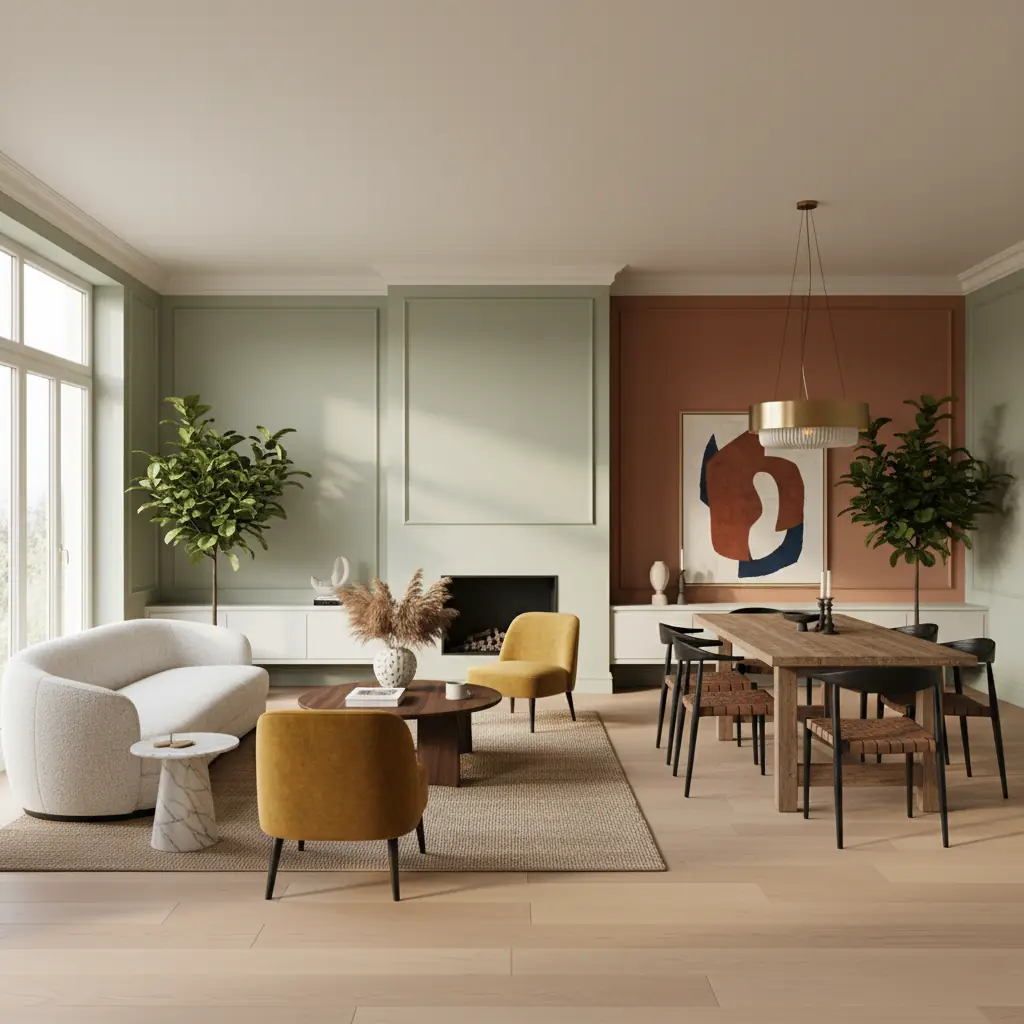
### Living Rooms: Versatility and Warmth
For living rooms, the emphasis is on creating a versatile, comfortable gathering space that can adapt to different moods and seasons. Warm neutrals are paramount here. Benjamin Moore Edgecomb Gray (HC-173), a classic greige, provides a sophisticated backdrop that pairs beautifully with both warm and cool accents. For a bolder touch, consider a deep green like Sherwin-Williams Pewter Green (SW 6208) on an accent wall or built-ins, which grounds the space and adds depth without overwhelming it. Layering textures and art against these warm, earthy tones creates an inviting atmosphere perfect for relaxation or entertaining.
### Home Offices & Studies: Focus and Calm
As remote work remains prevalent, the home office has evolved into a space that needs to inspire focus while maintaining a sense of calm. Instead of stark whites, 2026 sees richer, more contemplative colors. A muted blue like Benjamin Moore Atmospheric (1676) can be wonderfully productive, known for its calming effect that aids concentration. For a more sophisticated and enveloping feel, a warm, deep olive green such as Farrow & Ball Treron (No.292) can transform a study into a distinguished retreat. These colors avoid visual noise, allowing your mind to focus on tasks while providing a comforting environment.
Which paint brand is best for my 2026 project?
Choosing the right paint brand is about balancing budget, desired finish, and specific color needs. Each of the top brands brings something unique to the table.
**Benjamin Moore** offers the widest range of curated colors and arguably the best color accuracy — what you see on the swatch is very close to what dries on your wall. Their Aura line provides excellent coverage in two coats and holds up exceptionally well to cleaning, making it ideal for high-traffic areas. They also offer diverse finishes, from flat to high-gloss, allowing for nuanced design. The downside is price: expect thirty-five to forty-five dollars per gallon for Aura.
**Sherwin-Williams** has the largest retail presence and offers frequent sales that often bring their premium Duration line down to a competitive price point. Their color-matching technology is excellent, and their design-forward annual palettes have made them a favorite of interior designers. The Emerald line is their top tier, comparable to Benjamin Moore Aura in quality and durability, offering superior washability and a smooth finish. For homeowners looking for quality and accessibility, Sherwin-Williams is a strong contender.
**Farrow & Ball** occupies the luxury tier, typically ranging from sixty-five to seventy-five dollars per gallon, but their colors are genuinely unique. Farrow & Ball paints have more pigment and less filler than most competitors, which means their colors have a depth, chalky finish, and complexity that is hard to replicate with a color match at another brand. If you are painting a feature wall or a high-impact room where the color _is_ the design, or if you're seeking a historical or particularly nuanced shade, Farrow & Ball is worth the premium for its distinct aesthetic and light-absorbing qualities.
How do I properly test paint colors for my home?
The biggest mistake homeowners make is choosing a paint color from a tiny swatch under fluorescent store lighting. This often leads to disappointment once the paint is on the wall. Instead, order large peel-and-stick samples (most brands now offer them) or paint poster-board swatches at least twelve by twelve inches. Place the swatch on the wall you plan to paint and observe it at three different times: morning sunlight, afternoon shade, and evening under artificial light. A color that looks perfect at noon might look muddy at 8 PM under warm LED bulbs, or too vibrant under cool fluorescents. Choosing the wrong paint color is a common mistake, with estimates suggesting **1 in 4 homeowners have regretted a paint choice, often leading to costly repainting efforts averaging $500-$1500 for a single room.**
Always test at least three colors in the same family. If you think you want a warm white, test three warm whites side by side. The subtle differences in undertones become obvious only in direct comparison. And critically, test against your fixed elements — your flooring, countertops, cabinetry, and any furniture you are keeping. A beautiful paint color becomes the wrong paint color if it clashes jarringly with your existing oak floors or granite counters. For example, a warm white might look yellow next to a stark white trim, or a cool gray could bring out unwanted orange tones in wood.
Digital tools have made the initial exploration faster and more fun. Habitas lets you apply different color palettes to photos of your actual rooms, so you can instantly see how a deep green kitchen or a navy bedroom would look before buying a single sample. With Habitas, visualizing a room in a new color scheme takes mere seconds, a stark contrast to the hours spent gathering samples or the days waiting for a traditional designer's mock-up. While not a replacement for physical testing — screens cannot perfectly replicate paint sheen and undertone — it narrows your choices from dozens to two or three serious contenders, saving significant time and money on unnecessary samples. You can even experiment with an [AI color palette generator](/blog/ai-color-palette-generator) to spark new ideas tailored to your existing decor.
Frequently Asked Questions
### What are the overall paint color trends for 2026?
The overarching paint color trends for 2026 strongly emphasize warmth, groundedness, and connection to nature. We're seeing a decisive shift away from cool grays and icy whites towards rich, inviting hues like warm whites with subtle yellow or peach undertones, deep nature-inspired greens, sophisticated navys, and earthy terracottas. The goal is to create spaces that feel comfortable, enveloping, and deeply human.
### Are cool grays still in style for 2026?
Cool grays are largely being phased out as default neutrals in 2026. While they can still work in specific, deliberate contexts—such as a modern bathroom or a sleek, minimalist office—they are no longer the go-to safe choice for general living spaces. The design world has moved towards warmer, more nuanced neutrals like greiges, warm whites, and earthy tones to create more inviting environments.
### How can I incorporate trending colors without repainting my whole house?
You don't need to repaint every room to stay on trend. Consider incorporating 2026's trending colors through accent walls in a bedroom or living room, painting kitchen island cabinetry, or transforming a small space like a powder room with a bold, saturated hue. Even accessories like throw pillows, artwork, or textiles in deep greens, terracottas, or warm greiges can update your space without a full commitment.
### What's the best way to choose a white paint color?
Choosing white paint requires careful attention to undertones. The best approach for 2026 is to lean into warm whites that have subtle yellow, pink, or peach undertones, rather than cool, stark whites. Always test several large swatches on your wall, observing them in different lighting conditions throughout the day. Compare them against your existing trim, flooring, and furniture to ensure harmony. Look for whites that feel alive and inviting, not sterile.
### Is expensive paint worth it?
Often, yes. While premium paints like Benjamin Moore Aura, Sherwin-Williams Emerald, or Farrow & Ball come at a higher price point, they typically offer superior coverage, durability, and a richer depth of color due to higher pigment content and less filler. This can mean fewer coats, better longevity, easier cleaning, and a more sophisticated finish that is hard to replicate with cheaper alternatives. For high-impact rooms or specific color effects, the investment can be well worth it.
### How long will these paint trends last?