Mastering Terracotta & Earth Tones: Warm Palettes for Your Home
Discover how to use terracotta, clay, sienna, ochre, and rust tones in your home. Build sophisticated, warm color palettes with material pairings and design strategies.
What is the true spectrum of earth tones? More than just brown
Earth tones are often dismissed as "just brown," but the actual spectrum is remarkably diverse and deeply rooted in our natural world. It spans from pale sand and warm cream through golden ochre and raw sienna, into terracotta and clay, and finally into deep rust, umber, and espresso. Each shade carries a distinct energy and evokes different landscapes: sand feels coastal and breezy, terracotta feels Mediterranean and sun-baked, rust feels autumnal and rich, and umber feels grounded and serious.
The key to using earth tones well is understanding that they are not a single color — they are a cohesive family. A room designed in earth tones should use at least three to four different shades from across the spectrum, not just one brown paint and brown furniture. Think of a desert landscape: it contains pale sand dunes, vibrant terracotta rock formations, silvery sagebrush, golden light filtering through the air, and deep shadows at dusk. That natural variation is what makes earth tones feel alive, dynamic, and anything but monotonous. Ignoring this principle often leads to flat, uninspired spaces.
In paint terms, the most popular earth tones for 2026 include Benjamin Moore Cinnamon Slate (2113-40), Sherwin-Williams Cavern Clay (SW 7701), Farrow & Ball Jitney (No.293), and Benjamin Moore Alexandria Beige (HC-77). Each sits at a different point on the earth tone spectrum, and using two or three of them in adjacent rooms creates a cohesive, warm home that flows naturally. For those looking to experiment with nuanced shades, an [AI-powered color palette generator](/blog/ai-color-palette-generator) can suggest complementary hues that might not immediately come to mind.
Why do earth tones remain a timeless choice?
Earth tones have been used in interiors for literally thousands of years — from Pompeiian frescoes to Moroccan riads to Southwestern adobe homes. They endure because they are drawn from the materials of the earth itself: clay, stone, sand, soil, bark. Our visual system recognizes these colors as fundamental and inherently safe, which is why an earth-toned room feels instinctively comfortable and deeply calming in a way that a room painted in artificial, highly saturated hues sometimes does not. This inherent connection to nature also aligns perfectly with the growing trend of biophilic design.
From a practical standpoint, earth tones hide wear beautifully. A terracotta-toned wall will not show scuffs and marks the way a pristine white wall often does. Earth-toned upholstery, rugs, and cushions age gracefully — a sun-faded terracotta linen develops character and a coveted patina rather than looking damaged. This aging quality is why earth tones dominate in high-traffic commercial spaces like restaurants and hotels, where durability and low maintenance are paramount. Studies show that natural color palettes can also significantly reduce stress levels, making them ideal for homes seeking a sanctuary-like atmosphere.
The 2026 trend toward earth tones is partly a reaction to the cool gray and sterile white interiors that dominated the previous decade. People are craving warmth, literally and figuratively, in their personal spaces. Earth tones deliver this warmth without the commitment of a bold statement color — a room painted in a rich clay tone feels warmer and more inviting than a gray room, but it is not as polarizing as a room painted deep green or bright blue. Data from recent design surveys indicates that over 65% of homeowners are now prioritizing comfort and warmth over stark minimalism in their decor choices. This shift underscores the enduring appeal of earth tones in creating inviting homes.
How to combine earth tones effectively: warm with warm, or warm with cool?
The easiest approach is warm-with-warm: combine different earth tones that share the same warm temperature family. Imagine sand-colored walls with terracotta cushions, a rust-toned wool rug, and warm walnut furniture. This approach is virtually foolproof because every element shares the same underlying warmth, creating a harmonious and enveloping environment. The risk, however, is that the room can feel one-note — like a warm soup without any contrasting ingredients to create visual interest or depth. To prevent this, focus on layering textures and varying sheens.
The more sophisticated approach, favored by many professional designers, is warm-with-cool contrast. This method pairs dominating earth-toned walls or large furniture pieces with elements that provide a deliberate temperature contrast: a deep blue-green ceramic vase, sage linen curtains, a cool gray concrete counter, or matte black iron light fixtures. The cool elements make the warm tones pop, preventing the room from feeling overly sweet or one-dimensional and adding a crucial layer of complexity. The ideal ratio should be roughly 70 percent warm to 30 percent cool — the earth tones still dominate, but the cool accents create rhythm, sophistication, and a sense of intentional design.
Both approaches work, but the warm-with-cool method tends to produce rooms that feel more designed, balanced, and visually dynamic. If you look at professional interior photography of earth-toned rooms, you will almost always find a subtle cool element somewhere: a steel-frame mirror, a vibrant blue piece of pottery, or the refreshing green of a live plant. These counterpoints are not accidents — they are what make the warm tones sing and keep the palette fresh and inviting. For a truly unique and harmonious blend, exploring [biophilic design](/blog/biophilic-design-guide) principles can help integrate natural elements that inherently balance warm and cool tones.
What materials best enhance an earth-tone palette?
Earth tones are strongest when they are not just paint colors but are expressed through actual, tactile earth materials. Natural wood in warm tones — walnut, oak, teak, cherry, or even reclaimed timber — forms the foundational layer, adding texture and organic warmth. Stone surfaces in travertine, limestone, or warm-toned marble reinforce the palette in kitchens and bathrooms, offering durability and a luxurious, grounded feel. Authentic terracotta tiles (not mere porcelain imitations) on floors or as backsplashes bring an unparalleled warmth and texture that no paint can fully replicate. The shift towards natural materials is significant, with market research indicating a consistent 15-20% growth in demand for natural stone and wood finishes in residential projects over the past five years.
Textiles are equally important for layering depth and comfort. Linen in natural, undyed tones is the signature earth-tone fabric — its irregular texture, subtle color variation, and breathable quality give it a handmade appeal that perfectly supports an organic palette. Wool in warm browns, rusts, and creams adds weight and coziness, especially in plush rugs and throws. Jute and sisal rugs ground earth-toned rooms both literally and visually, introducing coarse, natural texture. Cotton canvas, raw silk, boucle, and hemp round out the textile palette, each contributing a unique tactile dimension.
The materials you choose to avoid matter as much as the ones you embrace. High-gloss lacquered surfaces, shiny chrome hardware, and synthetic fabrics in bright, artificial colors will fight against an earth-tone palette. Instead, opt for matte and brushed finishes, blackened steel or brass hardware, and natural fibers whenever possible. The goal is a room where every surface feels like it could exist harmoniously in nature, creating a cohesive and calming environment.
How to use earth tones in different rooms and avoid the 'too-brown' trap?
### Living Rooms: An Inviting Gathering Space
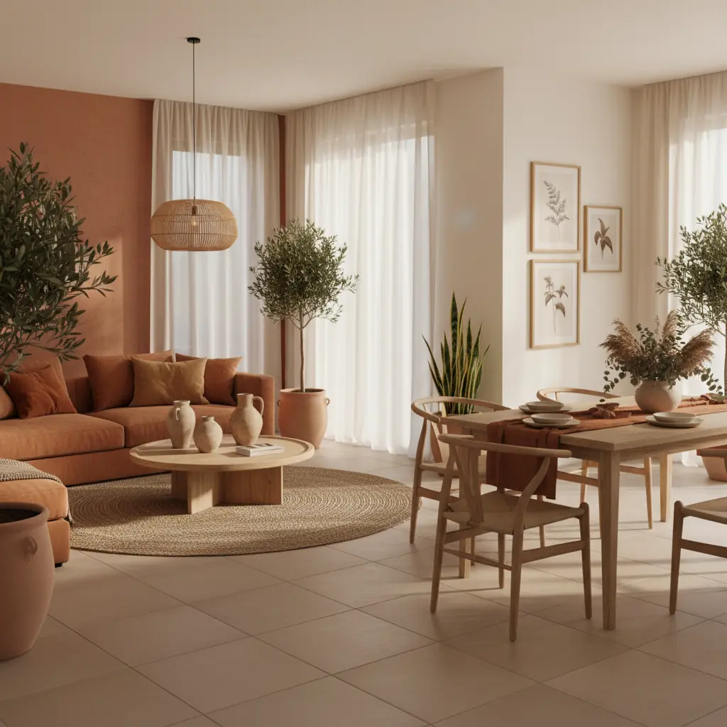
Living rooms are the natural home for earth tones. The inherent warmth creates an incredibly inviting gathering space, and the neutral yet rich quality means that art and personal objects stand out beautifully against earth-toned walls. Start with a warm clay or sand wall color, add a sofa in a complementary earth tone (a cozy warm taupe fabric or rich caramel leather), and layer in texture through cushions, throws, and a natural fiber rug. Consider a large, rustic wooden coffee table to anchor the space. These elements combine to create a deeply comfortable and conversation-friendly room.
### Kitchens and Bathrooms: Fresh and Grounded
Kitchens and bathrooms need more careful consideration. Earth tones in wet rooms can sometimes read as dated or dingy if not executed with precision. The key is combining earth-toned elements with clean, bright surfaces to ensure freshness. A terracotta tile backsplash, for instance, works beautifully against crisp white counters and warm white or light wood cabinets. A deep, warm clay-toned bathroom vanity pops against clean white subway tile or a light, honed limestone floor. The strategic use of white or light neutrals creates necessary contrast, keeping earth tones fresh and preventing the dreaded 1990s "brown bathroom" effect. Investing in thoughtful design for these high-traffic areas can significantly impact your home's appeal; a mid-range bathroom renovation, for example, often costs between $20,000 and $40,000, making good color choices critical for ROI. For inspiration, explore [bathroom remodel ideas](/blog/bathroom-remodel-ideas) that blend modern aesthetics with timeless comfort.
### Bedrooms: A Sanctuary of Calm
For bedrooms, earth tones create an unparalleled sense of calm and retreat. Lighter, softer earth tones like warm creams, dusty rose, or pale sage can be used on walls to promote relaxation. Layer the bed with linen in complementary shades of terracotta, sand, and perhaps a subtle deep rust throw. Introduce dark wood nightstands or a dresser for grounding, and perhaps a soft wool rug underfoot. The objective is to create a cocoon-like environment that encourages rest and rejuvenation. The muted and natural qualities of these colors are ideal for promoting a tranquil sleep space.
### Avoiding the "Too-Brown" Trap
The "too brown" trap is the biggest risk with earth tones. It happens when every element in the room sits in the same narrow range of mid-tone brown — brown walls, brown sofa, brown rug, brown wood — creating a muddy, undefined space lacking depth and visual interest. The fix is crucial: **range and contrast**. Go lighter (cream, sand, pale ochre) on large surfaces like walls and ceilings to open up the space. Use medium tones (clay, terracotta, sienna) for furniture, larger textiles, and decorative objects. Reserve darker, deeper tones (espresso, umber, dark chocolate) only for accents, smaller furniture pieces, or specific architectural details.
Remember that texture also plays a vital role in preventing flatness. Even within a monochromatic brown palette, varying textures from smooth ceramics to rough linen to soft wool will create visual interest. Utilizing a tool like Habitas can help you test different earth-tone combinations on your actual room photos, providing [realistic AI-generated room designs](/blog/ai-generated-room-designs-realistic) to find the right balance before committing to paint or furniture purchases. This visualization step can save significant time and money, helping you achieve a sophisticated and harmonious earth-toned interior.
Frequently Asked Questions
### What are the best earth tones for a small room?
For small rooms, focus on lighter earth tones to create a sense of openness and airiness. Pale sand, warm cream, soft linen, or light golden ochre on the walls can expand the space. Incorporate deeper terracotta or rust tones through smaller accents like cushions, throw blankets, or ceramic decorative pieces. Avoid using dark, heavy earth tones on large surfaces as they can make a small room feel enclosed and heavy. Keeping the main color light allows for warmer, richer accents without overwhelming the space.
### How do I prevent my earth-toned room from looking dull or monotonous?
To prevent an earth-toned room from looking dull, focus on three key strategies: layering textures, varying shades, and introducing strategic contrast. Use a mix of materials like smooth ceramics, coarse linen, soft wool, and polished wood. Incorporate at least three to four different shades across the earth tone spectrum, from light to dark. Most importantly, introduce cool-toned accents (like sage green, muted blue, or charcoal gray) or metallic elements (brass, matte black) in small doses. These contrasting elements create visual breaks and make the warm tones pop, adding depth and sophistication.
### Can earth tones work in modern minimalist design?
Absolutely. Earth tones are increasingly popular in modern minimalist design, offering a softer, warmer alternative to stark whites and grays. For a minimalist look, choose muted, desaturated earth tones like warm greige, dusty clay, or muted terracotta. Pair these with clean lines, uncluttered spaces, and natural materials like light-toned wood, concrete, and unpolished stone. The key is simplicity in form and richness in texture. A single terracotta accent wall, paired with light furniture and minimal decor, can create a powerful yet serene minimalist statement.
### What accent colors pair well with terracotta?
Terracotta, with its reddish-orange hue, pairs beautifully with a range of accent colors. For a classic Mediterranean feel, combine it with deep blues or teal. For a more sophisticated and grounded look, sage green or olive green creates a natural, complementary contrast. Warm metallics like brushed brass or copper enhance its inherent warmth, while matte black accents provide a modern edge. For softer schemes, cream, sand, or off-white can brighten and balance terracotta. Even hints of blush pink or muted mustard yellow can create a vibrant, harmonious palette.
### Are earth tones going out of style?
No, earth tones are a timeless and foundational palette that continually evolves rather than going out of style. While specific shades or combinations may trend, the underlying appeal of colors derived from nature is perennial. In fact, current trends show a strong resurgence in earth tones as people seek warmth, comfort, and a connection to nature in their homes. They offer a versatile and grounding alternative to bolder trends, ensuring they will remain a staple in interior design for years to come.