Esquemas de Colores para Salas: Una Guía de Diseñador Impulsada por IA
Cómo elegir la paleta de colores perfecta para tu sala, desde neutros cálidos hasta acentos atrevidos.
¿Por qué el Color es Tan Poderoso en el Diseño de Salas?
El color es, posiblemente, la herramienta de diseño más impactante, y a menudo la menos costosa, a tu disposición. Un solo galón de pintura tiene el poder de transformar completamente la sensación de una sala, estableciendo el ambiente, definiendo el estilo e incluso influyendo en la percepción del espacio. Los colores cálidos, como rojos, naranjas y amarillos, tienden a hacer que un espacio se sienta íntimo, acogedor y envolvente, estimulando la conversación y la comodidad. Los colores fríos, como azules, verdes y morados, evocan sentimientos de calma, amplitud y serenidad. Más allá de la temperatura general, el color de acento adecuado puede inyectar personalidad y estilo sin requerir la compra de un solo mueble nuevo, lo que lo convierte en un elemento increíblemente versátil en tu arsenal de diseño.
Sin embargo, este mismo poder a menudo hace que la selección de color sea la decisión de diseño más angustiante para los propietarios. El miedo a elegir el color "equivocado", lo que lleva a repintados costosos y que consumen mucho tiempo, puede paralizar incluso a los decoradores más seguros. De hecho, un trabajo típico de repintado de sala puede variar entre $300 y $1,000 al considerar la pintura, los suministros y la posible mano de obra, lo que convierte un error en una inversión significativa de tiempo y dinero. ¿La buena noticia? La solución a este dilema común radica en la visualización antes del compromiso. Las herramientas de IA modernas, como Habitas, te permiten probar sin esfuerzo innumerables colores y estilos de diseño completos en tus paredes reales, en tus condiciones de iluminación específicas, eliminando las conjeturas mucho antes de que abras una lata de pintura. Esto te empodera para tomar decisiones seguras, asegurando que tu sala refleje verdaderamente tu visión y estilo.
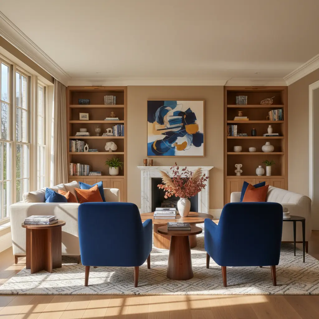
La Regla de Oro: Comprendiendo el Principio 60-30-10
Los diseñadores de interiores se basan en una fórmula simple, pero increíblemente efectiva, para crear espacios equilibrados y estéticamente agradables: la regla 60-30-10. Esta proporción asegura armonía y profundidad sin monotonía, guiándote sobre cómo distribuir los colores elegidos.
- **60% Color Dominante:** Este es tu tono principal, típicamente aplicado a superficies grandes como paredes y muebles principales (por ejemplo, un sofá grande, gabinetes empotrados). Establece el ambiente y el tono general de la habitación. - **30% Color Secundario:** Este color actúa como papel de apoyo para tu tono dominante. Se utiliza para muebles de acento, cortinas, alfombras o una pared destacada, proporcionando contraste e interés visual sin dominar el color principal. - **10% Color de Acento:** Este es tu "toque de color", usado con moderación para atraer la vista y añadir personalidad. Piensa en cojines decorativos, obras de arte, objetos decorativos o una pieza vibrante de mobiliario más pequeña.
Para una sala, la aplicación de esta regla podría traducirse en:
- **Un santuario acogedor:** 60% paredes blancas cálidas (dominante), 30% sofá y cortinas gris suave (secundario), y 10% amarillo mostaza o verde bosque en cojines y una manta decorativa (acento). - **Un refugio sereno:** 60% paredes verde salvia claro, 30% sofá de lino natural y mesa de centro de madera clara, 10% azul marino intenso en jarrones de cerámica y una pieza de arte abstracto. - **Un espacio moderno y dramático:** 60% paredes gris carbón, 30% sofá de cuero color camello y alfombra crema, 10% dorado metálico o borgoña intenso en pequeños objetos decorativos y un cuadro enmarcado.
Esta fórmula simple es elegante, prácticamente imposible de errar si se sigue con juicio, y proporciona un acabado profesional en todo momento.
Abrazando los Neutros Cálidos: La Base de la Sofisticación
El Greige (una mezcla armoniosa de gris y beige), los blancos cálidos y los tonos arcilla o tierra continúan dominando las salas modernas por razones convincentes. Estas tonalidades versátiles funcionan a la perfección con casi cualquier estilo de mobiliario, se adaptan maravillosamente a diversas condiciones de iluminación y poseen una cualidad atemporal que evita que se sientan anticuados. Son la apuesta segura que siempre luce cara y refinada.
La clave para dominar los neutros cálidos radica en seleccionar aquellos con los subtonos correctos. Un neutro no es solo "gris" o "blanco"; lleva sutiles toques de otros colores que influyen drásticamente en cómo aparece en un espacio.
- **Subtonos Cálidos:** Estos a menudo parecen amarillentos, melocotón o rojizos. Al probar, si una muestra de pintura se ve ligeramente amarilla, rosa o naranja junto a un blanco puro e intenso, es probable que tenga subtonos cálidos. Estas son excelentes opciones para espacios habitables, ya que crean una atmósfera acogedora y envolvente y evitan que una habitación se sienta fría o estéril. Ejemplos populares incluyen "Pale Oak" de Benjamin Moore o "Accessible Beige" de Sherwin-Williams. - **Subtonos Fríos:** Estos tienden a parecer azulados, verdosos o violáceos. Si tu muestra de pintura se ve fría junto al blanco puro, tiene subtonos fríos. Si bien son hermosos en ciertos contextos (como un baño tipo spa), a veces pueden parecer estériles o poco acogedores en una sala, particularmente si la habitación carece de suficiente luz natural o tiene muebles de tonos fríos.
Siempre prueba tus muestras de neutros cálidos elegidos contra un trozo de papel blanco puro o molduras en tu habitación real. Esta comparación es crucial para identificar esos esquivos subtonos y asegurar que el tono elegido cree la calidez deseada. Para más información sobre cómo lograr una paleta neutra sofisticada, explora nuestros consejos sobre [diseño de habitaciones totalmente blancas](/blog/all-white-room-design-tips).
Esquemas de Colores Fríos: Serenidad y Amplitud
Mientras que los neutros cálidos ofrecen comodidad, los esquemas de colores fríos aportan un conjunto de beneficios completamente diferente a una sala. Piensa en grises suaves, azules apagados y verdes delicados. Estos colores son reconocidos por su capacidad para crear una sensación de calma, tranquilidad y amplitud.
- **Azules:** Desde el azul cielo pálido hasta el azul marino intenso, los azules son inherentemente relajantes y asociados con la paz y la estabilidad. Los azules más claros pueden hacer que una habitación pequeña se sienta más grande y abierta, mientras que los azules más profundos ofrecen sofisticación y un ambiente contemplativo. - **Verdes:** Reflejando la naturaleza, los verdes son refrescantes y armoniosos. Los verdes salvia apagados, musgo u olivo pueden aportar una sensación orgánica y arraigada a una sala, promoviendo la relajación y el bienestar. - **Grises:** Como neutro más frío, el gris ofrece un telón de fondo moderno y sofisticado. Cuando se elige con sutiles subtonos azules o verdes, los grises fríos pueden crear una base elegante y contemporánea que combina maravillosamente con blancos nítidos y acentos más brillantes.
Las paletas frías son particularmente efectivas en habitaciones que reciben abundante luz solar cálida, ya que ayudan a equilibrar la intensidad y evitan que el espacio se sienta sobrecalentado. También son ideales para ideas de salas minimalistas, Scandinavian o [costeras](/blog/coastal-living-room-ideas) donde una estética aireada y despejada es primordial.
¿Cuándo Debes Elegir Colores Atrevidos para la Sala?
Colores atrevidos —verdes intensos, grises carbón, azules marinos ricos o incluso tonos joya vibrantes— inyectan drama, personalidad e intimidad en una sala. Son una declaración poderosa que puede transformar un espacio mundano en algo realmente memorable.
- **Intimidad Dramática:** Las tonalidades más oscuras absorben la luz, haciendo que una habitación grande y aireada se sienta más acogedora y encerrada. Esto crea una sensación de lujo envolvente, perfecta para las noches de relax o entretenimiento. - **Definiendo Personalidad:** Los colores atrevidos dicen mucho sobre tu estilo. Un verde bosque intenso podría evocar una sensación sofisticada e inspirada en la naturaleza, mientras que un azul cobalto vibrante grita energía moderna. - **Creando Contraste:** Las paredes atrevidas funcionan mejor cuando se combinan con muebles y decoración más claros para crear un contraste llamativo. Imagina una pared azul marino intenso detrás de un sofá crema con acentos de madera natural – los elementos más claros resaltan contra el fondo oscuro. - **Aplicación Estratégica:** No siempre necesitas comprometerte con una habitación entera. Una sola pared de acento pintada en un color atrevido puede lograr un drama significativo sin abrumar el espacio. Esto es particularmente efectivo en diseños de concepto abierto donde quieres definir zonas específicas.
Los colores atrevidos prosperan en ciertos estilos de diseño de interiores como el Bohemio, Industrial y [Moderno de Mediados de Siglo](/blog/best-interior-design-styles-2026), donde su intensidad complementa los materiales y las formas. Sin embargo, pueden tener dificultades en estilos como el Scandinavian o Costero, donde la ligereza y la amplitud son fundamentales para la estética. Antes de comprometerte con una habitación completa en un color atrevido, considera la luz natural de la habitación; las habitaciones con mucha luz pueden manejar colores más oscuros con mayor facilidad, evitando que se sientan como una cueva.
¿Cómo Afecta la Luz Natural tus Elecciones de Color?
La dirección y cantidad de luz natural que recibe tu sala es uno de los factores más críticos a considerar al elegir los colores de pintura. El color luce completamente diferente en una pequeña muestra de pintura que en una pared de 3 metros, y esta percepción cambia a lo largo del día a medida que la luz varía.
- **Habitaciones Orientadas al Norte:** Estas habitaciones reciben luz indirecta, más fría. Los colores lucen apagados y a menudo tienen un matiz azul o grisáceo. Para contrarrestar esto, opta por colores más cálidos (como amarillos, naranjas o neutros de tonos cálidos) para aportar calidez y vitalidad al espacio. Evita los grises o azules fríos, ya que pueden hacer que la habitación se sienta más fría y apagada. - **Habitaciones Orientadas al Sur:** Bañadas en luz brillante y cálida durante todo el día, estas habitaciones pueden manejar una gama más amplia de colores. Los tonos más fríos (azules, verdes, grises fríos) pueden ayudar a equilibrar la intensidad de la luz, evitando que la habitación se sienta demasiado "cálida" o sobresaturada. Los colores cálidos aparecerán aún más vibrantes aquí. - **Habitaciones Orientadas al Este:** Estas habitaciones reciben luz brillante y cálida por las mañanas, que luego cambia a una luz más fría e indirecta por las tardes. Los colores aparecerán más fieles por la mañana. Considera neutros suaves y cálidos para que se sientan acogedores por la mañana y mantengan una sensación agradable a medida que cambia la luz. - **Habitaciones Orientadas al Oeste:** Las habitaciones orientadas al oeste reciben luz cálida e intensa por las tardes y noches. Pueden sentirse muy brillantes e incluso ásperas en ciertos momentos. Al igual que las habitaciones orientadas al sur, los tonos más fríos pueden ayudar a atenuar esta intensidad. Si usas colores cálidos, ten en cuenta que aparecerán muy vibrantes durante las horas pico de luz de la tarde.
Comprender cómo la luz interactúa con el color es crucial. Lo que parece perfecto en una muestra bajo luz artificial podría ser completamente diferente cuando la luz solar inunda tu habitación. Esta interacción dinámica subraya la necesidad de una visualización exhaustiva.
Más Allá de la Pintura: Integrando el Color con Muebles y Decoración
El esquema de colores de una sala se extiende mucho más allá de la pintura en tus paredes. Para un espacio verdaderamente cohesivo y acogedor, el color debe integrarse cuidadosamente en todos los elementos, desde tus muebles más grandes hasta los más pequeños acentos decorativos.
- **Grandes Piezas de Mobiliario:** Tu sofá, sillas de acento y alfombra de área son anclas de color significativas. Si tus paredes son de un tono neutro, tus muebles pueden introducir tus colores secundarios e incluso primarios según la regla 60-30-10. Por el contrario, si tienes un color de pared atrevido, los muebles neutros pueden proporcionar equilibrio. Una alfombra de área grande es una excelente manera de fundamentar tu esquema de colores y definir el área de asientos. - **Textiles:** Cortinas, cojines decorativos y mantas son oportunidades para superponer colores, patrones y texturas. Te permiten introducir tus colores de acento o variaciones de tu color secundario. No temas mezclar patrones, pero asegúrate de que compartan un hilo conductor de color para mantener la armonía. - **Arte y Accesorios:** Las obras de arte son una forma fantástica de unificar toda tu paleta de colores, a menudo presentando los tres colores elegidos. Los objetos decorativos –jarrones, esculturas, libros e incluso plantas– contribuyen a la historia general del color. Recuerda que incluso elementos naturales como los tonos de madera y la vegetación contribuyen a la paleta de tu habitación. - **Acentos Metálicos:** Los metales dorados, plateados, bronce y negros pueden añadir brillo y sofisticación. Los metales cálidos (oro, latón) combinan maravillosamente con esquemas de colores cálidos, mientras que los metales fríos (plata, cromo) complementan las paletas más frías. Los metales negros ofrecen un toque moderno y pueden proporcionar un contraste nítido.
Al integrar estos elementos, piensa en el flujo y equilibrio general. ¿Hay suficiente contraste? ¿Algún color está abrumando el espacio? Este enfoque holístico asegura que tu sala se sienta profesionalmente diseñada y perfectamente coordinada.
La Ventaja de la Visualización con IA: Prueba Antes de Pintar
Los métodos tradicionales de selección de color –pequeñas muestras de pintura de 5 cm, latas de muestra costosas y pintar muestras directamente en las paredes– no solo consumen mucho tiempo y son desordenados, sino que a menudo no logran proporcionar una representación verdadera de cómo se verá un color. La iluminación, los elementos circundantes y la escala de una pared alteran drásticamente la percepción del color. Lo que parece un salvia suave en una muestra podría aparecer como un verde menta intenso una vez aplicado a una pared entera. Aquí es donde Habitas revoluciona el proceso.
En lugar de adivinar o cometer errores costosos, las herramientas de IA como Habitas te permiten subir una foto de tu sala real y visualizar instantáneamente cómo se verán diferentes esquemas de colores, incluso estilos de diseño completos. Nuestra plataforma te permite:
- **Experimentar con miles de colores:** Ve exactamente cómo aparecerán tonos específicos en tus paredes, no solo un pequeño cuadrado. - **Aplicar paletas de estilo completas:** Cada estilo de diseño dentro de Habitas (ej. Bohemio, Minimalista, Industrial) trae su propia paleta de colores optimizada, adaptada para complementar la estética. Puedes ver instantáneamente tu habitación transformada con colores que encajan naturalmente con tu estilo elegido. Esto te permite explorar no solo colores individuales, sino [diseños de habitaciones generados por IA](/blog/ai-generated-room-designs-realistic) completos. - **Considerar tus elementos existentes:** La IA tiene en cuenta tus muebles, pisos y luz natural existentes, proporcionando una vista previa mucho más precisa de lo que cualquier muestra física podría ofrecer. - **Ahorrar tiempo y dinero:** La visualización con IA toma segundos en comparación con horas o incluso días de comprar, aplicar y evaluar muestras físicas. Esto no solo acelera tu toma de decisiones, sino que también te ayuda a evitar el compromiso financiero de un error de repintado. Estudios indican que los hogares con colores de pintura bien elegidos y atractivos pueden aumentar el valor percibido de una casa hasta en un 5%, haciendo de las decisiones de color inteligentes una inversión valiosa.
Esta capacidad realmente te empodera para tomar decisiones de color seguras e informadas, asegurando que la transformación de tu sala sea exactamente lo que imaginaste. Aquí es donde Habitas realmente brilla, convirtiendo lo que antes era un proceso de decisión de varios días en cuestión de minutos. Para más información sobre cómo funciona nuestra tecnología, echa un vistazo a [diseño de interiores con IA: cómo funciona](/blog/ai-interior-design-how-it-works).
Preguntas Frecuentes
### ¿Cómo elijo un esquema de colores que haga que mi sala se vea más grande?
Para que una sala se sienta más grande, opta por colores más claros y fríos como azules suaves, verdes y grises claros para tus paredes. Estos colores retroceden visualmente, creando una ilusión de espacio expandido. Usa un esquema de color monocromático o análogo (colores adyacentes en la rueda de color) para crear un flujo continuo y minimiza el desorden. Incorpora superficies reflectantes como espejos para amplificar la luz y mejorar aún más la sensación de amplitud.
### ¿Cuáles son los mejores esquemas de colores para salas pequeñas?
Para salas pequeñas, los esquemas de colores claros y aireados son ideales. Blancos cálidos, grises pálidos o pasteles suaves son excelentes opciones para las paredes, ya que reflejan la luz y hacen que la habitación se sienta abierta. Puedes introducir profundidad con un solo color de acento más oscuro en cojines o arte, pero mantén la paleta general clara para evitar que el espacio se sienta estrecho. Considera usar una [técnica de inmersión de color](/blog/color-drenching-technique) con un tono muy claro para difuminar las líneas entre las paredes y los molduras, mejorando aún más la sensación expansiva.
### ¿Cómo afecta la luz natural mi elección de color de pintura?
La luz natural impacta significativamente cómo aparece un color de pintura. Las habitaciones orientadas al norte reciben luz fría e indirecta, haciendo que los colores luzcan más opacos; los colores cálidos pueden contrarrestar esto. Las habitaciones orientadas al sur reciben luz abundante y cálida, lo que permite que la mayoría de los colores prosperen, pero los tonos fríos pueden ayudar a equilibrar el brillo intenso. Las habitaciones orientadas al este tienen luz matutina brillante y luz vespertina más fría, mientras que las habitaciones orientadas al oeste reciben luz vespertina cálida e intensa. Siempre prueba los colores en tu habitación específica, observándolos a lo largo del día, o usa una herramienta de visualización de IA como Habitas para previsualizar en diversas condiciones de iluminación.
### ¿Puedo usar colores atrevidos en una sala pequeña?
Sí, definitivamente puedes usar colores atrevidos en una sala pequeña, pero con cuidadosa consideración. En lugar de pintar todas las paredes, considera una sola pared de acento en un tono profundo y rico para añadir drama sin abrumar. Combínala con colores más claros en las paredes restantes y los muebles para crear contraste. Alternativamente, usa colores atrevidos estratégicamente en dosis más pequeñas a través de una pieza de mobiliario destacada, obras de arte vibrantes o accesorios impactantes. Esto te permite disfrutar de la personalidad de los colores atrevidos mientras mantienes una sensación de espacio.
### ¿Cuál es la diferencia entre subtonos cálidos y fríos en la pintura?
Los subtonos son los colores sutiles que se transparentan a través de un color de pintura principal. Los subtonos cálidos (como el amarillo, naranja o rojo) hacen que un color se sienta acogedor y envolvente. Los subtonos fríos (como el azul, verde o morado) hacen que un color se sienta nítido, fresco y a veces más expansivo. Identificar los subtonos es crucial porque determinan cómo luce realmente un color de pintura en una habitación, especialmente al interactuar con la luz natural y el mobiliario existente. Siempre compara una muestra de pintura con un fondo blanco puro para ayudar a revelar su verdadero subtono.