Cómo Elegir Colores de Pintura sin Arrepentimientos: Un Método Infalible
Un enfoque sistemático e infalible para elegir colores de pintura, desde la lectura de subtonos hasta la correcta prueba de muestras y la coordinación de colores entre habitaciones.
Empieza por lo que no puedes cambiar: los elementos fijos de tu habitación
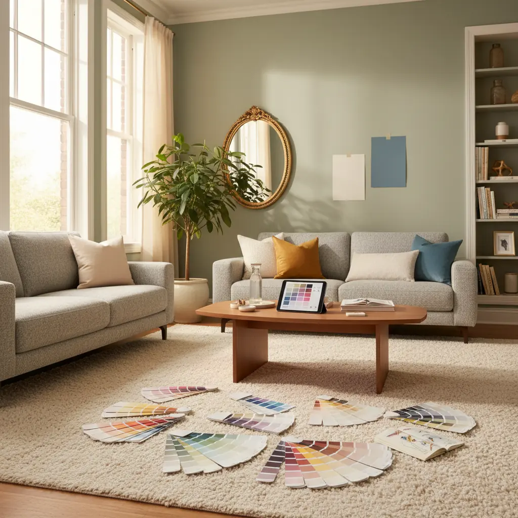
El error número uno al elegir colores de pintura es empezar por la pintura en sí. En cambio, inicia tu viaje de color evaluando meticulosamente los elementos fijos de tu habitación, esas bases inamovibles que no vas a reemplazar. Estas piezas fundamentales, como tus pisos, encimeras, gabinetes empotrados grandes, chimeneas y cualquier revestimiento cerámico o de piedra, establecen colectivamente una paleta base. El color de pintura que elijas debe armonizar con estos elementos, no chocar con ellos.
Considera las características dominantes de estos elementos fijos. ¿Tus pisos de roble cálido tienen tonos miel o rojizos? ¿Tu encimera de granito tiene vetas grises frías o remolinos beige cálidos? ¿Tu sofá es de un carbón de tono frío o de un lino cálido y terroso? Estos son tus colores ancla. Tu pintura debe coexistir cómodamente dentro de la misma familia de colores o proporcionar un contraste intencional y bien pensado que realce en lugar de restar. Forzar un gris azulado frío en paredes rodeadas de madera y piedra de tonos cálidos, por ejemplo, es un error común que hace que una habitación se sienta perpetuamente "desentonada" o desarticulada. Se estima que aproximadamente el 15% de los propietarios expresan arrepentimiento inmediato por la elección de un color de pintura, a menudo debido a esta falta de coincidencia con los elementos fijos.
Para capturar con precisión estos tonos existentes, toma varias fotos de tus elementos fijos en diferentes momentos del día para observar cómo la luz natural impacta su apariencia. Mejor aún, lleva muestras físicas reales a la tienda de pinturas o estudio. Una baldosa suelta, un frente de cajón, una muestra de tela de tu sofá, o incluso un pequeño trozo de piedra de desecho proporcionarán la representación más precisa. Confiar únicamente en fotos digitales puede ser engañoso, ya que las pantallas distorsionan el color, y lo que parecía un beige cálido en tu teléfono podría revelarse como un topo frío en la vida real.
Desentrañando los Subtonos: El Secreto de una Pintura Perfecta
Cada color de pintura, incluso los aparentemente neutros, posee un subtono, un color secundario sutil que se esconde bajo la superficie, a menudo revelándose solo cuando se coloca en contexto. Comprender los subtonos es quizás la habilidad más crítica en la selección exitosa de pintura. Un blanco podría tener subtonos rosados, amarillos, verdes o azules elusivos. Un gris aparentemente puro puede inclinarse distintivamente hacia el púrpura, azul o verde. Este fenómeno explica por qué una muestra de pintura que parecía perfecta bajo las luces artificiales de la tienda puede verse completamente equivocada una vez aplicada a tu pared, transformándose de un sofisticado greige a un verde inesperadamente turbio.
Para dominar la identificación de subtonos, siempre compara. Sostén la muestra de pintura contra una hoja de papel blanco puro y brillante. Este marcado contraste resalta inmediatamente el tinte subyacente. Un "blanco cálido" junto al blanco verdadero revelará claramente su matiz amarillo o rosa. Un "gris frío" mostrará su inclinación azul o verde. Tus ojos son expertos en adaptarse a colores aislados, lo que dificulta detectar estos matices sin un punto de referencia neutral. Por ejemplo, muchos colores "greige" populares obtienen su complejidad al equilibrar el gris con el beige, pero su subtono específico (verde-gris, púrpura-gris o amarillo-gris) dicta con qué otros colores armonizarán. Aprender a ver estos subtonos te empodera para tomar decisiones informadas y evitar repintados costosos; corregir una mala elección de color después de pintar toda una habitación puede añadir un inesperado 10-20% al presupuesto de tu proyecto.
La Regla 60-30-10: Creando Ambientes Equilibrados y Atractivos
Los diseñadores emplean universalmente la regla 60-30-10 para orquestar habitaciones que se sienten intrínsecamente equilibradas, armoniosas y visualmente atractivas sin caer en la monotonía. Esta guía proporciona un marco para distribuir el color, la textura y el patrón dentro de un espacio:
- **60 por ciento:** Este es tu color dominante, a menudo representado por las superficies más grandes de la habitación, típicamente las paredes, alfombras grandes y piezas tapizadas principales como un sofá o seccional. Este color ancla el espacio y establece el ambiente general. - **30 por ciento:** Este es tu color secundario, que proporciona contraste e interés sin abrumar el tono dominante. Lo encontrarás en elementos como cortinas, muebles de acento (por ejemplo, sillones, un puf), ropa de cama, una pared de acento o una pieza de arte significativa. - **10 por ciento:** Este es tu color de acento, usado con moderación para añadir toques de personalidad, energía y puntos focales. Piensa en cojines decorativos, objetos decorativos, accesorios más pequeños, lámparas, detalles de obras de arte o incluso arreglos florales.
Esta proporción es efectiva porque establece naturalmente una clara jerarquía visual. Tu ojo sabe intuitivamente dónde descansar (el 60 por ciento expansivo), qué explorar a continuación (el 30 por ciento complementario) y en qué detalles encantadores detenerse (el 10 por ciento vibrante). Las habitaciones que se sienten caóticas, inquietas o visualmente "recargadas" a menudo violan esta regla al dar el mismo peso visual a demasiados colores o elementos en competencia.
Para un ejemplo práctico, imagina una sala de estar: podría presentar paredes de un blanco suave y cálido y una alfombra grande (60 por ciento). Un sofá verde salvia y cortinas a juego con estampados podrían representar el color secundario (30 por ciento). Finalmente, cojines decorativos de terracota, una pieza de arte vibrante con toques de naranja y objetos decorativos de latón proporcionarían el acento (10 por ciento). La belleza de esta regla es su flexibilidad; la "matemática" no tiene que ser rígidamente exacta. Sirve como un principio rector para crear un ambiente cohesivo y estéticamente agradable a través de varios estilos de diseño, desde el moderno minimalista hasta el bohemio ecléctico. Este enfoque estructurado ayuda a garantizar un resultado más satisfactorio, reduciendo la probabilidad de que una habitación se sienta "inacabada" o desentonada.
Cómo Probar Muestras de Pintura Correctamente para una Verdadera Evaluación del Color
Elegir un color de pintura de una pequeña muestra es como elegir una comida de una foto microscópica: te estás perdiendo la experiencia sensorial completa. Para comprender verdaderamente cómo un color funcionará en tu espacio, debes invertir en pequeños botes de muestra. Pinta cuadrados de dos por dos pies (o más grandes) directamente en tu pared. Crucialmente, pinta estas muestras en al menos dos paredes diferentes dentro de la habitación, una que reciba luz solar directa y otra que no, o una frente a una ventana y otra frente a una pared interior. El mismo color puede aparecer dramáticamente diferente bajo diversas exposiciones de luz, cambiando de vibrante a tenue, y necesitas observar ambas manifestaciones antes de comprometerte.
Para un método de prueba aún más versátil, pinta tus muestras en grandes trozos de cartón blanco o cartulina pluma. Esto te permite mover las muestras por la habitación, observándolas en diferentes paredes, junto a elementos fijos e incluso a diferentes alturas. Pégalas con cinta, retrocede y convive con ellas.
El período de observación es igualmente vital. Observa tus muestras en un mínimo de cuatro momentos distintos:
1. **Mañana:** Con luz natural, típicamente más fría y brillante. 2. **Mediodía:** A menudo con sol pleno y directo, que puede desvanecer o intensificar los colores. 3. **Tarde:** Con luces artificiales encendidas, que pueden tener tonos cálidos (incandescentes/LED 2700K-3000K) o fríos (LED 4000K+), alterando drásticamente la percepción del color. 4. **Noche:** Solo con lámparas o iluminación ambiental, revelando cómo se siente el color en un ambiente más íntimo.
Un color que se ve fresco y luminoso al mediodía podría parecer opaco o plano bajo la luz cálida de una lámpara a las 9 PM. Convive con tus muestras durante al menos 48 horas, idealmente más tiempo. La emoción inicial de un nuevo color a menudo se desvanece, y necesitas asegurarte de sentirte bien con él en una sombría mañana de martes, no solo en una soleada tarde de sábado. Este diligente proceso de prueba reduce significativamente la posibilidad de arrepentimientos costosos por la pintura. Después de todo, pintar profesionalmente una habitación de tamaño promedio puede costar entre $300 y $1,000, lo que hace que un repintado sea un gasto inesperado significativo.
Coordinación de Colores entre Habitaciones Conectadas: Asegurando un Flujo Armonioso
En hogares con planos de planta abiertos o líneas de visión visibles entre habitaciones adyacentes, asegurar que los colores de pintura fluyan cohesivamente es primordial para crear una estética unificada. Esto no significa que cada habitación deba pintarse del mismo color exacto, sino más bien que los espacios adyacentes deben compartir un hilo visual común o una relación complementaria.
Uno de los enfoques más simples y efectivos es seleccionar colores de la misma paleta de colores del fabricante. Estos colores están diseñados específicamente para compartir el mismo pigmento base y subtonos subyacentes, garantizando que siempre coordinarán armoniosamente, a menudo simplemente difiriendo en saturación o luminosidad. Por ejemplo, podrías usar un blanco roto suave de una paleta en tu área de estar principal, un greige ligeramente más oscuro de la misma paleta en un comedor conectado, y un tono aún más profundo y temperamental de la misma paleta para una dramática pared de acento en un baño de visitas.
Otra estrategia poderosa implica mantener el mismo color neutro en las paredes de todos los espacios conectados, y luego diferenciar cada habitación a través de paredes de acento, colores de molduras variados (por ejemplo, un blanco nítido en una, un gris tenue en otra), o colores secundarios distintivos en muebles, textiles y obras de arte. Esto crea una unidad arquitectónica al tiempo que permite que cada habitación individual exprese su propia personalidad y función a través de sus elecciones de decoración. Para una creación de paleta más avanzada, podrías explorar herramientas como un [Generador de Paletas de Colores con IA de Habitas](/blog/ai-color-palette-generator) para experimentar con esquemas complementarios y análogos que mantengan el flujo.
Considera también el impacto emocional: un azul sereno en un dormitorio podría transicionar elegantemente a un crema cálido en un pasillo que lleva a un verde vibrante en un home office, siempre que sus subtonos se alineen o un amortiguador neutral los conecte. El objetivo es un viaje visual que se sienta natural e intencional, no abrupto o discordante.
¿Cuáles Son los Errores Más Comunes que Conducen al Arrepentimiento por la Pintura?
Evitar errores comunes puede ahorrarte una cantidad significativa de tiempo, dinero y frustración emocional. Aquí están los principales errores que conducen al arrepentimiento por la pintura:
1. **Elegir un Color de una Pequeña Muestra:** Este es, con mucho, el paso en falso más frecuente. Los colores se intensifican drásticamente en superficies grandes. Lo que parecía un salvia sutil y sofisticado en una muestra de pintura de dos pulgadas puede transformarse en un verde agresivo y abrumador en cuatro paredes. Siempre elige uno o dos tonos más claros de lo que inicialmente crees que quieres, especialmente con colores más saturados u oscuros, ya que parecerán más profundos una vez extendidos por toda una habitación.
2. **Ignorar la Iluminación Natural de tu Habitación:** La iluminación es, sin duda, el factor más influyente en cómo aparecerá un color de pintura. - **Habitaciones orientadas al norte** reciben luz fría, indirecta y azulada. Esto puede hacer que los colores cálidos parezcan apagados o turbios, y los colores fríos (como azules y verdes) se vean aún más gélidos. Para contrarrestar esto, introduce blancos más cálidos o colores con subtonos amarillos/rojos, o inclínate hacia la frialdad con azules intensos. - **Habitaciones orientadas al sur** están bañadas por una luz cálida y dorada durante todo el día. Esta luz realza naturalmente los tonos cálidos y puede hacer que los azules fríos parezcan casi grises o incluso ligeramente verdes. Aquí, los tonos fríos pueden ayudar a equilibrar la calidez, mientras que los tonos cálidos se sentirán aún más acogedores. - **Habitaciones orientadas al este** disfrutan de luz brillante, cálida y de tono amarillo por la mañana, que cambia a una luz más fría y azulada por la tarde y noche. Los colores aquí tendrán una calidad dinámica, cambiando a lo largo del día. - **Habitaciones orientadas al oeste** experimentan luz fría y tenue por la mañana, seguida de una luz intensa, cálida y dorada al final de la tarde y por la noche. Este cambio dramático significa que un color que se ve bien a las 9 AM podría ser abrumador a las 5 PM.
Identifica siempre la orientación de tu habitación y considera cómo reaccionarán los diferentes colores a su perfil de luz único.
3. **Seguir Ciegamente las Tendencias:** Si bien las tendencias de diseño pueden ser inspiradoras, adoptarlas sin considerar la arquitectura de tu hogar, tu estilo personal y los elementos fijos existentes es un camino rápido hacia el arrepentimiento. Esa audaz pared de acento esmeralda luce impresionante en una sesión de fotos profesional con iluminación perfecta y muebles curados. En tu habitación, con diferentes proporciones, luz diferente y mobiliario distinto, podría sentirse completamente equivocada o rápidamente anticuada. Las tendencias son un punto de partida para la inspiración, no una prescripción rígida. Tu hogar debe reflejarte _a ti_, no solo la última moda de Pinterest.
4. **Olvidar las Molduras, el Techo y las Puertas:** La pintura no es solo para las paredes. El color que elijas para tus molduras, techo y puertas impacta profundamente la sensación general de la habitación. Una moldura blanca nítida puede hacer que los colores de las paredes resalten, mientras que una moldura a juego o más oscura puede crear un aspecto uniforme y sofisticado. El techo, a menudo olvidado, es la "quinta pared" y puede influir en la altura percibida de la habitación o en cómo se refleja la luz. No dejes que estos elementos sean una ocurrencia tardía.
5. **No Aprovechar las Herramientas de Visualización:** En el panorama del diseño actual, no tienes que adivinar. Herramientas como Habitas te permiten "pintar" virtualmente tus paredes y visualizar cómo se vería un color en tu habitación específica usando una representación impulsada por IA de tu foto real antes de comprar siquiera un bote de muestra. Esto reduce significativamente las conjeturas y puede ayudarte a evitar comprar cinco galones de pintura que podrías odiar. Incluso puedes explorar varios [diseños de habitaciones generados por IA para visualizar resultados realistas](/blog/ai-generated-room-designs-realistic) con diferentes paletas y estilos. Invertir unos minutos con una plataforma así puede ahorrarte cientos, incluso miles, de dólares en costos de repintado y tiempo perdido.
Preguntas Frecuentes
### ¿Cómo identifico los subtonos en los elementos existentes de mi hogar?
Para identificar los subtonos en elementos fijos como pisos, encimeras o muebles, acerca un trozo de papel o tela de color blanco puro junto a ellos. Observa de cerca bajo diferentes condiciones de iluminación (luz natural, luz artificial). Empezarás a ver sutiles toques de amarillo, rojo, naranja (subtonos cálidos), o azul, verde, púrpura (subtonos fríos) asomándose a través del color dominante. Por ejemplo, una alfombra beige podría inclinarse ligeramente hacia el rosado o amarillento. Comparar con un blanco neutro ayuda a tu ojo a detectar estos sutiles cambios.
### ¿Mis paredes deben ser más claras o más oscuras que las molduras?
Esto es una cuestión de preferencia personal y estética deseada. Pintar las paredes más claras que las molduras (típicamente blanco o blanco roto) crea contraste, haciendo que las molduras "resalten" y definan los detalles arquitectónicos. Este es un aspecto clásico y popular. Pintar las paredes más oscuras que las molduras puede crear una sensación más dramática, sofisticada o acogedora, con las molduras más claras enmarcando el color más profundo de la pared. Para un aspecto muy moderno o minimalista, algunos eligen pintar paredes y molduras del mismo color exacto (inmersión de color) para un efecto uniforme y envolvente.
### ¿Cuántas muestras de pintura debo comprar para una habitación?
Para una sola habitación, es aconsejable seleccionar entre 3 y 5 colores de pintura potenciales que realmente te gusten y creas que podrían funcionar. Esto permite una comparación suficiente sin abrumarte. Recuerda comprar botes de muestra de cada uno, no solo depender de pequeñas muestras, y pruébalos correctamente en múltiples paredes y bajo diferentes condiciones de iluminación.
### ¿Cuál es la mejor manera de elegir colores de pintura para una habitación pequeña?
Para habitaciones pequeñas, los colores más claros tienden a hacer que el espacio se sienta más grande y abierto al reflejar la luz. Sin embargo, no dudes en usar colores más profundos y temperamentales si buscas un efecto acogedor tipo "caja de joyas". Considera usar colores con subtonos fríos (azules, verdes) que tienden a retroceder, o usar un esquema monocromático para crear una sensación de unidad expansiva. Los techos de colores claros también pueden ayudar a elevar la altura percibida. Usar herramientas como Habitas para visualizar estos colores puede ser particularmente útil para espacios más pequeños donde cada tono importa.