Cómo Mezclar Patrones en el Diseño de Interiores sin Que Choquen
Aprende las reglas profesionales para mezclar patrones en tu hogar: la regla de los 3 patrones, hilos de color compartidos, combinaciones seguras para empezar y ejemplos habitación por habitación.
La Regla Fundamental de los 3 Patrones: Dominando la Escala para la Armonía Visual
El secreto más crucial para mezclar patrones sin crear una cacofonía visual es la "regla de las tres escalas". Este principio dicta que selecciones patrones con pesos visuales distintos: un patrón de gran escala, uno de escala media y uno de pequeña escala. Esta variación en el tamaño es lo que evita que los patrones compitan directamente; en cambio, se superponen con gracia, permitiendo que tu ojo procese cada uno como un elemento distinto que contribuye a un todo unificado.
Imagina una habitación donde todos los patrones tienen el mismo tamaño: tu ojo se movería frenéticamente, incapaz de encontrar un punto de descanso o discernir un punto focal. Al variar la escala, creas una jerarquía visual. El patrón de gran escala a menudo actúa como ancla, el de escala media introduce un interés secundario, y el de pequeña escala proporciona detalles intrincados o textura, uniendo todo.
Desglosemos cómo funciona esto:
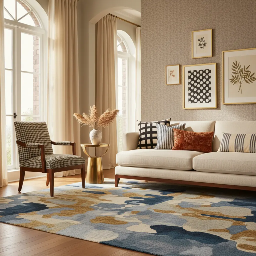
- **Patrón de Gran Escala:** Esta es la pieza destacada de tu habitación, que a menudo abarca una zona significativa. Piensa en estampados florales atrevidos en las cortinas, un dramático estampado ikat en una alfombra de área grande, o un llamativo papel tapiz geométrico. Su función principal es definir el ambiente e inyectar una poderosa dosis de carácter. - **Patrón de Escala Media:** Este patrón sirve de puente entre el grande y el pequeño, ofreciendo un interés visual de transición. Podría aparecer en cojines decorativos, un sillón auxiliar o una funda de edredón. Una raya clásica, una celosía sutil o un cuadro sencillo funcionan de maravilla aquí, complementando el patrón dominante sin abrumarlo. - **Patrón de Pequeña Escala:** Estos son los detalles delicados, a menudo percibidos como textura desde la distancia. Considera unos lunares pequeños, un tejido sutil en espiga, un delicado paisley, o incluso una tela lisa con una superficie rica y táctil como el bouclé o el lino. Estos patrones añaden riqueza y profundidad, a menudo desempeñando un papel de apoyo a los elementos más grandes.
**Ejemplo de Aplicación:** Imagina una sala de estar. Tu patrón de gran escala podría ser un estampado botánico vibrante y de gran tamaño en cortinas de suelo a techo. Luego, introduce un patrón de escala media con diseños geométricos abstractos en un par de cojines decorativos en el sofá. Finalmente, una alfombra de raya diplomática de tejido apretado unifica el espacio, añadiendo una textura sutil sin competir. La variación en la escala asegura que cada patrón tenga su momento, contribuyendo a una habitación en capas, interesante, que se siente cuidadosamente curada en lugar de caótica. La clave es que cada patrón opera en una frecuencia visual diferente, por lo que coexisten en lugar de chocar.
Si tres patrones te resultan intimidantes, especialmente para principiantes, empieza con dos. Combina un patrón prominente con una tela sólida texturizada, o dos patrones muy diferentes en escala y tipo. Los lisos texturizados como el lino, el bouclé, la pana o incluso un tejido sutil en espiga cuentan como patrones en términos de interés visual, pero son mucho más indulgentes que los patrones estampados, introduciéndote suavemente en el arte de la superposición.
El Poder Unificador de un Hilo de Color Compartido
Mientras que la escala proporciona estructura, un hilo de color compartido es el pegamento invisible que une patrones dispares en una narrativa cohesiva. Esto es no negociable para una mezcla exitosa de patrones. Cada patrón en una habitación debe compartir al menos un color común. Este tono compartido no tiene que ser el color dominante en cada patrón; solo necesita estar presente, incluso de forma sutil, para crear una conexión armoniosa.
Esta técnica es a menudo lo que separa un espacio diseñado profesionalmente de un intento bienintencionado pero improvisado. El ojo humano busca naturalmente la continuidad. Cuando los patrones comparten un color, sienten que pertenecen juntos, incluso si sus motivos y escalas son muy diferentes.
**Enfoques Prácticos para Encontrar Tu Hilo de Color:**
1. **Empieza con Tu Patrón Principal:** Elige tu patrón más importante primero; este suele ser el más grande o el más impactante, como una alfombra de área grande, un papel tapiz llamativo o la tela principal de tus cortinas. Este patrón "principal" a menudo contendrá varios colores. 2. **Extrae un Color Secundario:** De tu patrón principal, extrae un color secundario o de acento. Este color se convertirá en el color dominante en tu siguiente elección de patrón. Por ejemplo, si tu cortina floral tiene toques de azul marino, verde salvia y crema sobre un fondo blanco, podrías elegir el azul marino como tu hilo conductor. 3. **Construye Tu Paleta:** Ahora, introduce cojines decorativos azul marino lisos y quizás un sillón auxiliar a rayas azul marino y blanco. El azul marino conecta consistentemente todo mientras cada pieza conserva su identidad única. Esto crea profundidad sin depender de un esquema monocromático. 4. **Considera los Neutros:** A menudo, el hilo de color compartido puede ser un tono neutro presente en todos los patrones: un blanco cremoso, un gris suave o un beige cálido. Estos neutros proporcionan un fondo tranquilo que permite que los colores y patrones más audaces brillen sin abrumar el espacio.
Un error común es intentar igualar el mismo tono exacto en todos los patrones. En cambio, enfócate en el _tono_ o la _familia_ del color. Un azul empolvado en un patrón puede complementar hermosamente un azul celeste más brillante en otro, siempre que el tono azul subyacente esté presente. Usar un [generador de paletas de colores con IA de Habitas](/blog/ai-color-palette-generator) puede ser increíblemente útil aquí, permitiéndote extraer y experimentar con esquemas de color directamente de tus patrones elegidos.
Decodificando Tipos de Patrones: Combinaciones Seguras y Emparejamientos Estilísticos
Los patrones se dividen en diversas categorías, y comprender estas clasificaciones ayuda a crear contrastes y conexiones agradables.
Aquí están las categorías generales y cómo abordar su combinación:
1. **Patrones Geométricos:** Incluyen rayas (clásicas, diplomáticas, de toldo), cheurones, cuadros, celosías, cuadrículas, rombos y lunares. Son estructurados, ordenados y a menudo aportan una sensación de modernidad o elegancia tradicional, dependiendo de su color y escala. 2. **Patrones Orgánicos/Botánicos:** Florales, botánicos, hojas, enredaderas, estampados animales (cebra, leopardo, ocelote) y cualquier cosa inspirada en la naturaleza. Estos patrones tienden a ser más fluidos, expresivos y pueden introducir suavidad, un toque de fantasía o un aire exótico. 3. **Patrones Abstractos:** Acuarelas, pinceladas, diseños de forma libre, salpicaduras, tie-dye y motivos no representativos. Los abstractos son excelentes para añadir un toque artístico, un borde moderno y, a menudo, una sensación de movimiento o emoción sin imágenes específicas. 4. **Patrones Texturales:** Aunque no siempre son estampados, los tejidos, los puntos (punto de cable), las superficies en relieve (damasco, brocado), los linos slub, el bouclé e incluso los estampados sutiles tono sobre tono crean un patrón visual a través de la calidad de su superficie. Estos son los héroes anónimos de la mezcla de patrones, añadiendo una profundidad inmensa sin estridencia visual. 5. **Patrones Étnicos/Globales:** Ikats, paisleys, suzanis, estampados de bloque, kilim, motivos tribales. Estos patrones a menudo tienen ricas historias y diseños intrincados, aportando una sensación global, bohemia o artesanal a un espacio. 6. **Patrones Novedosos:** Estampados caprichosos que representan objetos, animales o temas específicos (por ejemplo, razas de perros, tazas de té, paisajes urbanos). Estos son excelentes para inyectar personalidad y un toque juguetón, a menudo en dosis más pequeñas.
**Combinaciones Más Seguras:**
Las combinaciones más seguras y efectivas emparejan patrones de diferentes categorías. Esto crea un contraste agradable entre lo estructurado y lo fluido, lo tradicional y lo moderno, o lo atrevido y lo sutil.
- **Raya + Floral:** Una combinación clásica de diseñadores que casi nunca falla. La linealidad de la raya proporciona un telón de fondo estable o un contrapunto al flujo orgánico del floral. - **Geométrico + Orgánico:** Crea una tensión y un equilibrio agradables: la precisión de un estampado geométrico (por ejemplo, un cuadro) puede asentar la exuberancia de un estampado botánico. - **Cuadro + Toile:** Un emparejamiento tradicional y elegante. La naturaleza rústica y ordenada del cuadro complementa las intrincadas escenas narrativas del toile. - **Estampado Animal + Casi Cualquier Cosa:** Los estampados animales a menudo se consideran un neutro en pequeñas dosis. Un cojín de estampado de leopardo puede añadir un toque sofisticado a florales, geométricos o incluso arte abstracto. - **Abstracto + Textura Sólida:** Un patrón abstracto (especialmente si es colorido) funciona maravillosamente junto a un sólido texturizado, permitiendo que la pieza abstracta sea la protagonista mientras la textura proporciona profundidad.
**Combinaciones a Abordar con Precaución:**
Evita combinar dos patrones de la misma categoría a la misma escala, especialmente si su intensidad es similar. Dos florales de escala media con paletas de colores similares o dos geométricos de tamaño similar competirán por la atención, dando como resultado un aspecto recargado y confuso. Si debes combinar patrones de la misma categoría, asegúrate de que sus escalas sean enormemente diferentes (por ejemplo, un floral grande con un pequeño estampado floral delicado) y que sus colores estén armonizados.
Comprender los [diferentes estilos de diseño de interiores](/blog/best-interior-design-styles-2026) también puede guiar tus elecciones de patrones, ya que ciertos estilos tienen preferencias de patrones inherentes. Por ejemplo, una habitación bohemia se nutre de la mezcla de varios estampados étnicos, mientras que un espacio minimalista podría centrarse en texturas sutiles y un único acento geométrico.
Introducción Estratégica: Empezando con Piezas de Bajo Compromiso y la Regla 60-30-10
Si la mezcla de patrones te resulta intimidante, empieza con los elementos más fáciles de cambiar y menos costosos. Esto te permite experimentar, ganar confianza y descubrir lo que realmente resuena con tu estilo sin un desembolso financiero significativo o cambios permanentes.
**Puntos de Partida de Bajo Compromiso:**
1. **Cojines Decorativos:** Estos son el compromiso más bajo. Puedes comprarlos, probarlos y reemplazarlos por tan solo $20-$50 cada uno. Una sala de estar típica podría necesitar de 3 a 5 cojines para introducir una nueva combinación de patrones. Este es el campo de juego perfecto para probar nuevas escalas e hilos de color. 2. **Mantas y Plaids:** Colocada sobre un sofá o sillón, una manta con patrón puede introducir un patrón de escala media a grande y puede moverse o intercambiarse fácilmente. 3. **Ropa de Mesa:** Un mantel, individuales o un camino de mesa con patrón pueden cambiar drásticamente la sensación de un comedor o mesa de centro, ofreciendo un espacio contenido para experimentar. 4. **Pequeños Accesorios:** Bandejas decorativas, jarrones con motivos estampados o incluso un trozo de tela estampada enmarcado pueden introducir sutilmente un nuevo estampado.
Una vez que te sientas cómodo con la mezcla de patrones a pequeña escala, pasa a piezas más grandes y de compromiso moderado:
- **Cortinas o Persianas:** Los tratamientos de ventana hacen una declaración de patrón significativa. Definen un plano vertical y pueden introducir un patrón audaz y de gran escala. Aunque requieren más esfuerzo que los cojines, aún pueden intercambiarse con un esfuerzo y costo moderados. - **Alfombras de Área:** Una alfombra es una inversión fundamental que define toda la habitación. A menudo es el patrón "principal" y puede anclar tu esquema de color. Elegir una alfombra estampada es un compromiso, pero típicamente es menos permanente que el papel tapiz. - **Sillones Auxiliares u Otomanas:** Un sillón auxiliar tapizado puede introducir un patrón de escala media de manera hermosa. Si te encanta un patrón, una pieza de acento es una excelente manera de mostrarlo sin comprometerse con un sofá completo.
**Opciones de Patrones de Alto Compromiso:**
- **Papel Tapiz:** Esta es una elección de alto compromiso, que cubre una pared o una habitación entera. Un papel tapiz estampado bien elegido puede ser impresionante, pero considera usar herramientas como Habitas para visualizar cómo se verá un estampado audaz en tus paredes _antes_ de comprometerte. La visualización con IA puede tomar segundos, ahorrándote las 2-4 semanas que un diseñador tradicional podría tardar en una representación similar, y evitando errores costosos. - **Muebles Tapizados (Sofá/Asientos Principales):** Tapizar una pieza grande como un sofá con un patrón audaz es una inversión significativa (retapizar un sofá a medida podría costar más de $1,500 - $5,000, dependiendo de la tela y el tamaño). Guarda estas opciones para patrones con los que hayas convivido en piezas más pequeñas y de los que estés absolutamente seguro.
**La Regla del Ratio 60-30-10:**
Para mantener las cosas ancladas y evitar el abrumamiento de patrones, los diseñadores a menudo se adhieren a una versión modificada de la regla 60-30-10:
- **60 por ciento colores lisos:** Esto forma la base tranquila de tu habitación (paredes, muebles grandes como sofás, grandes áreas de piso). - **30 por ciento patrón o textura sutil:** Esto podría ser un estampado de escala media en un sillón auxiliar, una alfombra texturizada o cortinas con patrones sutiles. - **10 por ciento patrón audaz:** Este es tu factor "wow": un cojín decorativo vibrante, una llamativa pieza de arte, una sección de papel tapiz pequeña pero impactante.
Este ratio asegura que los patrones añadan interés y energía sin abrumar el espacio. Una habitación que está completamente estampada se siente agotadora; una habitación con patrones estratégicamente colocados se siente dinámica y diseñada por expertos.
Juego de Patrones Avanzado: Elevando tu Diseño con Matices
Más allá de las reglas fundamentales, algunas consideraciones avanzadas pueden elevar tu mezcla de patrones de buena a excepcional:
- **Considera la Función de la Habitación:** Las habitaciones de alto tránsito y estancias cortas (como un tocador o comedor) pueden manejar patrones más audaces y enérgicos. Los dormitorios o salas de estar, donde pasas períodos prolongados de relajación, a menudo se benefician de una mezcla más tenue. - **Equilibra el Contraste:** La mezcla de patrones se nutre del contraste, pero necesita ser equilibrada. El contraste en escala, color y tipo de patrón es esencial. Demasiada similitud conduce a la planitud; demasiada disimilitud conduce al caos. Busca un tira y afloja armonioso. - **Introduce Metálicos y Superficies Reflectantes:** Aunque no son patrones en sí mismos, los acentos metálicos (oro, plata, latón) y las superficies reflectantes (espejos, vidrio) pueden actuar como "pausas" neutrales entre patrones, añadiendo glamour y permitiendo al ojo un momento de descanso. También recogen y reflejan maravillosamente los colores y la luz de los patrones que los rodean. - **Abraza la Imperfección:** A veces, las habitaciones más interesantes tienen un emparejamiento de patrones ligeramente inesperado o "desacertado" que funciona debido a su personalidad única. No tengas miedo de romper una regla una vez que la entiendas, especialmente si aporta alegría a tu espacio.
Mezcla de Patrones Habitación por Habitación: Ejemplos Inspiradores para Cada Espacio
Apliquemos estos principios a áreas específicas de tu hogar:
### Sala de Estar: El Arte del Confort en Capas
En una sala de estar, donde se dan las conversaciones y la relajación, concéntrate en una sensación de capas y confort. Prueba un estampado botánico de gran escala en las cortinas como tu patrón principal. Introduce un geométrico de escala media en dos cojines decorativos en tu sofá de color liso (quizás un tono extraído del patrón de las cortinas). Finalmente, unifica el espacio con un tejido texturizado de pequeña escala en la alfombra, que se lee como un patrón sutil. También podrías añadir un estampado abstracto de pequeña escala en una manta colocada sobre un sillón. Según un estudio reciente de la Asociación Nacional de Agentes Inmobiliarios, una sala de estar bien diseñada aumenta significativamente el valor percibido de la vivienda hasta en un 10-15%.
### Dormitorio: Santuario con Estilo
Los dormitorios se benefician de patrones que promueven la calma y la suavidad, pero con un toque de personalidad. Un cabecero con patrón llamativo o una pared de acento de papel tapiz sutil, tono sobre tono, detrás de la cama puede ser tu patrón de gran escala. Combina esto maravillosamente con ropa de cama a rayas o sutilmente estampada (como una funda nórdica en espiga o sábanas florales delicadas) como tu escala media. Cortinas de color liso que recojan un color de acento del cabecero o la ropa de cama completan el aspecto, mientras que una manta de felpa con patrón de pequeña escala al pie de la cama añade textura. Considera cómo los patrones contribuyen al desglose de costos de [rediseño de tu dormitorio](/blog/bedroom-redesign-cost-breakdown).
### Comedor: Elegancia Atractiva
Los comedores pueden manejar elecciones de patrones más audaces porque pasas menos tiempo continuo en ellos; a menudo son para reuniones más cortas y enérgicas. Un papel tapiz llamativo (gran escala), cojines de silla estampados (geométrico o botánico de escala media) y un camino de mesa sencillo y texturizado (pequeña escala) crean un interés visual significativo para cenas sin la fatiga que podría surgir de vivir con esas mismas elecciones audaces en una habitación que ocupas todo el día. Una fuente de servir o platos base bellamente estampados pueden añadir otra capa pequeña y temporal de patrón.
### Baño: Un Toque de Personalidad en un Espacio Pequeño
Los baños, al ser más pequeños, ofrecen un ambiente contenido para la experimentación audaz de patrones. Un azulejo dramático estampado (gran escala) en una pared destacada o una vibrante cortina de ducha estampada pueden ser tu declaración principal. Combínalo con toallas de color liso que recojan un acento del patrón y una alfombra de baño texturizada (pequeña escala) para mantener el espacio pequeño animado sin abrumarlo. Incluso una pequeña toalla de mano con estampado abstracto puede añadir un toque chic. Para más ideas, explora [ideas de remodelación de baños](/blog/bathroom-remodel-ideas).
### Home Office: Estilo Centrado
En un home office, los patrones pueden inspirar la creatividad manteniendo una sensación de calma. Un estampado artístico abstracto de gran escala o una alfombra geométrica pueden ser tu ancla. Introduce una raya diplomática de escala media o un cuadro sutil en una silla de oficina tapizada. Un organizador de escritorio con patrón de pequeña escala o una maceta texturizada añade un detalle reflexivo. Asegúrate de que los patrones aquí no sean demasiado distractores, centrándose en aquellos que evocan concentración y sofisticación.
Errores Comunes a Evitar al Mezclar Patrones
Incluso con las reglas en mano, algunos errores son comunes. Ser consciente de ellos puede ayudarte a mantenerte alejado:
1. **Ignorar la Escala:** El mayor culpable. Como se discutió, los patrones de la misma escala competirán, creando un ambiente plano e inquieto. 2. **Falta de un Hilo de Color Compartido:** Sin ese color unificador, incluso los patrones perfectamente escalados se sentirán desconectados y aleatorios. 3. **Demasiados Patrones Dominantes:** No todos los patrones pueden ser los protagonistas. Necesitas estrellas y actores de reparto. Si cada patrón grita por atención, la habitación se vuelve abrumadora. 4. **Mezclar Demasiados Estilos de Diseño:** Si bien la mezcla ecléctica puede funcionar, intentar forzar estilos muy dispares (por ejemplo, toile francés tradicional con geometrías industriales marcadas) sin un elemento unificador puede resultar discordante. 5. **Olvidar la Textura:** La textura es una forma vital y sutil de patrón. Descuidarla significa perder una capa crucial de profundidad e interés, especialmente en habitaciones donde no se desean estampados audaces. 6. **Sobrecargar de Patrones Espacios Pequeños:** Aunque las habitaciones pequeñas pueden manejar patrones audaces, asegúrate de mantener suficiente espacio sólido o base neutra para evitar que la habitación se sienta claustrofóbica.
Desata tu Creatividad con Habitas
El camino para dominar la mezcla de patrones es uno de experimentación y descubrimiento. Con los principios de escala, color y tipo en mente, estás bien equipado para transformar tu hogar. Pero, ¿qué pasaría si pudieras ver tus elecciones de patrones cobrar vida antes de hacer cualquier compromiso?
Aquí es donde las plataformas de diseño de interiores impulsadas por IA como Habitas realmente brillan. En lugar de adivinar o depender únicamente de pequeños muestrarios de tela, puedes subir una foto de tu habitación real y usar Habitas para visualizar diferentes papeles tapiz, alfombras, cortinas y muebles tapizados con patrones. Puedes intercambiar instantáneamente un floral de gran escala por un geométrico audaz, probar varios hilos de color y ver cómo se desarrolla la regla de los 3 patrones en _tu_ espacio único.
Habitas reduce significativamente la ansiedad del diseño y el riesgo de errores costosos. Mientras que un diseñador de interiores profesional podría cobrar un promedio de $50-$200 por hora por consultas de diseño, usar una herramienta de IA te permite iterar infinitamente a tu propio ritmo y presupuesto, con renderizaciones realistas de alta calidad. Esto te empodera para tomar decisiones de diseño seguras, asegurando que tus patrones mezclados no solo son modernos, sino que están perfectamente adaptados a tu visión. ¿Listo para experimentar? ¡Empieza a crear hermosas combinaciones de patrones sin choque en tu hogar con Habitas hoy!
---
Preguntas Frecuentes
### ¿Cuántos patrones son demasiados en una habitación?
Si bien la "regla de tres" es un excelente punto de partida para escalas distintas, técnicamente puedes incorporar más patrones tratándolos como texturas sutiles o asegurándote de que sean de escala muy pequeña y de color neutro. La clave no es un número estricto, sino asegurar que cada patrón tenga suficiente "espacio para respirar", que las escalas varíen y que un hilo de color compartido los conecte. Una guía general es no tener más de 3-5 patrones _notorios_, siendo los demás texturales o muy sutiles.
### ¿Puedo mezclar patrones de diferentes estilos de diseño, como el moderno y el tradicional?
¡Sí, absolutamente! Mezclar patrones de diferentes estilos de diseño puede crear un aspecto rico, ecléctico y único. El secreto reside en usar un hilo de color compartido fuerte y mantener escalas variadas. Por ejemplo, un geométrico moderno puede combinarse bellamente con un floral tradicional si comparten un color de fondo o un tono de acento clave. Este enfoque añade profundidad y personalidad, evitando que una habitación se sienta unidimensional o con un tema excesivo.
### ¿Cuál es la forma más fácil para un principiante de empezar a mezclar patrones?
Para principiantes, el enfoque más fácil es empezar con artículos pequeños y de bajo compromiso. Comienza con dos cojines decorativos: uno con un patrón geométrico de escala media y otro con un patrón orgánico o texturizado de pequeña escala, asegurándote de que compartan al menos un color (o un fondo neutro). Colócalos en un sofá de color liso. Esto te permite experimentar con la escala y la armonía de colores sin hacer una gran inversión. Una vez que te sientas cómodo, puedes introducir gradualmente un tercer patrón en una manta o un accesorio pequeño.
### ¿La textura cuenta como patrón en el diseño de interiores?
Sí, la textura absolutamente cuenta como patrón en el diseño de interiores. Si bien podría no implicar un motivo impreso, las variaciones visuales y táctiles en materiales como bouclé, lino, tejidos de punto (cable knit), machihembrado o incluso hormigón visto crean interés visual y repetición, que es la esencia de un patrón. Incorporar diversas texturas es crucial para añadir profundidad y calidez a un espacio, especialmente cuando se trabaja con una paleta de colores limitada o menos patrones impresos.
### ¿Cómo se utilizan los patrones de manera efectiva en una habitación pequeña?
En una habitación pequeña, usa patrones estratégicamente para evitar abrumar el espacio. Opta por patrones que sean proporcionales al tamaño de la habitación; un patrón de gran escala puede hacer que una habitación pequeña se sienta más grande si se usa con moderación (por ejemplo, en una pared de acento o una alfombra grande). Equilibra los patrones audaces con muchos colores lisos y más claros. Usa patrones o texturas de pequeña escala para dar profundidad, y siempre asegúrate de un hilo de color consistente. Las rayas verticales también pueden hacer que una habitación se sienta más alta. Considera usar espejos para reflejar patrones, duplicando su impacto sin añadir más patrón físico.