Ideas para Espacios Azul Marino: Diseño, Pintura y Estilismo para Hogares Modernos
Explora ideas atemporales para espacios en azul marino. Descubre colores de pintura expertos, combinaciones de muebles y estrategias de diseño moderno para dormitorios, cocinas y más.
Por qué el Azul Marino Perdura: Profundidad Sin Pesadez, Sofisticación Sin Formalidad
El azul marino ha sido un elemento básico del diseño de interiores durante siglos, y su permanencia se debe a una simple cualidad óptica: proporciona profundidad y dramatismo sin el peso visual del negro. Donde el negro absorbe toda la luz y puede sentirse austero, el azul marino retiene suficiente color para sentirse rico, cálido y acogedor. Se percibe como sofisticado en cualquier condición de iluminación: fresco y nítido a plena luz del día, cálido y envolvente con la luz de la tarde. Esta notable adaptabilidad permite que el azul marino transforme un espacio de un centro vibrante durante el día a un refugio acogedor por la noche sin problemas.
Psicológicamente, el azul marino se asocia a menudo con la estabilidad, la confianza y la paz. Es un color que evoca el mar profundo y el cielo nocturno, aportando una sensación de calma y grandiosidad expansiva a los interiores. A diferencia de los colores de moda que surgen y desaparecen, el azul marino opera en un ciclo más largo, demostrando su atractivo atemporal. Fue un clásico en los interiores georgianos del siglo XVIII, un elemento básico del diseño moderno de mediados de siglo y sigue siendo uno de los colores oscuros más solicitados en el diseño residencial en 2026. Esta longevidad significa que un espacio azul marino no se sentirá anticuado en cinco años, como podría ocurrir con una habitación pintada en un color más efímero y de tendencia. De hecho, las propiedades que presentan paletas de colores clásicas y sofisticadas, incluido el azul marino, a menudo ven un valor de reventa entre un 2 y un 3 % más alto en comparación con aquellas con colores muy saturados o de nicho de moda, según análisis inmobiliarios recientes.
El azul marino también es notablemente versátil en los diferentes estilos de diseño. Funciona maravillosamente en habitaciones tradicionales con molduras de techo y muebles antiguos, en espacios modernos con líneas limpias y decoración minimalista, en hogares costeros combinados con blanco y fibras naturales, y en ambientes maximalistas con capas de patrones y colores. Una misma pared azul marino puede sentirse completamente diferente según los muebles, el arte y los accesorios que coloques sobre ella. Esta flexibilidad lo convierte en una herramienta poderosa tanto para diseñadores como para propietarios que buscan infundir carácter y elegancia en sus espacios.
¿Qué Pinturas Azul Marino Son Mejores? Una Comparación Detallada para Cada Ambiente
Elegir la pintura azul marino adecuada es primordial, ya que los subtonos sutiles pueden cambiar drásticamente el ambiente de una habitación. La forma en que aparece un color puede variar a lo largo del día, influenciada por la luz natural, la iluminación artificial e incluso los elementos circundantes.
**Benjamin Moore Hale Navy (HC-154)** es ampliamente considerado el referente. Es un azul marino verdadero y equilibrado, sin subtonos morados o verdes fuertes, lo que lo hace increíblemente versátil. Es el color al que la mayoría de los diseñadores recurren primero, funcionando maravillosamente en prácticamente cualquier espacio y condición de iluminación. Para un azul marino con más gris, **Benjamin Moore Old Navy (2063-10)** es ligeramente más apagado y se siente más contemporáneo, ideal para una paleta sofisticada y discreta. Para una profundidad máxima, **Benjamin Moore Van Deusen Blue (HC-156)** es más oscuro y saturado, creando un ambiente envolvente, casi formal, perfecto para bibliotecas o comedores dramáticos.
**Sherwin-Williams Naval (SW 6244)**, su Color del Año 2020, es un clásico que tiende a ser ligeramente más cálido que Hale Navy. Es una excelente opción para habitaciones con iluminación fría y orientada al norte, porque su calidez sutil evita que se perciba como áspero o frío. **Sherwin-Williams Anchors Aweigh (SW 9179)** es una opción más nueva, ligeramente más apagada con una base gris sutil que se ve muy moderna y combina bien con estéticas industriales o minimalistas.
**Farrow & Ball Stiffkey Blue (No.281)** es la opción de lujo, un azul marino con complejos subtonos grises y verdes que cambia a lo largo del día a medida que la luz varía. Nombrado así por las marismas de la playa de Stiffkey en Norfolk, tiene esa misma cualidad de no ser puramente azul ni puramente gris, ofreciendo una profundidad orgánica. **Farrow & Ball Hague Blue (No.30)** es su azul marino más oscuro y saturado —casi un azul-negro— que es impresionante en habitaciones completamente inmersas, particularmente efectivo en espacios diseñados para un ambiente nocturno. Al considerar los colores de pintura para todo tu hogar, explorar recursos como el [generador de paletas de colores con IA](/blog/ai-color-palette-generator) de Habitas puede ayudarte a visualizar estos matices en tu espacio específico antes de comprometerte.
Inspiración Azul Marino Espacio por Espacio: Elevando Cada Rincón de Tu Hogar
El azul marino puede transformar cualquier espacio, desde los más íntimos y privados hasta las áreas comunes más concurridas.
### Refugios de Descanso: Dormitorios Azul Marino
Los dormitorios azul marino están viviendo un gran momento. El enfoque de inmersión total –paredes, molduras y techo todo en el mismo azul marino– crea un efecto capullo que es a la vez dramático y profundamente relajante. Esta técnica, a menudo llamada [inmersión de color](/blog/color-drenching-technique), es particularmente efectiva en los dormitorios, ya que difumina las líneas de la habitación, creando un ambiente inmersivo y tranquilo. La clave es elegir el azul marino adecuado (evita cualquier cosa con fuertes subtonos morados, que pueden sentirse menos calmantes) y combinarlo con blancos cálidos y texturas naturales. Ropa de cama de lino color crema, mesitas de noche de madera cálida y lámparas de lectura de latón contra paredes azul marino es una de las fórmulas de dormitorio más atemporales disponibles. Considera una alfombra de felpa color marfil para anclar el espacio y añadir otra capa de suavidad. Un dormitorio azul marino bien diseñado no solo luce sofisticado, sino que también puede contribuir a una sensación de calma, con un 68% de los propietarios reportando una mejor calidad de sueño en entornos de dormitorio oscuros y tranquilos.
### Reuniones Elegantes: Comedores Azul Marino
Los comedores fueron de los primeros espacios en adoptar paredes oscuras, y el azul marino sigue siendo la opción principal para crear una atmósfera de intimidad refinada. Un comedor azul marino con una gran luminaria protagonista, una mesa de madera maciza y sillas tapizadas en un neutro cálido crea el tipo de habitación donde las cenas se prolongan hasta la medianoche. El color oscuro hace brillar la luz de las velas y hace que los rostros luzcan más cálidos; hay una razón por la que los restaurantes elegantes suelen usar paredes oscuras. La profundidad del azul marino fomenta la concentración en la conversación y las delicias culinarias, mejorando la experiencia gastronómica. Para un toque de lujo moderno, combina paredes azul marino con una mesa de comedor de mármol pulido o cuarzo.
### Productividad Enfocada: Home Offices Azul Marino
Los home offices se benefician enormemente del azul marino porque el color favorece el enfoque y la concentración sin la esterilidad del blanco o lo sombrío del carbón. Paredes azul marino con estanterías empotradas blancas nítidas es una combinación clásica que luce pulcra en videollamadas y crea un ambiente profesional pero personal. El contraste permite que tus artículos de oficina y objetos decorativos resalten, manteniendo el interés visual. Añade una cómoda silla de cuero en un tono tostado o coñac intenso y algunas plantas estratégicamente colocadas para un espacio de trabajo equilibrado e inspirador. Esta elección de color puede aumentar sutilmente la productividad al crear un entorno propicio para el trabajo profundo.
### Sofisticación Culinaria: Cocinas Azul Marino
Las islas de cocina y gabinetes inferiores en azul marino con gabinetes superiores blancos y herrajes de latón es una de las configuraciones de cocina más populares de la década. Los usuarios de Habitas prueban regularmente esta combinación y consistentemente supera a las cocinas totalmente blancas en los índices de satisfacción, a menudo hasta en un 15-20%. Esta elección de diseño ofrece un contraste dinámico que mantiene el espacio sintiéndose luminoso y aireado, a la vez que lo ancla con un toque sofisticado. Los gabinetes azul marino también pueden ocultar las rozaduras y derrames cotidianos de manera más efectiva que los colores más claros. Combínalo con una encimera de cuarzo claro y un salpicadero de azulejos tipo metro para un aspecto atemporal, o introduce estanterías abiertas con detalles de madera natural para una sensación más de estilo rústico contemporáneo.
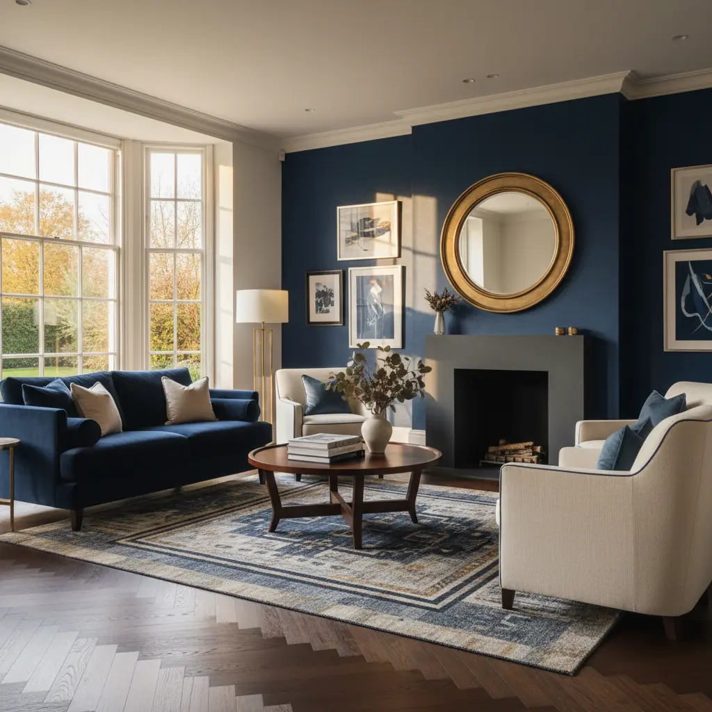
### Salas de Estar Acogedoras: Salas de Estar Azul Marino
Una sala de estar azul marino ofrece un lienzo versátil para la relajación y el entretenimiento. Ya sea que optes por un efecto de inmersión total o una sola pared de acento azul marino, el color proporciona un fondo sofisticado. Imagina una pared azul marino intenso detrás de un sofá de lino color crema, con cojines decorativos en rosa empolvado y terracota. El azul marino funciona excepcionalmente bien con texturas naturales como alfombras de yute, cestas tejidas y muebles de madera natural, creando una sensación acogedora y vivida. Para salas de estar más grandes, el azul marino puede definir áreas de asientos, haciendo que los espacios amplios se sientan más acogedores. En habitaciones más pequeñas, usar azul marino en una pared puede añadir profundidad sin abrumar el espacio. Considera una gran pieza de arte abstracto con colores complementarios para unificar la habitación.
### Santuario tipo Spa: Baños Azul Marino
El azul marino puede transformar un baño en un santuario tranquilo, tipo spa. En un tocador, un azul marino de inmersión total puede crear un efecto de caja de joyas dramático que se siente lujoso e inesperado. En baños más grandes, considera gabinetes de tocador azul marino combinados con encimeras de mármol blanco y accesorios de cromo pulido para una estética nítida y limpia. Para un ambiente costero, incorpora azulejos tipo metro azul marino en la ducha o en el suelo, combinados con acentos de madera natural y texturas tejidas. Los tonos fríos del azul marino son intrínsecamente calmantes, lo que lo convierte en una excelente opción para un espacio dedicado al cuidado personal. Habitas te permite experimentar con diferentes estilos y acabados de tocadores, ayudándote a visualizar el diseño ideal de tu baño con elementos azul marino.
Combinando el Azul Marino: Metales, Maderas y Colores de Acento para un Estilo Cohesivo
La verdadera magia del azul marino reside en su capacidad para armonizar con una amplia gama de materiales y colores. Una combinación cuidadosa eleva un espacio azul marino de simplemente oscuro a profundamente dinámico.
### Acentos Metálicos: El Brillo del Oro y el Latón
El oro y el latón son los metales distintivos del azul marino. Los tonos metálicos cálidos contrastan bellamente con la profundidad fría del azul marino, creando una combinación clásica que se siente lujosa y atemporal. Los herrajes de latón para gabinetes, los espejos con marco dorado y las luminarias metálicas cálidas añaden un brillo sofisticado. El latón cepillado ofrece una calidez más sutil y contemporánea, mientras que el latón pulido proporciona un glamour tradicional. Evita el cromo y el níquel con el azul marino a menos que busques intencionalmente un aspecto muy moderno y de tonos fríos; la combinación puede sentirse áspera y fría en lugar de acogedora. Un impresionante candelabro de latón contra un techo azul marino puede ser un punto focal deslumbrante.
### Calidez Orgánica: Los Mejores Tonos de Madera con Azul Marino
Para los tonos de madera, las maderas cálidas y medianas funcionan mejor. El nogal, el roble con un tinte cálido y la teca aportan una calidez orgánica que equilibra perfectamente la profundidad fría del azul marino. Estas maderas añaden riqueza y arraigo a un espacio azul marino, evitando que se sienta estéril. Las maderas muy oscuras (espresso, caoba teñida oscura) contra el azul marino pueden crear demasiado peso visual, haciendo que la habitación se sienta pesada y sombría. Las maderas claras como el arce o el abedul funcionan cuando se busca una sensación más escandinava o minimalista, pero a menudo necesitan accesorios cálidos (como textiles o acentos de latón) para cerrar la brecha visual y evitar que la habitación se sienta demasiado austera.
### Tonos Armoniosos: Colores de Acento Sofisticados
Los espacios azul marino más sofisticados utilizan uno o dos colores de acento cuidadosamente elegidos, no un arcoíris. El blanco y el crema son los neutros obvios (y siempre efectivos), proporcionando un contraste nítido y luminosidad. El rosa empolvado es un acento favorito de los diseñadores desde hace mucho tiempo: almohadas color rosa empolvado, una manta rosa pálido o arte rosa pálido contra paredes azul marino crean una elegancia discreta que se siente romántica y moderna a la vez. Los tonos cálidos de terracota y óxido son el acento de tendencia con azul marino en 2026, aportando calidez terrosa y un toque de sofisticación orgánica. Un verde musgo suave o verde oliva también puede crear una paleta tranquila, inspirada en la naturaleza. Evita los acentos de amarillo y naranja brillantes, que pueden hacer que el azul marino se sienta náutico o infantil en lugar de sofisticado. Para un toque verdaderamente único, considera un verde azulado intenso o verde esmeralda para un esquema monocromático pero dinámico.
Azul Marino como Acento vs. Color Dominante: Iluminación y Aplicación Estratégica
No todos los espacios necesitan —o pueden soportar— cuatro paredes azul marino. Comprender cuándo usar el azul marino como acento versus como color dominante es clave para un diseño exitoso.
### Acentos Estratégicos: Donde Menos es Más
En una habitación pequeña, una habitación orientada al norte o una habitación con pocas ventanas, el azul marino como color dominante puede sentirse opresivo o hacer que el espacio parezca aún más pequeño. En estos casos, utiliza el azul marino como un acento estratégico: una sola pared destacada, gabinetes azul marino contra paredes blancas, o un impresionante techo azul marino (una técnica dramáticamente subutilizada que crea la ilusión de altura y profundidad sin encerrar las paredes). Los muebles tapizados en azul marino, como un sofá de terciopelo o sillones de acento, pueden introducir el color sin abrumar el espacio. Un enfoque de acento te brinda la sofisticación del azul marino sin el compromiso total, haciendo que el espacio a menudo se sienta más curado y en capas.
### Drama de Inmersión Total: Cuando el Azul Marino Toma Protagonismo
En habitaciones más grandes con ventanas generosas y exposición sur u oeste, el azul marino de inmersión total es transformador. La abundancia de luz natural que entra juega hermosamente contra las paredes oscuras, creando un contraste natural y un juego de sombras que cambia a lo largo del día. Estas son las habitaciones donde el azul marino de inmersión total realmente brilla, ofreciendo una experiencia envolvente que se siente lujosa e íntimamente personal. Dichas habitaciones a menudo logran el tipo de efecto dramático que detiene a la gente en seco, haciendo una declaración de diseño impactante.
### El Rol Crítico de la Iluminación en Espacios Azul Marino
La iluminación es crucial en cualquier espacio azul marino. Las paredes azul marino mal iluminadas lucen sucias, planas y deprimentes; las paredes azul marino bien iluminadas lucen ricas, lujosas y acogedoras. Utiliza bombillas LED de luz cálida (2700K) en múltiples fuentes de luz; una sola luz de techo crea sombras duras e iluminación desigual contra paredes oscuras. Superpón tu iluminación con un propósito:
- **Iluminación Ambiental:** La iluminación empotrada con reguladores de intensidad o un candelabro central proporcionan una iluminación general. - **Iluminación de Trabajo:** Lámparas de mesa, lámparas de pie y apliques ofrecen luz enfocada para leer o trabajar, al tiempo que añaden puntos de calidez. - **Iluminación de Acento:** Lámparas de cuadro sobre obras de arte, o tiras de luz en estanterías, resaltan características específicas y añaden profundidad.
Distribuir la luz uniformemente y crear calidez en capas hace que los espacios azul marino se sientan acogedores y evita que parezcan una cueva. Herramientas como Habitas te permiten visualizar cómo las paredes azul marino interactúan con las condiciones de iluminación específicas de tu habitación antes de comprometerte, lo cual es particularmente valioso para el azul marino porque la diferencia entre un azul marino bien y mal iluminado es dramática. Aprovechar la visualización por IA puede ahorrar a los propietarios de viviendas una cantidad significativa de tiempo y dinero, reduciendo errores costosos de pintura hasta en un 40%.
Integrando el Azul Marino en Diversos Estilos de Diseño
La adaptabilidad del azul marino le permite trascender tendencias específicas e integrarse sin problemas en prácticamente cualquier estilo de diseño de interiores.
- **Estilo Costero Chic:** Combina el azul marino con blancos nítidos, ratán natural, yute y lino. Piensa en rayas azul marino, acentos marítimos y madera de tinte claro para un sofisticado refugio junto al mar. - **Elegancia Tradicional:** Combina paredes azul marino con molduras clásicas, muebles de caoba rica, accesorios de latón antiguo y alfombras estampadas. Un sofá de terciopelo azul marino eleva instantáneamente un espacio tradicional. - **Minimalismo Moderno:** Utiliza el azul marino como un audaz color de acento en una paleta que, de otro modo, sería neutra. Piensa en gabinetes azul marino elegantes, una única pared destacada en azul marino o textiles geométricos azul marino sobre blanco o gris claro. Los metales cromados o negros mate funcionan bien aquí. - **Rapsodia Bohemia:** Superpón el azul marino con textiles de inspiración global, tonos de madera natural, plantas exuberantes y patrones eclécticos. Un fondo azul marino permite que los colores y texturas vibrantes resalten sin abrumar los sentidos. - **Glamour Art Déco:** Combina el azul marino con acentos dorados, patrones geométricos, superficies espejadas y telas lujosas como el terciopelo y la seda. Esta combinación evoca la opulencia y sofisticación de la década de 1920.
No importa tu estética, el azul marino ofrece un color fundamental que aporta seriedad y estilo atemporal, permitiendo que tu personalidad brille a través de los detalles cuidadosamente seleccionados.
Preguntas Frecuentes
### ¿Es el azul marino un buen color para habitaciones pequeñas?
Si bien los colores intensos a veces pueden hacer que las habitaciones pequeñas se sientan más pequeñas, el azul marino en realidad puede crear una ilusión de profundidad e intimidad cuando se usa estratégicamente. En habitaciones pequeñas, considera usar el azul marino en una sola pared de acento, gabinetes empotrados o incluso el techo para añadir carácter sin abrumar el espacio. Combínalo con colores más claros en otras paredes y una amplia iluminación para mantener el equilibrio y evitar que se sienta demasiado encerrado.
### ¿Qué colores NO se deben combinar con el azul marino?
Si bien el azul marino es muy versátil, generalmente es aconsejable evitar combinarlo con amarillos y naranjas primarios demasiado brillantes, que pueden hacer que el espacio se sienta demasiado náutico o infantil en lugar de sofisticado. Del mismo modo, los verdes o morados brillantes, fríos y ásperos pueden chocar. En su lugar, opta por versiones apagadas o empolvadas de estos colores, o quédate con combinaciones sofisticadas como rosa empolvado, terracota cálida, grises suaves, blancos y varios tonos de madera para un aspecto más elegante.
### ¿El azul marino hace que una habitación parezca más pequeña o más grande?
El azul marino, como otros colores oscuros, tiende a absorber la luz, lo que puede hacer que una habitación se sienta más acogedora e íntima, potencialmente percibida como más pequeña. Sin embargo, cuando se usa con consideración, particularmente en habitaciones con amplia luz natural o iluminación artificial en capas, puede crear una profundidad significativa y un ambiente lujoso y envolvente. Pintar las molduras y el techo del mismo azul marino que las paredes puede difuminar los límites de la habitación, haciéndola sentir expansiva y cohesiva en lugar de constreñida.
### ¿Qué tipo de iluminación funciona mejor con paredes azul marino?
La iluminación en capas es crucial para las paredes azul marino. Evita una sola fuente de luz de techo, que puede crear sombras duras y hacer que el color parezca plano. En su lugar, combina iluminación ambiental (luces empotradas, luminaria central), iluminación de trabajo (lámparas de mesa, lámparas de pie) e iluminación de acento (apliques, lámparas de cuadro). Utiliza bombillas LED de luz cálida (alrededor de 2700K-3000K) para resaltar la riqueza del azul marino y crear un brillo acogedor. La iluminación estratégicamente colocada resaltará la profundidad y la belleza del color.