Modern Neutral Color Palettes 2026: Beyond Basic Beige and Gray
Discover modern neutral color palettes for 2026. Learn to build warm, layered schemes with depth and character, using taupe, mushroom, greige, and sand tones.
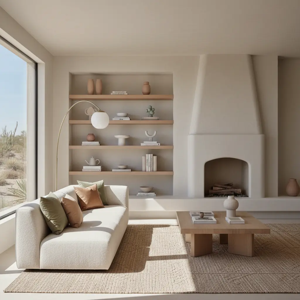
The New Neutrals: Why Warm Replaced Cool
For most of the 2010s, the neutral of choice was cool gray — Sherwin-Williams Repose Gray, Benjamin Moore Revere Pewter (which is actually a warm gray, but it was often the warmest gray most people dared try), and dozens of similar shades painted every wall in every new construction home and apartment renovation. Gray was safe. Gray was modern. Gray was everywhere. And by 2023, gray was exhausted. The widespread adoption of gray eventually led to a sense of visual fatigue, leaving many interiors feeling stark and impersonal.
The shift away from cool gray began subtly with greige — gray mixed with beige — which signaled that people wanted warmth but were not ready to fully abandon gray’s sophisticated edge. Sherwin-Williams Accessible Beige (SW 7036) and Benjamin Moore Balboa Mist (OC-27) became essential transition colors, offering a gentle embrace of warmth. By 2025, the shift was complete: warm taupe, mushroom, sand, and clay tones replaced cool gray as the new default neutrals. This preference for warmer tones is significant: a recent industry report indicated that 68% of interior designers reported an increased client demand for warm neutral palettes in 2025, a dramatic increase from just 25% in 2020.
The reason for the shift is partly cyclical (design trends always pendulum-swing between warm and cool, mirroring fashion and broader cultural movements) and partly psychological. After years of cool, sterile environments — compounded by the clinical associations of pandemic-era spaces and a general societal craving for comfort — people actively craved warmth, coziness, and a sense of grounding. Warm neutrals deliver this warmth without the commitment of a bold color, making them the perfect palette for a world that wants comfort and sophistication simultaneously. They foster environments that feel welcoming and secure, transforming a house into a true home.
The 2026 Neutral Spectrum: Taupe, Mushroom, Greige, Sand, and Clay
Understanding the nuances of the new warm neutrals is key to mastering this sophisticated palette. Each shade carries its own unique character and undertones, offering a rich tapestry of options for depth and dimension.
**Taupe** is the anchor of the 2026 neutral palette — it sits perfectly between gray and brown, reading as warm and sophisticated without being either boring or bold. Its versatility lies in its balanced composition. Benjamin Moore Weimaraner (AF-155) is a beautiful rich taupe that works exceptionally well on walls, built-ins, and even cabinetry, bringing an earthy grounding. Sherwin-Williams Poised Taupe (SW 6039) is slightly lighter and more versatile for larger surfaces, offering a softer elegance. The key quality of taupe is that it has enough brown to feel warm and inviting, and enough gray to feel modern and refined, preventing it from leaning too rustic or too stark. Consider its subtle violet or green undertones carefully when pairing with other colors or materials.
**Mushroom tones** are arguably the most interesting new neutral — they blend gray, brown, and the faintest lavender, mauve, or even a hint of green undertone, creating a color that is impossible to pin down and endlessly appealing. This complexity allows them to shift beautifully with the changing light throughout the day. Farrow & Ball Elephant's Breath (No.229) is the quintessential mushroom neutral: warm, complex, and beautiful in every light, offering an ethereal quality. Benjamin Moore Smokey Taupe (983) offers a similar nuanced quality at a more accessible price point. Mushroom works extraordinarily well in bedrooms and living rooms, where its soft, calming presence promotes relaxation and introspection.
**Greige**, the original bridge between cool and warm, continues its evolution. Today's preferred greiges lean decidedly warmer, embracing more beige than gray, but retaining just enough gray to prevent them from becoming dated. Think of shades like Benjamin Moore Edgecomb Gray (HC-173) or Sherwin-Williams Agreeable Gray (SW 7029) – staples that remain popular because of their ability to harmonize with both cool and warm elements already present in a home. They are the chameleons of the neutral world, adapting to their surroundings.
**Sand and clay tones** sit at the warmer end of the neutral spectrum and work best in homes with abundant natural materials and plenty of natural light. These shades evoke a sense of the outdoors, bringing the warmth of sun-baked earth and coastal landscapes inside. Benjamin Moore Sandy Hook Gray (HC-108) is a wonderfully warm sand tone that is neither gray nor beige but something perfectly in between, exuding a quiet confidence. Farrow & Ball Jitney (No.293) is a warm clay-sand that reads as golden in afternoon light, infusing spaces with a serene glow. Sherwin-Williams Tony Taupe (SW 7038) is another reliable warm neutral that has been quietly popular with designers for years, offering a rich, comforting depth. For more inspiration on balancing light and color, explore our guide to [all-white room design tips](/blog/all-white-room-design-tips).
How to Build a Neutral Palette with Depth
The biggest mistake in neutral-palette design is using a single neutral shade throughout a space. One neutral, no matter how beautiful, creates a flat, monotonous environment that lacks visual interest. The key to a successful neutral palette is **range and layering**: employing at least three neutral shades that span from light to dark, all drawn from the same warm (or cool, though less common in 2026) family. This creates natural contrast and a sophisticated visual flow.
Start with your lightest neutral on the ceiling and largest wall surfaces. This is your warm white or pale cream — think Benjamin Moore White Dove (OC-17), Sherwin-Williams Alabaster (SW 7008), or Farrow & Ball Pointing (No.2003). These shades bounce light beautifully and serve as a fresh canvas. Next, choose a medium neutral for accent walls, cabinetry, built-ins, or larger furniture pieces. This is where your taupe, mushroom, or sand tones come into play — one to two shades darker than your lightest neutral. For instance, if your walls are White Dove, a stunning medium could be Benjamin Moore Revere Pewter (HC-172) for a nuanced greige or Farrow & Ball Shaded White (No.201) for a soft, warm gray-beige.
Finally, add a dark neutral on trim, doors, furniture, or smaller accent areas. This could be a warm charcoal like Benjamin Moore Chelsea Gray (HC-168), a deep mushroom like Farrow & Ball Down Pipe (No.26), or a rich dark taupe like Sherwin-Williams Urbane Bronze (SW 7048), which was a former Color of the Year. The three-shade system creates natural contrast and hierarchy. The eye moves from light to medium to dark, finding depth and interest without the stimulation of bold color. Professional designers often add a fourth shade — a very dark neutral, sometimes with a subtle color undertone (e.g., a deep olive-gray or a charcoal-navy) used sparingly on one statement piece of furniture or a single dramatic accent, to anchor the palette and provide a visual full stop. For a more detailed look at the latest color trends, check out our insights on the [best paint colors 2026](/blog/best-paint-colors-2026).
Why is Texture Essential for Neutral Interior Design?
A neutral palette without texture variety is simply a beige room. A neutral palette with rich texture variety is a design statement – sophisticated, inviting, and endlessly interesting. This is not optional — it is the single most important factor in whether a neutral room feels boring or beautiful. Without vibrant color to create visual interest, texture must do all the heavy lifting, adding dimension, warmth, and tactile appeal.
The texture checklist for neutral rooms includes a careful balance of rough and smooth, matte and sheen, woven and solid, soft and hard. In practice, imagine a textural symphony: a substantial linen sofa (rough, matte, organic) against a subtly limewashed plaster wall (smooth, matte, artisanal) resting on a hand-knotted wool or jute rug (woven, rough, natural fiber) with a polished marble side table (smooth, cool, subtle sheen) and a chunky boucle throw pillow (nubby, dimensional, soft). Notice how each surface is distinctly different – the variety creates the visual richness that a single neutral paint color cannot provide alone.
Natural materials are absolutely essential for achieving this depth. Wood grain, stone veining, linen slub, wool fiber, and ceramic glaze all have inherent variation, imperfections, and subtle color shifts that synthetic materials simply lack. A neutral room with a laminate floor, polyester curtains, and a microfiber sofa will never feel as rich or luxurious as one with wide-plank oak floors, soft linen curtains, and a cotton-linen blend sofa, even if the colors are identical. The material is the message in neutral design, conveying authenticity and quality. Furthermore, incorporating natural materials aligns with biophilic design principles, which studies show can reduce stress by up to 25% and enhance well-being. Look for opportunities to introduce rattan, bamboo, terra cotta, and hand-blown glass to further elevate your space. For more on creating harmonious environments, explore our guide on [biophilic design](/blog/biophilic-design-guide).
Should You Add an Accent Color to a Neutral Room? And How Neutrals Work in Different Spaces.
A fully neutral room can be incredibly beautiful, but it is also demanding — it requires meticulous attention to texture balance, material quality, and layered lighting. If you are not confident in your texture game, or if you simply crave a touch more vibrancy, adding one accent color is a smart and stylish hedge. The accent should be muted and nature-derived to complement the warm neutral scheme, rather than competing with it. Think a soft sage green, a dusty terracotta, a muted ocean blue, a warm blush, or even a deep, earthy bronze.
Use this accent color sparingly, in no more than ten to fifteen percent of the room. A few throw pillows, a piece of abstract art with a subtle pop, a single ceramic vase, or a strategically placed antique book can provide that point of interest without undermining the neutral scheme. This small injection of color gives the eye a delightful pause and enhances the overall sophistication.
Neutral palettes work differently and require specific considerations in different rooms:
- **Living Rooms:** These spaces need the most texture variety and depth because they are high-traffic areas where you spend significant time. Layering different fabric weights, furniture materials, and rug textures is paramount. Consider a dark neutral for a statement armchair or a media console to ground the space. - **Bedrooms:** Bedrooms benefit from the softest and warmest end of the neutral spectrum. Think warm whites, pale mushroom, soft sand, and gentle taupes. The goal here is restfulness and serenity. Focus on luxurious, soft textures like cashmere throws, linen bedding, and plush wool rugs to maximize comfort. - **Kitchens and Bathrooms:** These rooms often feature many hard surfaces (tile, stone, cabinetry). They need the most contrast between their neutral shades to prevent these elements from blending into a flat wall of sameness. Use varying shades of taupe or greige for cabinetry against a lighter, warm white countertop, and incorporate a darker, earthy tone for flooring or a backsplash. Matte black or aged brass fixtures can provide metallic texture and a touch of edgy contrast. - **Hallways and Entryways:** These transitional spaces are perfect for making a quiet statement. A mid-tone mushroom or rich greige on the walls can feel incredibly inviting, especially when paired with natural wood furniture and a simple, textured runner. Consider a dark neutral on trim for added architectural interest.
Using AI tools to test neutral palettes is particularly valuable because the differences between neutrals are often subtle and hard to imagine on a large scale. A taupe that looks perfect on a small swatch might overwhelm a room, or a mushroom that appears perfect on screen might read as slightly purple or green on your actual walls. Habitas lets you apply full neutral palettes — walls, cabinetry, textiles, and even furniture — to photos of your actual rooms. This allows you to see whether your chosen neutrals create the depth and warmth you are envisioning, or whether they need adjustment before you buy a single gallon of paint. While a traditional interior designer might charge upwards of $5,000 for a detailed color consultation, platforms like Habitas offer instantaneous visualizations at a fraction of the cost, often under $100 for multiple design iterations, saving you both time and potential costly mistakes. Explore how AI can transform your design process with our guide on [how AI interior design works](/blog/ai-interior-design-how-it-works).
Frequently Asked Questions
### What are the main benefits of using a warm neutral color palette?
Warm neutral color palettes offer numerous benefits, making them a popular choice for modern interiors. They create a sense of calm, comfort, and sophistication, fostering inviting and serene environments. Unlike bolder colors, neutrals provide a timeless backdrop that won't quickly go out of style, allowing for easy updates through accessories and textiles. Their versatility means they can adapt to various design styles, from minimalist to rustic, and they enhance natural light, making spaces feel larger and more open. From a practical standpoint, homes with warm, sophisticated neutral palettes often have a higher appeal to potential buyers, with a 2025 survey by the National Association of Realtors indicating that homes staged with modern neutral schemes sold 15% faster than those with outdated or overly personal decor.
### How do I choose the right warm neutral paint color for my home?
Choosing the right warm neutral requires careful consideration of several factors. First, assess the natural light in your room – rooms with ample natural light can handle deeper tones, while darker rooms benefit from lighter, more reflective neutrals. Next, examine existing elements like flooring, built-ins, or large furniture pieces, and identify their undertones (red, yellow, green, blue) to ensure your chosen paint harmonizes rather than clashes. Always sample paint colors on your actual walls, observing them in different lights throughout the day. What looks good on a swatch or screen can appear dramatically different in your space due to varying light sources and reflections. Consider the mood you want to create; softer, lighter neutrals promote tranquility, while richer, deeper tones offer coziness and drama.
### Can I mix warm and cool neutrals in the same room?
While the current trend strongly favors warm neutrals, it is possible to successfully mix warm and cool neutrals in a single room, but it requires a careful hand. The key is to have a dominant warm neutral palette and introduce cool neutrals as subtle accents, usually in textures or small decorative elements rather than large expanses of paint. For instance, a warm taupe wall color can be complemented by a cool-toned gray marble fireplace surround or a blue-gray ceramic vase. The cool tones should act as a refreshing counterpoint, providing contrast and preventing the space from feeling monotonous, rather than competing with the primary warm scheme. Always ensure the undertones of your chosen cool accents still relate back to the overall palette in a harmonious way, avoiding stark contrasts.
### What are some common mistakes to avoid when designing with neutral palettes?
Several pitfalls can make a neutral room fall flat. The most common mistake is using only one neutral shade, leading to a monotonous, undifferentiated space. Another error is neglecting texture; without varied textures, a neutral room lacks visual interest and feels sterile. Ignoring undertones is also crucial – mixing warm and cool neutrals carelessly can create a disjointed and uncomfortable feeling. Overlooking lighting is another pitfall; warm neutrals benefit from layered lighting (ambient, task, accent) to highlight their depth and prevent shadows from making them appear dull. Finally, failing to incorporate natural materials diminishes the richness and authenticity that makes neutral design so appealing. Always prioritize variety in shade, texture, and material.