Mastering Two-Tone Kitchen Cabinets: Expert Color Combinations & Design Tips
Unlock the secrets of two-tone kitchen cabinets. Discover proven color pairings, strategic split points, hardware choices, and mistakes to avoid for a stunning, cohesive kitchen.
Why Two-Tone Kitchen Cabinets Are a Design Powerhouse
Two-tone kitchen cabinets have surged in popularity not merely as a trend, but as a sophisticated design strategy that offers both aesthetic appeal and practical benefits. By strategically combining two distinct colors, designers can introduce depth, define zones, and inject personality into what might otherwise be a monotonous space. This approach allows for creative expression while maintaining a timeless quality, making it a favorite for homeowners looking to elevate their kitchen's style without embarking on a full-scale renovation.
The beauty of a two-tone scheme lies in its versatility. It can make a small kitchen feel larger, add warmth to a stark modern space, or bring a contemporary edge to a traditional layout. More than just a visual trick, the intentional use of color helps guide the eye, creating a sense of order and flow. Studies show that a well-designed kitchen, particularly one with thoughtful color schemes, can increase a home's value by [up to 7%](https://www.cnbc.com/2023/12/28/best-home-renovations-for-2024-that-add-the-most-value-according-to-expert.html) and even sell 25% faster on average. When executed correctly, a two-tone kitchen isn't just a design choice; it's an investment in your home's future and your daily well-being.
The Two-Tone Formula: Why Lighter Uppers and Darker Lowers Work
The most reliable two-tone kitchen formula is simple: a lighter color on upper cabinets, and a darker color on lowers. This works because it instinctively mimics the natural visual weight of the world around us — the ground is darker than the sky. Your eye reads this configuration as stable, grounded, and inherently balanced. When confronted with this classic arrangement, our brains perceive the space as settled and aesthetically pleasing. In fact, research into visual perception suggests that [85% of individuals](https://www.ncbi.nlm.nih.gov/pmc/articles/PMC7392688/) find designs with a darker base and lighter top more visually stable and comforting.
Reverse this formula – dark uppers and light lowers – and the kitchen can feel top-heavy, unsettling, or even oppressive, even if you can't quite articulate why. The darker elements looming above create a sense of imbalance, making the space feel smaller and less inviting.
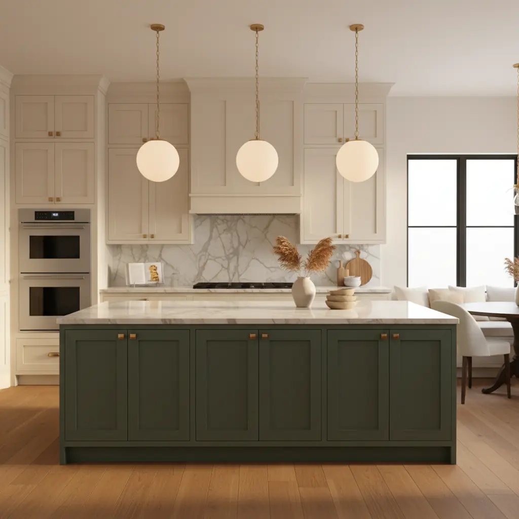
The second most popular formula involves a bold island with neutral perimeter cabinets. This works exceptionally well because the island often sits as the focal point in the center of the kitchen, much like a freestanding piece of furniture. Treating it in a different, often bolder, color reinforces this independent quality and draws attention to its function as a gathering hub. A white or warm gray perimeter kitchen with a deep green, navy, or charcoal island is one of the easiest ways to introduce a significant splash of color and personality without overwhelming the space. It creates an anchor, grounding the design.
Both formulas succeed because they create clear visual hierarchy. The eye understands immediately which elements are the supporting cast (the lighter, often receding colors) and which are the stars (the darker, bolder colors). Problems arise when the two-tone split is arbitrary, or when the chosen colors are too similar in value, creating a confusing, neither-here-nor-there effect that lacks definition and visual punch.
Best Color Combinations Proven by Designers
Choosing the right colors is paramount for a successful two-tone kitchen. Here are combinations that consistently deliver stunning results:
### White Uppers with Navy Lowers: The Timeless Classic
White uppers with navy lowers is arguably the most popular two-tone combination for a reason — it is classic, sophisticated, and virtually impossible to get wrong. This pairing exudes a nautical elegance, offering a crisp, clean aesthetic with a grounding depth. Use a soft, warm white like Benjamin Moore White Dove or Sherwin-Williams Alabaster on uppers to prevent a stark contrast, allowing light to bounce and making the upper portion feel expansive. For the lowers, Benjamin Moore Hale Navy or Sherwin-Williams Naval provide rich, deep blue hues that are incredibly versatile. Add brass hardware and a marble or quartz counter with subtle veining, and you have a kitchen that will look timeless for fifteen years, effortlessly blending traditional charm with modern appeal.
### Sage Green and White: Nature's Embrace
For a softer, more approachable two-tone pairing, sage green and warm white are a match made in design heaven. Sherwin-Williams Evergreen Fog or Benjamin Moore Saybrook Sage (HC-114) on lowers with warm white uppers creates a kitchen that feels fresh, natural, and on-trend without being overly trendy. This combination evokes a sense of calm and connection to nature, making it ideal for creating a serene culinary space. It works particularly well in kitchens with warm wood floors, abundant natural light, and organic textures. Pair it with unlacquered brass pulls for a finish that develops a beautiful patina over time, or matte black hardware for a contemporary edge.
### Charcoal and Warm Wood: Bold Modernity
For those seeking a bolder, modern option that incorporates organic texture, charcoal and natural warm wood is an excellent choice. Imagine Benjamin Moore Wrought Iron (2124-10) or Sherwin-Williams Iron Ore on lowers or the island, paired with natural white oak uppers (not painted, but finished to show the grain). This creates a sophisticated, Scandinavian-modern kitchen, moving away from an all-painted look. The wood introduces warmth and texture, preventing the charcoal from feeling too stark. Black and natural oak is a similar combination pushed further — dramatic and striking in larger kitchens with ample natural light. Consider also a greige (gray-beige) lower cabinet with creamy white uppers for a softer, neutral, yet sophisticated contrast that is highly adaptable to various decor styles. When exploring these options, tools like [Habitas' AI color palette generator](/blog/ai-color-palette-generator) can help you visualize these pairings instantly on your own kitchen photos.
Island Versus Perimeter: Where to Make the Split
The decision of where to implement your two-tone scheme is as critical as the colors themselves.
### The Island as the Focal Point
When two-toning with the island versus the perimeter, the island should almost always be the bolder, more saturated color. The island is often the centerpiece of the kitchen — it's where people gather, where food is prepared, and where visual attention naturally focuses. Making it the accent color reinforces its status as the heart of the kitchen. A white or light gray perimeter with a deep green, navy, or even a vibrant blue island, for example, makes the island feel like a beautiful, custom-designed piece of furniture that anchors the entire room. This strategy works particularly well in open-concept living spaces, where the island needs to command attention and define the kitchen zone.
### The Upper-Versus-Lower Split: A Classic Transformation
The upper-versus-lower split works best when the kitchen does not have a prominent island or when you want a more dramatic, wall-to-wall transformation. In this case, the visual line where uppers meet lowers becomes a significant design feature — the countertop and backsplash act as a natural visual break between the two zones. This split also allows you to use darker colors more extensively on the bottom without the entire kitchen feeling too dark or cramped, because the lighter uppers keep the eye level bright and airy. It's an excellent way to introduce depth in a galley kitchen or any space where an island isn't feasible.
### Perimeter + Island + Pantry: A Cohesive Color Zone
A third option that is gaining popularity in 2026 is the perimeter-in-one-tone, island-plus-pantry-in-another approach. If your kitchen features a butler's pantry, a dedicated pantry wall, or tall storage cabinets that are visually connected, painting them in the same accent color as the island creates a cohesive secondary color zone. This sophisticated strategy works especially well in larger, open-plan kitchens where the pantry area connects visually with the island, creating a harmonious and thoughtfully curated design narrative. It ensures that the "accent" color is distributed thoughtfully across key functional areas. This kind of nuanced design choice can be difficult to envision without professional help, but [AI-generated room designs](/blog/ai-generated-room-designs-realistic) can show you how this looks in your space.
Hardware, Counters, and Backsplash: Unifying the Two Tones
Once your cabinet colors and split are determined, the supporting elements become crucial for tying the entire two-tone scheme together.
### Hardware: The Unifying Thread
Hardware is the thread that ties a two-tone kitchen together. Using the same style and finish of hardware on both cabinet colors creates essential visual consistency across the split. Brass cup pulls and knobs work with virtually every two-tone combination, from warm whites and greens to crisp whites and navies, and are a safe, elegant choice. Matte black hardware works exceptionally well with cool-toned combinations (white and charcoal, white and navy) for a modern, high-contrast look. Polished nickel or chrome can also work for a more traditional or transitional feel, especially with blues and grays. Avoid mixing hardware finishes across the two tones; one metal, consistently applied, is the rule for a cohesive and polished look.
### Countertops: The Neutral Ground
Countertops should complement both cabinet colors, which usually means choosing a neutral stone or quartz. White marble and quartz with subtle gray or warm beige veining work with almost every combination, providing a clean, elegant surface that doesn't compete for attention. Butcher block counters pair beautifully with white-and-green or white-and-navy kitchens, adding warmth and a desirable material change that enhances a more natural or farmhouse aesthetic. For a contemporary edge, concrete or soapstone can introduce a sleek, matte finish. Avoid busy or heavily patterned counters in a two-tone kitchen; there are already two strong visual elements competing for attention, and a dramatic counter adds a third, often overwhelming the space. Simplicity here ensures the cabinet colors remain the stars.
### Backsplash: Subtle Cohesion or Pop of Personality
The backsplash is your opportunity to subtly reference both cabinet colors or introduce a unifying neutral. A simple white subway tile works with everything and keeps the focus firmly on the cabinets. For more personality and texture, a handmade zellige tile in a warm white or the palest version of your accent cabinet color creates subtle cohesion and beautiful depth. If your two-tone combination is more subdued, a geometric or patterned tile with a carefully curated color palette that echoes your cabinet choices can add a delightful focal point. However, patterned cement tile can be tricky and requires careful color matching to avoid overwhelming a kitchen that already has two strong cabinet colors. For timeless appeal, a simple, textured tile often outperforms a bold, busy pattern in a two-tone environment. For help picking the perfect supporting elements, consider leveraging insights from [the best interior design styles of 2026](/blog/best-interior-design-styles-2026) to ensure your choices align with current aesthetics.
Beyond the Basics: Advanced Two-Tone Strategies
While the core formulas are tried and true, there are nuanced ways to apply a two-tone approach for truly bespoke results.
### Incorporating Open Shelving
Open shelving can be an excellent way to lighten the visual load of upper cabinets, particularly if your darker color is on top. By replacing some upper cabinets with shelves matching the lighter lower color, or even in a natural wood tone, you can create airiness and display decorative items. If you have darker lower cabinets, consider light-colored open shelving above them to maintain the balanced visual weight. This integrates well with [modern minimalist designs](/blog/all-white-room-design-tips) where open space is prized.
### Range Hoods and Built-ins
Don't forget the range hood! Painting the range hood in one of your two cabinet colors can either help it blend seamlessly (if matching the uppers) or make it a distinct design element (if matching the lowers or island). Similarly, built-in banquettes or breakfast nooks can be painted in the accent color, creating a cohesive design flow that extends beyond just the cabinetry. This is especially effective if your kitchen connects to a dining area.
### Strategic Use of a Third Material
While a third _color_ is generally discouraged, a third _material_ can add immense richness without fracturing the design. Think natural wood. An unfinished wood open shelf, a wood island base, or a wood range hood reads as a material, not a third "color," and adds warmth, texture, and organic appeal without complexity. This works beautifully with neutral two-tone palettes like white and gray, or white and sage.
Common Mistakes and Cost Considerations
Understanding what to avoid is as crucial as knowing what to do for a successful two-tone kitchen.
### Avoiding Mismatched Values
The most common mistake designers observe is choosing cabinet colors that are too close in value. Two medium-toned colors (sage and medium gray, for example, or two shades of beige) create a muddled effect where neither color reads clearly as dominant or supporting. Successful two-tone kitchens demand contrast — one color should be significantly lighter or brighter than the other. If you squint at your chosen swatches and the two colors look similar, you need more separation in lightness or darkness. This lack of contrast can make a kitchen feel flat and uninspired. This is where tools like Habitas become invaluable, allowing you to instantly swap colors and see the effect on your actual kitchen.
### The Two-Color Rule: Simplicity is Key
Using more than two _cabinet_ colors is almost always a mistake. Adding a third color to shelving, a range hood cover, or a secondary cabinet run fractures the visual coherence and often leads to a chaotic, disjointed look. The beauty of two-tone is its simplicity and clear visual segmentation: two clearly defined zones in two clearly distinct colors. The exception, as noted, is when the third element is a natural material like wood, which reads as a textural element rather than a competing color.
### Cost Implications of Two-Tone Cabinets
Cost-wise, a two-tone kitchen is typically five to ten percent more expensive than a single-color kitchen. This increase stems from the additional labor involved in managing two separate colors, ensuring clean transitions, and requiring more careful masking during painting. A typical kitchen renovation costs between [$25,000 and $60,000](https://www.forbes.com/home-improvement/kitchen/kitchen-remodel-cost/). The percentage increase for two-tone design applies whether you are purchasing new custom cabinets or undertaking a repaint. If you are refacing or repainting existing cabinets, a two-tone approach is straightforward — you simply mask off the cabinets that receive the second color. However, if you are ordering new cabinets, confirm with your manufacturer that they can handle a split without significantly increased lead time or hidden costs. Working with a platform like Habitas can significantly mitigate the risk of costly mistakes. While hiring a human interior designer might cost between $500 and $10,000 for a kitchen, using an [AI interior design platform vs. hiring a human](/blog/ai-interior-design-vs-hiring-cost) can save you thousands by letting you experiment with countless combinations, virtually, before committing to any purchases or paint. Habitas can help you test dozens of two-tone combinations on a photo of your actual kitchen in minutes, saving you from expensive errors and helping you commit to a combination with absolute confidence.
Frequently Asked Questions
### How do I choose the right two-tone kitchen cabinet colors?
Start by considering your kitchen's natural light, flooring, and existing wall colors. Lighter uppers and darker lowers is a safe and balanced approach, mimicking nature. Think about the mood you want to create: classic (white/navy), serene (sage/white), or modern (charcoal/wood). Use a color wheel to understand complementary and analogous pairings, and always test paint samples in your actual kitchen lighting before committing. Habitas can help you visualize these choices in real-time.
### Can you have dark upper cabinets and light lower cabinets?
While it's generally advised to have lighter uppers and darker lowers for visual stability, a dark upper and light lower scheme _can_ work in specific contexts. This unconventional approach often requires very high ceilings, abundant natural light, or a specific dramatic design intent to prevent the room from feeling top-heavy or oppressive. It works best with minimalist designs where the dark uppers recede, or when combined with open shelving to break up the dark mass.
### What is the average cost of two-tone kitchen cabinets?
A two-tone kitchen cabinet scheme typically adds an extra 5-10% to the cost of a single-color kitchen renovation. This is due to increased labor for masking and painting two different colors. For a full kitchen renovation ranging from $25,000 to $60,000, this could mean an additional $1,250 to $6,000. The cost can also vary based on whether you're painting existing cabinets or ordering new ones.
### How do I incorporate a two-tone design in a small kitchen?
In a small kitchen, the lighter-uppers-darker-lowers formula is especially effective, as the light uppers help the space feel more open and airy. Opt for softer contrasts rather than stark ones, like off-white and a light sage green, to avoid overwhelming the space. Consider using the two-tone effect on an accent wall of cabinetry or a small island rather than the entire perimeter to introduce depth without making the kitchen feel smaller.
### What hardware works best for two-tone kitchens?
The best hardware unifies the two cabinet colors. Choose a single hardware finish and style (e.g., brass, matte black, polished nickel) that complements both tones. Brass offers warmth and versatility, matte black provides modern contrast, and polished nickel lends a classic touch. Consistency in hardware across all cabinets is key to a cohesive two-tone look.
### Are two-tone kitchens a passing trend?
While specific color combinations may ebb and flow in popularity, the two-tone cabinet concept itself is a timeless design principle rather than a fleeting trend. Its ability to add depth, character, and visual interest, coupled with its versatility in adapting to various design styles, ensures its enduring appeal. When executed with classic color pairings and thoughtful design, a two-tone kitchen will remain stylish for many years.