Como Escolher Cores de Tinta Sem Arrependimento: Um Método Infalível
Uma abordagem sistemática e à prova de arrependimento para escolher cores de tinta — desde a leitura de subtons até o teste correto de amostras e a coordenação de cores entre os cômodos.
Comece Com O Que Você Não Pode Mudar: Os Elementos Fixos Do Seu Cômodo
O erro número um ao escolher cores de tinta é começar pela própria tinta. Em vez disso, inicie sua jornada de cores avaliando meticulosamente os elementos fixos do seu cômodo — as bases imóveis que você não vai substituir. Essas peças fundamentais, como seu piso, bancadas, grandes armários embutidos, lareiras e qualquer revestimento ou pedraria, estabelecem coletivamente uma paleta base. A cor de tinta escolhida deve harmonizar com esses elementos, não entrar em conflito com eles.
Considere as características dominantes desses elementos fixos. Seus pisos de carvalho quente têm tons de mel ou avermelhados? Sua bancada de granito tem veios cinza-frios ou espirais bege-quentes? Seu sofá é um carvão de tom frio ou um linho quente e terroso? Essas são suas cores-âncora. Sua tinta precisa coexistir confortavelmente dentro da mesma família de cores ou proporcionar um contraste intencional e bem planejado que realce, em vez de prejudicar. Forçar um cinza-azulado frio em paredes cercadas por madeira e pedra de tons quentes, por exemplo, é uma armadilha comum que leva a um cômodo a parecer perpetuamente "deslocado" ou desconexo. Estima-se que cerca de 15% dos proprietários expressam arrependimento imediato por uma escolha de cor de tinta, muitas vezes devido a essa incompatibilidade com elementos fixos.
Para capturar com precisão essas tonalidades existentes, tire várias fotos dos seus elementos fixos em diferentes momentos do dia para observar como a luz natural afeta sua aparência. Melhor ainda, leve amostras físicas reais à loja de tintas ou ao estúdio. Uma peça solta de piso, uma frente de gaveta, uma amostra de tecido do seu sofá ou até mesmo um pequeno pedaço de pedra cortada fornecerão a representação mais precisa. Confiar apenas em fotos digitais pode ser enganoso, pois as telas distorcem as cores, e o que parecia um bege quente no seu telefone pode se revelar um taupe frio na vida real.
Decifrando Subtons: O Segredo Para a Tinta Perfeita
Toda cor de tinta, mesmo as aparentemente neutras, possui um subtom — uma cor secundária sutil que se esconde sob a superfície, muitas vezes revelando-se apenas quando colocada em contexto. Entender os subtons é talvez a habilidade mais crítica para uma seleção de tinta bem-sucedida. Um branco pode ter subtons elusivos de rosa, amarelo, verde ou azul. Um cinza aparentemente puro pode tender distintamente para o roxo, azul ou verde. Esse fenômeno explica por que uma amostra de tinta que parecia perfeita sob as luzes artificiais da loja pode parecer completamente errada uma vez aplicada na sua parede, transformando-se de um greige sofisticado para um verde inesperadamente turvo.
Para dominar a identificação de subtons, sempre compare. Segure a amostra de tinta contra uma folha de papel branco puro e brilhante. Esse contraste nítido destaca imediatamente a tonalidade subjacente. Um "branco quente" ao lado do branco verdadeiro revelará claramente seu tom amarelado ou rosado. Um "cinza frio" mostrará sua inclinação azul ou verde. Seus olhos são hábeis em se adaptar a cores isoladas, tornando difícil detectar essas nuances sem um ponto de referência neutro. Por exemplo, muitas cores populares de "greige" ganham sua complexidade ao equilibrar cinza com bege, mas seu subtom específico (verde-acinzentado, roxo-acinzentado ou amarelo-acinzentado) dita com quais outras cores elas harmonizarão. Aprender a ver esses subtons o capacita a tomar decisões informadas e evitar repinturas caras; corrigir uma má escolha de cor depois de pintar um cômodo inteiro pode adicionar um inesperado 10-20% ao orçamento do seu projeto.
A Regra 60-30-10: Criando Cômodos Equilibrados e Atraentes
designers utilizam universalmente a regra 60-30-10 para orquestrar cômodos que parecem inerentemente equilibrados, harmoniosos e visualmente atraentes, sem sucumbir à monotonia. Esta diretriz fornece uma estrutura para distribuir cor, textura e padrão dentro de um espaço:
- **60 por cento:** Esta é a sua cor dominante, muitas vezes representada pelas maiores superfícies do cômodo — tipicamente as paredes, grandes tapetes e peças estofadas principais como um sofá ou um sofá modular. Esta cor ancora o espaço e define o humor geral. - **30 por cento:** Esta é a sua cor secundária, proporcionando contraste e interesse sem sobrecarregar a tonalidade dominante. Você a encontrará em elementos como cortinas, móveis de destaque (por exemplo, poltronas, um pufe), roupas de cama, uma parede de destaque ou uma peça de arte significativa. - **10 por cento:** Esta é a sua cor de destaque, usada com moderação para adicionar toques de personalidade, energia e pontos focais. Pense em almofadas decorativas, objetos decorativos, acessórios menores, luminárias, detalhes de obras de arte ou até mesmo arranjos florais.
Essa proporção é eficaz porque estabelece naturalmente uma clara hierarquia visual. Seus olhos sabem intuitivamente onde descansar (os expansivos 60 por cento), o que explorar em seguida (os complementares 30 por cento) e em quais detalhes encantadores se demorar (os vibrantes 10 por cento). Cômodos que parecem caóticos, inquietos ou visualmente "cheios" muitas vezes violam esta regra ao dar o mesmo peso visual a muitas cores ou elementos conflitantes.
Para um exemplo prático, imagine uma sala de estar: ela pode apresentar paredes brancas suaves e quentes e um grande tapete de área (60 por cento). Um sofá verde-sálvia e cortinas estampadas combinando poderiam representar a cor secundária (30 por cento). Finalmente, almofadas decorativas de terracota, uma peça de arte vibrante com toques de laranja e objetos decorativos de latão proporcionariam o destaque (10 por cento). A beleza desta regra está em sua flexibilidade; a "matemática" não precisa ser rigidamente exata. Ela serve como um princípio orientador para criar um ambiente coeso e esteticamente agradável em vários estilos de design, do minimalista moderno ao boêmio eclético. Essa abordagem estruturada ajuda a garantir um resultado mais satisfatório, reduzindo a probabilidade de um cômodo parecer "inacabado" ou descombinado.
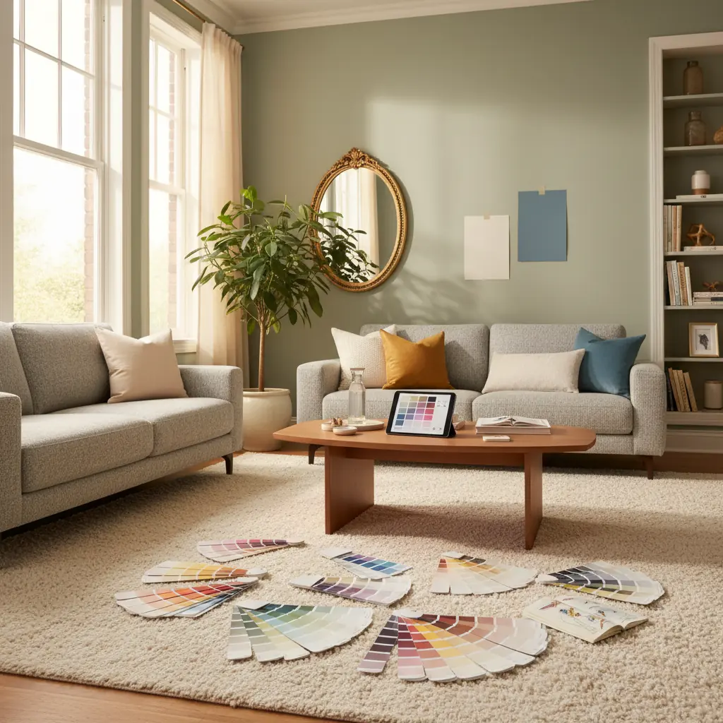
Como Testar Amostras de Tinta Corretamente Para Uma Verdadeira Avaliação de Cor
Escolher uma cor de tinta a partir de uma pequena amostra é como escolher uma refeição a partir de uma foto microscópica — você está perdendo a experiência sensorial completa. Para realmente entender como uma cor se comportará em seu espaço, você deve investir em pequenos potes de amostra. Pinte quadrados de sessenta por sessenta centímetros (ou maiores) diretamente na sua parede. Crucialmente, pinte essas amostras em pelo menos duas paredes diferentes dentro do cômodo — uma que receba luz solar direta e outra que não, ou uma de frente para uma janela e outra de frente para uma parede interna. A mesma cor pode parecer dramaticamente diferente sob exposições de luz variadas, mudando de vibrante para suave, e você precisa observar ambas as manifestações antes de se comprometer.
Para um método de teste ainda mais versátil, pinte suas amostras em grandes pedaços de papelão ou espuma branca. Isso permite que você mova as amostras pelo cômodo, observando-as em diferentes paredes, ao lado de elementos fixos e até em alturas variadas. Cole-as, afaste-se e conviva com elas.
O período de observação é igualmente vital. Veja suas amostras em um mínimo de quatro momentos distintos:
1. **Manhã:** Com luz natural, tipicamente mais fria e brilhante. 2. **Meio-dia:** Frequentemente com sol pleno e direto, que pode desbotar ou intensificar as cores. 3. **Noite:** Com as luzes artificiais acesas, que podem ter tons quentes (incandescentes/LED 2700K-3000K) ou frios (LED 4000K+), alterando drasticamente a percepção da cor. 4. **Noite:** Com apenas luminárias ou iluminação ambiente, revelando como a cor se sente em um ambiente mais íntimo.
Uma cor que parece fresca e arejada ao meio-dia pode parecer suja ou opaca sob a luz quente de uma lâmpada às 21h. Conviva com suas amostras por pelo menos 48 horas, idealmente mais. O entusiasmo inicial por uma nova cor muitas vezes desaparece, e você precisa garantir que se sente bem com ela em uma manhã sombria de terça-feira, não apenas em um sábado ensolarado à tarde. Esse processo de teste diligente reduz significativamente a chance de um arrependimento caro com a tinta. Afinal, a pintura profissional para um cômodo de tamanho médio pode custar entre US$ 300 e US$ 1.000, tornando uma repintura uma despesa inesperada significativa.
Coordenando Cores Entre Cômodos Conectados: Garantindo Um Fluxo Contínuo
Em casas com plantas abertas ou linhas de visão visíveis entre cômodos adjacentes, garantir que as cores da tinta fluam de forma coesa é primordial para criar uma estética unificada. Isso não significa que cada cômodo deve ser pintado exatamente da mesma cor, mas sim que os espaços adjacentes devem compartilhar um fio condutor visual comum ou uma relação complementar.
Uma das abordagens mais simples e eficazes é selecionar cores da mesma paleta de cores do fabricante. Essas cores são projetadas especificamente para compartilhar o mesmo pigmento base e subtons subjacentes, garantindo que sempre coordenarão harmoniosamente, muitas vezes diferindo simplesmente em saturação ou luminosidade. Por exemplo, você pode usar um branco-sujo suave de uma paleta em sua área de estar principal, um greige ligeiramente mais escuro da mesma paleta em uma sala de jantar conectada, e uma tonalidade ainda mais profunda e temperamental da mesma paleta para uma parede de destaque dramática em um lavabo.
Outra estratégia poderosa envolve manter a mesma cor neutra nas paredes em todos os espaços conectados, diferenciando cada cômodo através de paredes de destaque, cores de acabamento variadas (por exemplo, um branco nítido em um, um cinza suave em outro) ou cores secundárias distintas em móveis, têxteis e obras de arte. Isso cria unidade arquitetônica, permitindo que cada cômodo individual expresse sua própria personalidade e função através de suas escolhas de decoração. Para uma criação de paleta mais avançada, você pode explorar ferramentas como um [Habitas AI Color Palette Generator](/blog/ai-color-palette-generator) para experimentar esquemas complementares e análogos que mantêm o fluxo.
Considere também o impacto emocional: um azul sereno em um quarto pode transitar graciosamente para um creme quente em um corredor que leva a um verde vibrante em um home office, desde que seus subtons se alinhem ou um buffer neutro os conecte. O objetivo é uma jornada visual que pareça natural e intencional, não abrupta ou dissonante.
Quais São Os Erros Mais Comuns Que Levam Ao Arrependimento Da Cor De Tinta?
Evitar armadilhas comuns pode economizar tempo, dinheiro e frustração emocional significativos. Aqui estão os principais erros que levam ao arrependimento da cor de tinta:
1. **Escolher Uma Cor a Partir de Uma Pequena Amostra:** Este é, de longe, o passo em falso mais frequente. As cores se intensificam dramaticamente em grandes superfícies. O que parecia um sálvia sutil e sofisticado em uma amostra de tinta de cinco centímetros pode se transformar em um verde agressivo e avassalador em quatro paredes. Sempre escolha um a dois tons mais claros do que o que você inicialmente pensa que quer, especialmente com cores mais saturadas ou escuras, pois elas parecerão mais profundas uma vez espalhadas por um cômodo inteiro.
2. **Ignorar a Iluminação Natural do Seu Cômodo:** A iluminação é, sem dúvida, o fator mais influente na forma como uma cor de tinta aparecerá. - **Cômodos voltados para o Norte** recebem luz fria, indireta e azulada. Isso pode fazer com que cores quentes pareçam opacas ou enlameadas, e cores frias (como azuis e verdes) fiquem ainda mais geladas. Para neutralizar isso, introduza brancos mais quentes ou cores com subtons amarelo/vermelho, ou apoie-se na frieza com azuis ricos. - **Cômodos voltados para o Sul** são banhados por luz quente e dourada ao longo do dia. Essa luz naturalmente valoriza os tons quentes e pode fazer com que azuis frios pareçam quase cinza ou até ligeiramente verdes. Aqui, tons frios podem ajudar a equilibrar o calor, enquanto tons quentes se sentirão ainda mais aconchegantes. - **Cômodos voltados para o Leste** desfrutam de luz brilhante, quente e amarelada pela manhã, que muda para uma luz mais fria e azulada à tarde e à noite. As cores aqui terão uma qualidade dinâmica, mudando ao longo do dia. - **Cômodos voltados para o Oeste** experimentam luz fria e suave pela manhã, seguida por uma luz intensa, quente e dourada no final da tarde e à noite. Essa mudança dramática significa que uma cor que parece boa às 9h pode ser avassaladora às 17h.
Sempre identifique a orientação do seu cômodo e considere como as diferentes cores reagirão ao seu perfil de luz único.
3. **Seguir Tendências Cegamente:** Embora as tendências de design possam ser inspiradoras, adotá-las sem considerar a arquitetura da sua casa, seu estilo pessoal e os elementos fixos existentes é um caminho rápido para o arrependimento. Aquela parede de destaque em esmeralda vibrante fica deslumbrante em uma sessão de fotos profissional com iluminação perfeita e mobiliário selecionado. No seu cômodo, com proporções diferentes, luz diferente e mobiliário diferente, pode parecer completamente errado ou rapidamente datado. As tendências são um ponto de partida para a inspiração, não uma prescrição rígida. Sua casa deve refletir _você_, não apenas a última moda do Pinterest.
4. **Esquecer dos Rodapés, Teto e Portas:** Tinta não é apenas para paredes. A cor que você escolhe para seus rodapés, teto e portas impacta profundamente a sensação geral do cômodo. Um rodapé branco nítido pode fazer as cores das paredes se destacarem, enquanto um rodapé combinando ou mais escuro pode criar um visual contínuo e sofisticado. O teto, muitas vezes esquecido, é a "quinta parede" e pode influenciar a sensação de altura do cômodo ou como a luz reflete. Não deixe esses elementos como um mero detalhe.
5. **Não Utilizar Ferramentas de Visualização:** No cenário atual do design, você não precisa adivinhar. Ferramentas como Habitas permitem que você "pinte" virtualmente suas paredes e visualize como uma cor realmente ficaria em seu cômodo específico usando uma renderização alimentada por IA da sua foto real antes mesmo de comprar um pote de amostra. Isso reduz significativamente as suposições e pode ajudá-lo a evitar comprar cinco litros de tinta que você pode odiar. Você pode até explorar vários [designs de cômodos gerados por IA para visualizar resultados realistas](/blog/ai-generated-room-designs-realistic) com diferentes paletas e estilos. Investir alguns momentos com essa plataforma pode economizar centenas, até milhares, de dólares em custos de repintura e tempo desperdiçado.
Perguntas Frequentes
### Como identifico os subtons nos elementos existentes da minha casa?
Para identificar subtons em elementos fixos como piso, bancadas ou móveis, coloque um pedaço de papel ou tecido branco puro ao lado deles. Observe atentamente sob diferentes condições de iluminação (luz natural do dia, luz artificial). Você começará a ver sutis toques de amarelo, vermelho, laranja (subtons quentes), ou azul, verde, roxo (subtons frios) aparecendo através da cor dominante. Por exemplo, um carpete bege pode tender ligeiramente para o rosado ou amarelado. Comparar com um branco neutro ajuda seu olho a detectar essas pequenas variações.
### Minhas paredes devem ser mais claras ou mais escuras que os rodapés?
Isso é uma questão de preferência pessoal e estética desejada. Pintar as paredes mais claras que os rodapés (geralmente branco ou branco-sujo) cria contraste, fazendo com que os rodapés se destaquem e definindo os detalhes arquitetônicos. Este é um visual clássico e popular. Pintar as paredes mais escuras que os rodapés pode criar uma sensação mais dramática, sofisticada ou aconchegante, com os rodapés mais claros emoldurando a cor mais profunda da parede. Para um visual muito moderno ou minimalista, alguns optam por pintar paredes e rodapés exatamente da mesma cor (color drenching) para um efeito contínuo e envolvente.
### Quantas amostras de tinta devo comprar para um cômodo?
Para um único cômodo, é aconselhável selecionar de 3 a 5 cores de tinta potenciais que você realmente goste e acredite que possam funcionar. Isso permite uma comparação suficiente sem sobrecarregá-lo. Lembre-se de comprar potes de amostra de cada, não apenas confiar em pequenas amostras, e testá-las adequadamente em várias paredes e sob diferentes condições de iluminação.
### Qual é a melhor forma de escolher cores de tinta para um cômodo pequeno?
Para cômodos pequenos, cores mais claras tendem a fazer o espaço parecer maior e mais aberto, refletindo a luz. No entanto, não hesite em usar cores mais profundas e temperamentais se você busca um efeito aconchegante de "caixa de joias". Considere usar cores com subtons frios (azuis, verdes) que tendem a recuar, ou usar um esquema monocromático para criar uma sensação de unidade expansiva. Tetos de cores claras também podem ajudar a aumentar a altura percebida. O uso de ferramentas como Habitas para visualizar essas cores pode ser particularmente útil para espaços menores, onde cada tonalidade importa.