Como Misturar Estampas no Design de Interiores Sem Conflitar
Aprenda as regras profissionais para misturar estampas em sua casa — a regra das 3 estampas, fios de cor compartilhados, combinações seguras para começar e exemplos cômodo a cômodo.
A Regra Fundamental das 3 Estampas: Dominando a Escala para a Harmonia Visual
O segredo mais crucial para misturar estampas sem criar uma cacofonia visual é a "regra das três escalas". Este princípio dita que você selecione estampas com pesos visuais distintos: uma em grande escala, uma em média escala e uma em pequena escala. Essa variação de tamanho é o que impede que as estampas compitam diretamente; em vez disso, elas se sobrepõem graciosamente, permitindo que seu olho processe cada uma como um elemento distinto que contribui para um todo unificado.
Imagine um cômodo onde todas as estampas têm o mesmo tamanho – seu olho se movimentaria freneticamente, incapaz de encontrar um ponto de descanso ou discernir um ponto focal. Ao variar a escala, você cria uma hierarquia visual. A estampa em grande escala frequentemente atua como âncora, a de média escala introduz um interesse secundário e a de pequena escala oferece detalhes intrincados ou textura, unindo tudo.
Vamos detalhar como isso funciona:
- **Estampa em Grande Escala:** Esta é a peça de destaque do seu cômodo, frequentemente cobrindo uma área significativa. Pense em florais ousados em cortinas, uma dramática estampa ikat em um tapete grande ou um papel de parede geométrico marcante. Seu papel principal é definir o clima e injetar uma dose poderosa de caráter. - **Estampa em Média Escala:** Esta estampa serve como uma ponte entre a grande e a pequena, oferecendo um interesse visual transitório. Pode aparecer em almofadas, uma cadeira de destaque ou uma capa de edredom. Uma listra clássica, uma treliça sutil ou um xadrez simples funcionam maravilhosamente aqui, complementando a estampa dominante sem sobrecarregá-la. - **Estampa em Pequena Escala:** Estes são os detalhes delicados, frequentemente percebidos como textura à distância. Considere um minúsculo poá, um delicado tecido espinha de peixe, um sutil paisley, ou mesmo um tecido liso com uma superfície rica e tátil como o bouclé ou linho. Essas estampas adicionam riqueza e profundidade, muitas vezes desempenhando um papel de apoio aos elementos maiores.
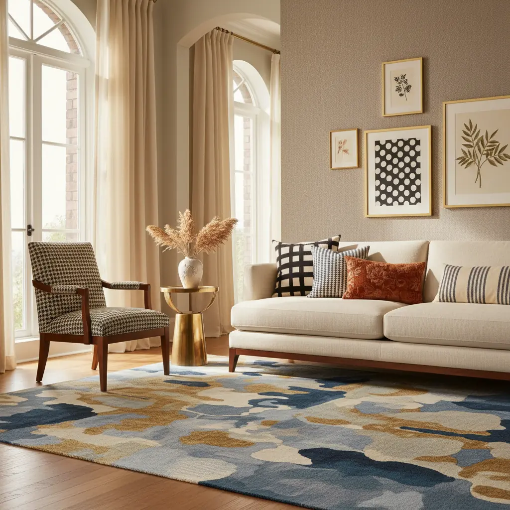
**Exemplo de Aplicação:** Imagine uma sala de estar. Sua estampa em grande escala poderia ser um vibrante e oversized floral botânico nas cortinas longas. Em seguida, introduza uma estampa em média escala com designs geométricos abstratos em um par de almofadas no sofá. Finalmente, um tapete listrado finamente tecido e em pequena escala ancora o espaço, adicionando textura sutil sem competir. A variação de escala garante que cada estampa tenha seu momento, contribuindo para um ambiente em camadas e interessante, que parece cuidadosamente curado em vez de caótico. A chave é que cada estampa opera em uma frequência visual diferente, para que coexistam em vez de conflitar.
Se três estampas parecem intimidantes, especialmente para iniciantes, comece com duas. Combine uma estampa proeminente com um tecido sólido texturizado, ou duas estampas que sejam muito diferentes em escala e tipo. Tecidos sólidos texturizados como linho, bouclé, veludo cotelê ou até mesmo um sutil tecido espinha de peixe contam como estampas em termos de interesse visual, mas são muito mais indulgentes do que as estampas impressas, introduzindo você à arte de sobrepor.
O Poder Unificador de um Fio Condutor de Cor Compartilhado
Enquanto a escala proporciona estrutura, um fio condutor de cor compartilhado é a cola invisível que une estampas díspares em uma narrativa coesa. Isso é inegociável para uma mistura de estampas bem-sucedida. Cada estampa em um cômodo deve compartilhar pelo menos uma cor comum. Essa tonalidade compartilhada não precisa ser a cor dominante em todas as estampas; ela apenas precisa estar presente, mesmo que de forma sutil, para criar uma conexão harmoniosa.
Essa técnica é frequentemente o que separa um espaço profissionalmente projetado de uma tentativa bem-intencionada, mas desordenada. O olho humano naturalmente busca a continuidade. Quando as estampas compartilham uma cor, elas parecem pertencer juntas, mesmo que seus motivos e escalas sejam vastamente diferentes.
**Abordagens Práticas para Encontrar Seu Fio Condutor de Cor:**
1. **Comece com Sua Estampa Principal:** Escolha sua estampa mais importante primeiro – esta é geralmente a maior ou mais impactante, como um tapete grande, um papel de parede ousado ou o tecido principal de suas cortinas. Essa estampa "heroína" frequentemente conterá várias cores. 2. **Extraia uma Cor Secundária:** De sua estampa principal, retire uma cor secundária ou de destaque. Essa cor se tornará a cor dominante em sua próxima escolha de estampa. Por exemplo, se sua cortina floral tem toques de azul-marinho, verde-sálvia e creme sobre um fundo branco, você pode escolher o azul-marinho como seu fio condutor. 3. **Desenvolva Sua Paleta:** Agora, introduza almofadas lisas em azul-marinho e talvez uma cadeira de destaque listrada em azul-marinho e branco. O azul-marinho conecta consistentemente tudo, enquanto cada peça mantém sua identidade única. Isso cria profundidade sem depender de um esquema monocromático. 4. **Considere os Neutros:** Frequentemente, o fio condutor de cor compartilhado pode ser um tom neutro presente em todas as estampas – um branco cremoso, um cinza suave ou um bege quente. Esses neutros fornecem um fundo tranquilo que permite que cores e estampas mais ousadas brilhem sem sobrecarregar o espaço.
Um erro comum é tentar combinar exatamente o mesmo tom em todas as estampas. Em vez disso, concentre-se no _tom_ ou na _família_ da cor. Um azul empoeirado em uma estampa pode complementar lindamente um azul-celeste mais brilhante em outra, desde que a tonalidade azul subjacente esteja presente. Usar um [gerador de paleta de cores AI da Habitas](/blog/ai-color-palette-generator) pode ser incrivelmente útil aqui, permitindo que você extraia e experimente esquemas de cores diretamente de suas estampas escolhidas.
Decodificando Tipos de Estampas: Combinações Seguras e Pareamentos Estilísticos
As estampas se enquadram em diversas categorias, e compreender essas classificações ajuda a criar contrastes e conexões agradáveis.
Aqui estão as categorias amplas e como abordar a combinação delas:
1. **Estampas Geométricas:** Incluem listras (clássicas, finas, toldo), zigue-zagues, xadrezes, treliças, grades, losangos e poás. São estruturadas, ordenadas e frequentemente trazem um senso de modernidade ou elegância tradicional, dependendo de sua cor e escala. 2. **Estampas Orgânicas/Botânicas:** Florais, botânicas, folhas, videiras, estampas de animais (zebra, leopardo, onça) e tudo inspirado na natureza. Essas estampas tendem a ser mais fluidas, expressivas e podem introduzir suavidade, um toque de capricho ou um charme exótico. 3. **Estampas Abstratas:** Aquarelas, pinceladas, designs de forma livre, salpicos, tie-dye e motivos não representacionais. Os abstratos são excelentes para adicionar um toque artístico, um toque moderno e frequentemente uma sensação de movimento ou emoção sem imagens específicas. 4. **Estampas Texturais:** Embora nem sempre impressas, tecidos (tricô trançado), superfícies em relevo (adamascados, brocados), linhos slubby, bouclé e até mesmo estampas sutis tom sobre tom criam padrões visuais através de sua qualidade superficial. Estes são os heróis desconhecidos da mistura de estampas, adicionando imensa profundidade sem ruído visual. 5. **Estampas Étnicas/Globais:** Ikats, paisleys, suzanis, block prints, kilim, motivos tribais. Essas estampas frequentemente possuem ricas histórias e designs intrincados, trazendo um toque global, boêmio ou artesanal a um espaço. 6. **Estampas de Novidade:** Estampas divertidas que retratam objetos, animais ou temas específicos (por exemplo, raças de cães, xícaras de chá, paisagens urbanas). São ótimas para injetar personalidade e um toque lúdico, muitas vezes em doses menores.
**Combinações Mais Seguras:**
As combinações mais seguras e eficazes unem estampas de diferentes categorias. Isso cria um contraste agradável entre o estruturado e o fluído, o tradicional e o moderno, ou o ousado e o sutil.
- **Listra + Floral:** Uma combinação clássica de designer que quase nunca falha. A linearidade da listra proporciona um pano de fundo estável ou um contraponto ao fluxo orgânico do floral. - **Geométrico + Orgânico:** Cria uma tensão e equilíbrio agradáveis — a precisão de uma estampa geométrica (por exemplo, um xadrez) pode ancorar a exuberância de uma estampa botânica. - **Xadrez + Toile:** Uma combinação tradicional e elegante. A natureza rústica e ordenada do xadrez complementa as cenas intrincadas e narrativas do toile. - **Estampa Animal + Quase Tudo:** Estampas de animais são frequentemente consideradas neutras em pequenas doses. Uma almofada com estampa de leopardo pode adicionar um toque sofisticado a florais, geométricos ou até mesmo arte abstrata. - **Abstrato + Textura Sólida:** Uma estampa abstrata (especialmente se colorida) funciona lindamente ao lado de um sólido texturizado, permitindo que a peça abstrata seja a estrela enquanto a textura proporciona profundidade.
**Combinações a Serem Abordadas com Cuidado:**
Evite combinar duas estampas da mesma categoria na mesma escala, especialmente se a intensidade delas for semelhante. Duas estampas florais de escala média com paletas de cores semelhantes ou duas estampas geométricas de tamanhos semelhantes competirão por atenção, resultando em um visual agitado e confuso. Se você precisar combinar estampas da mesma categoria, certifique-se de que suas escalas sejam vastamente diferentes (por exemplo, um floral grande com uma pequena estampa floral discreta) e que suas cores estejam harmonizadas.
Compreender [diferentes estilos de design de interiores](/blog/best-interior-design-styles-2026) também pode guiar suas escolhas de estampas, pois certos estilos têm preferências inerentes a padrões. Por exemplo, um ambiente boêmio prospera misturando várias estampas étnicas, enquanto um espaço minimalista pode focar em texturas sutis e um único destaque geométrico.
Introdução Estratégica: Começando com Peças de Baixo Compromisso e a Regra 60-30-10
Se misturar estampas parece assustador, comece pelos elementos mais facilmente trocáveis e menos caros. Isso permite que você experimente, construa confiança e descubra o que realmente ressoa com seu estilo sem um desembolso financeiro significativo ou mudanças permanentes.
**Pontos de Partida de Baixo Compromisso:**
1. **Almofadas Decorativas:** Estas são o menor compromisso. Você pode comprar, testar e substituí-las por tão pouco quanto $20-$50 cada. Uma sala de estar típica pode precisar de 3-5 almofadas para introduzir uma nova combinação de estampas. Este é o playground perfeito para experimentar novas escalas e fios condutores de cor. 2. **Mantas e Cobertores:** Jogada sobre um sofá ou poltrona, uma manta estampada pode introduzir uma estampa de média a grande escala e ser facilmente movida ou trocada. 3. **Roupas de Mesa:** Uma toalha de mesa estampada, jogos americanos ou um trilho de mesa podem mudar drasticamente a sensação de uma área de jantar ou mesa de centro, oferecendo um espaço contido para experimentar. 4. **Pequenos Acessórios:** Bandejas decorativas, vasos com motivos estampados ou até mesmo um pedaço de tecido estampado emoldurado podem introduzir sutilmente uma nova estampa.
Depois de se sentir confortável com a mistura de estampas em pequena escala, avance para peças maiores e moderadamente comprometedoras:
- **Cortinas ou Persianas:** Os tratamentos de janela fazem uma declaração de estampa significativa. Eles definem um plano vertical e podem introduzir uma estampa ousada e de grande escala. Embora exijam mais esforço do que almofadas, ainda podem ser trocados com esforço e custo moderados. - **Tapetes de Área:** Um tapete é um investimento fundamental que define todo o cômodo. É frequentemente a estampa "heroína" e pode ancorar seu esquema de cores. Escolher um tapete estampado é um compromisso, mas é tipicamente menos permanente do que um papel de parede. - **Cadeiras de Destaque ou Pufes:** Uma cadeira de destaque estofada pode introduzir lindamente uma estampa de média escala. Se você adora uma estampa, uma peça de destaque é uma ótima maneira de exibi-la sem se comprometer com um sofá completo.
**Escolhas de Padrão de Alto Compromisso:**
- **Papel de Parede:** Esta é uma escolha de alto compromisso, cobrindo uma parede inteira ou um cômodo. Um papel de parede estampado bem escolhido pode ser deslumbrante, mas considere usar ferramentas como a Habitas para visualizar como uma estampa ousada ficará em suas paredes _antes_ de se comprometer. A visualização por IA pode levar segundos, economizando as 2-4 semanas que um designer tradicional poderia levar para uma renderização semelhante, e evitando erros caros. - **Móveis Estofados (Sofá/Assentos Principais):** Estofar uma peça grande como um sofá com uma estampa ousada é um investimento significativo (uma reforma personalizada de sofá pode custar mais de $1.500 - $5.000 dependendo do tecido e do tamanho). Guarde-as para estampas com as quais você já conviveu em peças menores e sobre as quais está absolutamente confiante.
**A Regra da Proporção 60-30-10:**
Para manter as coisas ancoradas e evitar o excesso de padrões, os designers frequentemente aderem a uma versão modificada da regra 60-30-10:
- **60% cores sólidas:** Isso forma a base calma do seu cômodo (paredes, móveis grandes como sofás, grandes áreas de piso). - **30% padrão ou textura sutil:** Isso pode ser uma estampa de média escala em uma cadeira de destaque, um tapete texturizado ou cortinas sutilmente estampadas. - **10% padrão ousado:** Este é o seu fator "uau" – uma almofada vibrante, uma peça de arte marcante, uma pequena, mas impactante, seção de papel de parede.
Essa proporção garante que os padrões adicionem interesse e energia sem sobrecarregar o espaço. Um cômodo inteiramente estampado parece exaustivo; um cômodo com padrões estrategicamente colocados parece dinâmico e projetado com expertise.
Jogo Avançado de Padrões: Elevando Seu Design com Nuances
Além das regras fundamentais, algumas considerações avançadas podem elevar sua mistura de estampas de boa a excepcional:
- **Considere a Função do Cômodo:** Cômodos de alto tráfego e de permanência mais curta (como um lavabo ou sala de jantar) podem suportar estampas mais ousadas e energéticas. Quartos ou salas de estar, onde você passa períodos prolongados e relaxantes, geralmente se beneficiam de uma mistura mais discreta. - **Equilibre o Contraste:** A mistura de estampas prospera no contraste, mas precisa ser equilibrada. O contraste em escala, cor e tipo de estampa é essencial. Muita semelhança leva à planicidade; muita dissimilaridade leva ao caos. Busque um empurra e puxa harmonioso. - **Introduza Metais e Superfícies Refletivas:** Embora não sejam padrões em si, os detalhes metálicos (ouro, prata, bronze) e as superfícies refletivas (espelhos, vidro) podem atuar como "pausas" neutras entre os padrões, adicionando glamour e permitindo que o olho tenha um momento de descanso. Eles também captam e refletem lindamente as cores e a luz dos padrões ao seu redor. - **Abrace a Imperfeição:** Às vezes, os cômodos mais interessantes têm um pareamento de estampas ligeiramente inesperado ou "fora do lugar" que funciona por causa de sua personalidade única. Não tenha medo de quebrar uma regra depois de entendê-la, especialmente se isso trouxer alegria ao seu espaço.
Mistura de Padrões Cômodo a Cômodo: Exemplos Inspiradores para Cada Espaço
Vamos aplicar esses princípios a áreas específicas da sua casa:
### Sala de Estar: A Arte do Conforto em Camadas
Em uma sala de estar, onde acontecem conversas e relaxamento, concentre-se em uma sensação confortável e em camadas. Experimente uma estampa botânica de grande escala nas cortinas como seu padrão principal. Introduza um geométrico de média escala em duas almofadas de destaque no seu sofá de cor sólida (talvez um tom tirado do padrão da cortina). Finalmente, ancore o espaço com um tecido texturizado de pequena escala no tapete, que parece um padrão sutil. Você também pode adicionar uma pequena estampa abstrata em uma manta jogada sobre uma poltrona. De acordo com um estudo recente da Associação Nacional de Corretores de Imóveis, uma sala de estar bem projetada aumenta significativamente o valor percebido do imóvel em até 10-15%.
### Quarto: Santuário com Estilo
Os quartos se beneficiam de padrões que promovem calma e suavidade, mas com um toque de personalidade. Uma cabeceira com padrão ousado ou uma sutil parede de destaque com papel de parede tom sobre tom atrás da cama podem ser seu padrão de grande escala. Combine isso lindamente com roupas de cama listradas ou sutilmente estampadas (como uma capa de edredom em espinha de peixe ou lençóis florais delicados) como sua escala média. Cortinas de cor sólida que captam uma cor de destaque da cabeceira ou da roupa de cama completam o visual, enquanto uma manta felpuda com padrão em pequena escala aos pés da cama adiciona textura. Considere como os padrões contribuem para o seu [custo total de reforma do quarto](/blog/bedroom-redesign-cost-breakdown).
### Sala de Jantar: Elegância Envolvente
As salas de jantar podem suportar escolhas de padrões mais ousadas porque você passa menos tempo contínuo nelas; elas são frequentemente para reuniões mais curtas e energéticas. Um papel de parede de destaque (grande escala), almofadas de cadeira estampadas (geométrico ou botânico de média escala) e um simples trilho de mesa texturizado (pequena escala) criam um interesse visual significativo para jantares sem a fadiga que pode vir de conviver com as mesmas escolhas ousadas em um cômodo que você ocupa o dia todo. Uma travessa de servir ou sousplats lindamente estampados podem adicionar outra pequena camada temporária de padrão.
### Banheiro: Um Toque de Personalidade em um Espaço Pequeno
Banheiros, sendo menores, oferecem um ambiente contido para experimentação ousada de padrões. Um azulejo estampado dramático (grande escala) em uma parede de destaque ou uma cortina de chuveiro vibrante com padrão podem ser sua declaração principal. Combine-o com toalhas de cor sólida que captam um destaque do padrão e um tapete de banho texturizado (pequena escala) para manter o pequeno espaço animado sem sobrecarregá-lo. Mesmo uma pequena toalha de mão com padrão abstrato pode adicionar um toque chique. Para mais ideias, explore [ideias de reforma de banheiro](/blog/bathroom-remodel-ideas).
### Home Office: Toque Focado
Em um home office, os padrões podem inspirar a criatividade enquanto mantêm uma sensação de calma. Uma grande arte abstrata ou um tapete geométrico podem ser sua âncora. Introduza uma listra fina ou um xadrez sutil de média escala em uma cadeira de home office estofada. Um organizador de mesa estampado de pequena escala ou um vaso texturizado adiciona um detalhe cuidadoso. Garanta que os padrões aqui não sejam muito distrativos, focando naqueles que evocam foco e sofisticação.
Armadilhas Comuns a Evitar na Mistura de Padrões
Mesmo com as regras em mãos, alguns erros são comuns. Estar ciente deles pode ajudá-lo a evitá-los:
1. **Ignorar a Escala:** O maior culpado. Como discutido, padrões da mesma escala competirão, criando um ambiente plano e inquieto. 2. **Falta de um Fio Condutor de Cor Compartilhado:** Sem essa cor unificadora, mesmo padrões perfeitamente escalonados parecerão desconectados e aleatórios. 3. **Muitos Padrões Dominantes:** Nem todo padrão pode ser um herói. Você precisa de estrelas e coadjuvantes. Se cada padrão gritar por atenção, o cômodo se torna avassalador. 4. **Misturar Muitos Estilos de Design:** Embora a mistura eclética possa funcionar, tentar forçar estilos altamente díspares (por exemplo, toile francês tradicional com geométricos industriais marcantes) sem um elemento unificador pode parecer chocante. 5. **Esquecer a Textura:** A textura é uma forma vital e sutil de padrão. Negligenciá-la significa perder uma camada crucial de profundidade e interesse, especialmente em cômodos onde estampas ousadas não são desejadas. 6. **Exagerar nos Padrões em Espaços Pequenos:** Embora cômodos pequenos possam suportar padrões ousados, certifique-se de manter espaço sólido ou neutro suficiente para evitar que o cômodo pareça claustrofóbico.
Liberte Sua Criatividade com Habitas
A jornada para dominar a mistura de padrões é de experimentação e descoberta. Com os princípios de escala, cor e tipo em mente, você está bem equipado para transformar sua casa. Mas e se você pudesse ver suas escolhas de padrões ganharem vida antes de fazer qualquer compromisso?
É aqui que plataformas de design de interiores com IA como a Habitas realmente brilham. Em vez de adivinhar ou depender apenas de pequenas amostras de tecido, você pode fazer upload de uma foto do seu cômodo real e usar a Habitas para visualizar diferentes papéis de parede, tapetes, cortinas e móveis estofados estampados. Você pode trocar instantaneamente um floral de grande escala por um geométrico ousado, testar vários fios condutores de cor e ver como a regra das 3 estampas se desenrola no _seu_ espaço único.
A Habitas reduz significativamente a ansiedade do design e o risco de erros caros. Enquanto um designer de interiores profissional pode cobrar uma média de $50-$200 por hora por consultas de design, usar uma ferramenta de IA permite que você itere infinitamente em seu próprio tempo e orçamento, com renderizações realistas e de alta qualidade. Isso o capacita a tomar decisões de design confiantes, garantindo que seus padrões mistos não sejam apenas modernos, mas perfeitamente adaptados à sua visão. Pronto para experimentar? Comece a criar combinações de padrões bonitas e sem conflitos em sua casa com a Habitas hoje!
---
Perguntas Frequentes
### Quantos padrões são muitos em um cômodo?
Embora a "regra dos três" seja um ótimo ponto de partida para escalas distintas, você pode tecnicamente incorporar mais padrões tratando alguns como texturas sutis ou garantindo que sejam de escala muito pequena e de cor neutra. A chave não é um número estrito, mas sim garantir que cada padrão tenha "espaço para respirar", que as escalas variem e que um fio condutor de cor compartilhado os conecte. Uma diretriz geral é ter no máximo 3-5 padrões _perceptíveis_, com os outros sendo texturais ou altamente sutis.
### Posso misturar padrões de diferentes estilos de design, como moderno e tradicional?
Sim, absolutamente! Misturar padrões de diferentes estilos de design pode criar um visual rico, eclético e único. O segredo está em usar um forte fio condutor de cor e manter escalas variadas. Por exemplo, um geométrico moderno pode ser lindamente combinado com um floral tradicional se eles compartilharem uma cor de fundo ou um tom de destaque principal. Essa abordagem adiciona profundidade e personalidade, evitando que um cômodo pareça unidimensional ou excessivamente temático.
### Qual é a maneira mais fácil para um iniciante começar a misturar padrões?
Para iniciantes, a abordagem mais fácil é começar pequeno e com itens de baixo compromisso. Comece com duas almofadas: uma com um padrão geométrico de média escala e outra com um padrão orgânico ou texturizado de pequena escala, garantindo que elas compartilhem pelo menos uma cor (ou um fundo neutro). Coloque-as em um sofá de cor sólida. Isso permite que você experimente a escala e a harmonia de cores sem fazer um grande investimento. Uma vez confortável, você pode introduzir gradualmente um terceiro padrão em uma manta ou pequeno acessório.
### A textura conta como padrão no design de interiores?
Sim, a textura absolutamente conta como padrão no design de interiores. Embora possa não envolver um motivo impresso, as variações visuais e táteis em materiais como bouclé, linho, tricôs trançados, shiplap ou até mesmo concreto aparente criam interesse visual e repetição, que é a essência de um padrão. Incorporar diversas texturas é crucial para adicionar profundidade e calor a um espaço, especialmente ao trabalhar com uma paleta de cores limitada ou menos padrões impressos.
### Como usar padrões de forma eficaz em um cômodo pequeno?
Em um cômodo pequeno, use padrões estrategicamente para evitar sobrecarregar o espaço. Opte por padrões que sejam proporcionais ao tamanho do cômodo – um padrão de grande escala pode, na verdade, fazer um cômodo pequeno parecer mais grandioso se usado com moderação (por exemplo, em uma parede de destaque ou tapete grande). Equilibre padrões ousados com muitas cores sólidas e mais claras. Use padrões de pequena escala ou texturas para profundidade e sempre garanta um fio condutor de cor consistente. Listras verticais também podem fazer um cômodo parecer mais alto. Considere usar espelhos para refletir padrões, duplicando seu impacto sem adicionar mais padrões físicos.