Paletas de Cores Neutras Modernas 2026: Além do Bege e Cinza Básicos
Descubra paletas de cores neutras modernas para 2026. Aprenda a construir esquemas quentes e em camadas com profundidade e personalidade, usando tons de taupe, mushroom, greige e areia.
Os Novos Neutros: Por Que os Tons Quentes Substituíram os Frios
Durante a maior parte dos anos 2010, o neutro preferido era o cinza frio — Sherwin-Williams Repose Gray, Benjamin Moore Revere Pewter (que na verdade é um cinza quente, mas era frequentemente o cinza mais quente que a maioria das pessoas ousava experimentar), e dezenas de tons semelhantes pintavam todas as paredes em todas as casas recém-construídas e reformas de apartamentos. O cinza era seguro. O cinza era moderno. O cinza estava em todo lugar. E em 2023, o cinza estava exausto. A adoção generalizada do cinza eventualmente levou a uma sensação de fadiga visual, deixando muitos interiores com uma sensação austera e impessoal.
A mudança do cinza frio começou sutilmente com o greige — cinza misturado com bege — o que sinalizou que as pessoas queriam calor, mas não estavam prontas para abandonar completamente a sofisticação do cinza. Sherwin-Williams Accessible Beige (SW 7036) e Benjamin Moore Balboa Mist (OC-27) tornaram-se cores de transição essenciais, oferecendo um suave abraço de calor. Em 2025, a mudança estava completa: tons quentes de taupe, mushroom, areia e argila substituíram o cinza frio como os novos neutros padrão. Essa preferência por tons mais quentes é significativa: um relatório recente da indústria indicou que 68% dos designers de interiores relataram um aumento na demanda dos clientes por paletas neutras quentes em 2025, um aumento drástico em relação a apenas 25% em 2020.
A razão para a mudança é parcialmente cíclica (as tendências de design sempre oscilam entre quente e frio, espelhando a moda e movimentos culturais mais amplos) e parcialmente psicológica. Após anos de ambientes frios e estéreis — agravados pelas associações clínicas de espaços da era pandêmica e um desejo social geral por conforto — as pessoas ansiavam ativamente por calor, aconchego e uma sensação de enraizamento. Neutros quentes proporcionam esse calor sem o compromisso de uma cor ousada, tornando-os a paleta perfeita para um mundo que busca conforto e sofisticação simultaneamente. Eles promovem ambientes que se sentem acolhedores e seguros, transformando uma casa em um verdadeiro lar.
O Espectro Neutro de 2026: Taupe, Mushroom, Greige, Areia e Argila
Compreender as nuances dos novos neutros quentes é fundamental para dominar esta paleta sofisticada. Cada tonalidade possui seu próprio caráter e subtons únicos, oferecendo uma rica tapeçaria de opções para profundidade e dimensão.
**Taupe** é a âncora da paleta neutra de 2026 — ele se posiciona perfeitamente entre o cinza e o marrom, transmitindo calor e sofisticação sem ser monótono ou ousado. Sua versatilidade reside em sua composição equilibrada. Benjamin Moore Weimaraner (AF-155) é um taupe rico e bonito que funciona excepcionalmente bem em paredes, móveis embutidos e até mesmo armários, trazendo um enraizamento terroso. Sherwin-Williams Poised Taupe (SW 6039) é ligeiramente mais claro e mais versátil para superfícies maiores, oferecendo uma elegância mais suave. A qualidade fundamental do taupe é que ele tem marrom suficiente para parecer quente e convidativo, e cinza suficiente para parecer moderno e refinado, evitando que penda para o rústico ou austero. Considere cuidadosamente seus sutis subtons violeta ou verde ao combiná-lo com outras cores ou materiais.
Os **tons de mushroom** são, sem dúvida, os novos neutros mais interessantes — eles misturam cinza, marrom e os mais tênues subtons de lavanda, malva ou até mesmo um toque de verde, criando uma cor impossível de definir e infinitamente atraente. Essa complexidade permite que eles mudem lindamente com a luz ao longo do dia. Farrow & Ball Elephant's Breath (No.229) é o neutro mushroom por excelência: quente, complexo e belo em qualquer luz, oferecendo uma qualidade etérea. Benjamin Moore Smokey Taupe (983) oferece uma qualidade matizada semelhante a um preço mais acessível. Mushroom funciona extraordinariamente bem em quartos e salas de estar, onde sua presença suave e calmante promove relaxamento e introspecção.
**Greige**, a ponte original entre o frio e o quente, continua sua evolução. Os greiges preferidos atualmente tendem decididamente para o mais quente, abraçando mais bege do que cinza, mas retendo cinza suficiente para evitar que se tornem datados. Pense em tons como Benjamin Moore Edgecomb Gray (HC-173) ou Sherwin-Williams Agreeable Gray (SW 7029) – pilares que permanecem populares devido à sua capacidade de harmonizar com elementos quentes e frios já presentes em uma casa. Eles são os camaleões do mundo neutro, adaptando-se aos seus arredores.
Os **tons de areia e argila** ficam na extremidade mais quente do espectro neutro e funcionam melhor em casas com abundância de materiais naturais e bastante luz natural. Esses tons evocam uma sensação de exterior, trazendo o calor da terra banhada pelo sol e das paisagens costeiras para dentro. Benjamin Moore Sandy Hook Gray (HC-108) é um tom de areia maravilhosamente quente que não é cinza nem bege, mas algo perfeitamente intermediário, exalando uma confiança tranquila. Farrow & Ball Jitney (No.293) é um tom de argila-areia quente que parece dourado na luz da tarde, infundindo os espaços com um brilho sereno. Sherwin-Williams Tony Taupe (SW 7038) é outro neutro quente confiável que tem sido discretamente popular entre os designers por anos, oferecendo uma profundidade rica e reconfortante. Para mais inspiração sobre como equilibrar luz e cor, explore nosso guia sobre [dicas de design para ambientes totalmente brancos](/blog/all-white-room-design-tips).
Como Construir uma Paleta Neutra com Profundidade
O maior erro no design de paletas neutras é usar uma única tonalidade neutra em todo o espaço. Um neutro, não importa quão bonito, cria um ambiente plano e monótono que carece de interesse visual. A chave para uma paleta neutra bem-sucedida é a **amplitude e o layering (camadas)**: empregar pelo menos três tons neutros que variam do claro ao escuro, todos extraídos da mesma família quente (ou fria, embora menos comum em 2026). Isso cria contraste natural e um fluxo visual sofisticado.
Comece com o seu neutro mais claro no teto e nas maiores superfícies de parede. Este é o seu branco quente ou creme pálido — pense em Benjamin Moore White Dove (OC-17), Sherwin-Williams Alabaster (SW 7008) ou Farrow & Ball Pointing (No.2003). Esses tons refletem a luz lindamente e servem como uma tela fresca. Em seguida, escolha um neutro médio para paredes de destaque, armários, móveis embutidos ou peças maiores de mobiliário. É aqui que seus tons de taupe, mushroom ou areia entram em jogo — um a dois tons mais escuros que seu neutro mais claro. Por exemplo, se suas paredes são White Dove, um médio deslumbrante poderia ser Benjamin Moore Revere Pewter (HC-172) para um greige matizado ou Farrow & Ball Shaded White (No.201) para um bege-cinza suave e quente.
Finalmente, adicione um neutro escuro em molduras, portas, móveis ou áreas de destaque menores. Isso pode ser um carvão quente como Benjamin Moore Chelsea Gray (HC-168), um mushroom profundo como Farrow & Ball Down Pipe (No.26), ou um taupe escuro e rico como Sherwin-Williams Urbane Bronze (SW 7048), que foi uma antiga Cor do Ano. O sistema de três tonalidades cria contraste natural e hierarquia. O olho se move do claro para o médio e para o escuro, encontrando profundidade e interesse sem a estimulação de cores ousadas. Designers profissionais frequentemente adicionam uma quarta tonalidade — um neutro muito escuro, às vezes com um subtom de cor sutil (por exemplo, um cinza-oliva profundo ou um carvão-marinho) usado com moderação em uma peça de mobiliário de destaque ou um único toque dramático, para ancorar a paleta e proporcionar um ponto final visual. Para uma visão mais detalhada das últimas tendências de cores, confira nossas análises sobre as [melhores cores de tinta 2026](/blog/best-paint-colors-2026).
Por Que a Textura é Essencial para o design de Interiores Neutro?
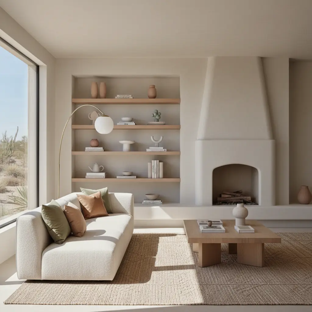
Uma paleta neutra sem variedade de textura é simplesmente um cômodo bege. Uma paleta neutra com rica variedade de textura é uma declaração de design – sofisticada, convidativa e infinitamente interessante. Isso não é opcional — é o fator mais importante para que um cômodo neutro seja chato ou bonito. Sem cores vibrantes para criar interesse visual, a textura deve fazer todo o trabalho pesado, adicionando dimensão, calor e apelo tátil.
A lista de verificação de texturas para cômodos neutros inclui um equilíbrio cuidadoso entre áspero e liso, fosco e brilhante, tecido e sólido, macio e duro. Na prática, imagine uma sinfonia textural: um substancial sofá de linho (áspero, fosco, orgânico) contra uma parede de reboco sutilmente caiação (lisa, fosca, artesanal) repousando sobre um tapete de lã ou juta feito à mão (tecido, áspero, fibra natural) com uma mesa lateral de mármore polido (lisa, fria, brilho sutil) e uma almofada de boucle volumosa (texturizada, dimensional, macia). Observe como cada superfície é distintamente diferente – a variedade cria a riqueza visual que uma única cor de tinta neutra não pode proporcionar sozinha.
Materiais naturais são absolutamente essenciais para alcançar essa profundidade. Grãos de madeira, veios de pedra, imperfeições do linho, fibras de lã e esmaltes cerâmicos possuem variações inerentes, imperfeições e sutis mudanças de cor que os materiais sintéticos simplesmente não têm. Um cômodo neutro com piso laminado, cortinas de poliéster e um sofá de microfibra nunca parecerá tão rico ou luxuoso quanto um com pisos de carvalho de pranchas largas, cortinas de linho macias e um sofá de mistura de algodão-linho, mesmo que as cores sejam idênticas. O material é a mensagem no design neutro, transmitindo autenticidade e qualidade. Além disso, incorporar materiais naturais alinha-se com os princípios do design biofílico, que estudos mostram que podem reduzir o estresse em até 25% e aumentar o bem-estar. Procure oportunidades para introduzir rattan, bambu, terracota e vidro soprado artesanalmente para elevar ainda mais o seu espaço. Para saber mais sobre como criar ambientes harmoniosos, explore nosso guia sobre [design biofílico](/blog/biophilic-design-guide).
Você Deve Adicionar uma Cor de Destaque a um Cômodo Neutro? E Como os Neutros Funcionam em Diferentes Espaços.
Um cômodo totalmente neutro pode ser incrivelmente bonito, mas também é exigente — requer atenção meticulosa ao equilíbrio de texturas, qualidade dos materiais e iluminação em camadas. Se você não tem confiança no seu jogo de texturas, ou se simplesmente anseia por um toque extra de vivacidade, adicionar uma cor de destaque é uma aposta inteligente e elegante. O destaque deve ser suave e derivado da natureza para complementar o esquema neutro quente, em vez de competir com ele. Pense em um verde sálvia suave, um terracota empoeirado, um azul oceano suave, um blush quente ou até mesmo um bronze profundo e terroso.
Use essa cor de destaque com moderação, em não mais de dez a quinze por cento do cômodo. Algumas almofadas decorativas, uma peça de arte abstrata com um toque sutil, um único vaso de cerâmica ou um livro antigo estrategicamente posicionado podem fornecer esse ponto de interesse sem comprometer o esquema neutro. Essa pequena injeção de cor proporciona um delicioso descanso para os olhos e realça a sofisticação geral.
Paletas neutras funcionam de forma diferente e exigem considerações específicas em diferentes cômodos:
- **Salas de Estar:** Esses espaços precisam da maior variedade e profundidade de textura porque são áreas de alto tráfego onde você passa um tempo significativo. A sobreposição de diferentes pesos de tecido, materiais de mobiliário e texturas de tapete é primordial. Considere um neutro escuro para uma poltrona de destaque ou um console de mídia para ancorar o espaço. - **Quartos:** Os quartos se beneficiam do lado mais suave e quente do espectro neutro. Pense em brancos quentes, mushroom pálido, areia suave e taupes delicados. O objetivo aqui é o repouso e a serenidade. Concentre-se em texturas luxuosas e macias, como mantas de caxemira, roupa de cama de linho e tapetes de lã felpudos para maximizar o conforto. - **Cozinhas e Banheiros:** Esses cômodos frequentemente apresentam muitas superfícies duras (azulejo, pedra, armários). Eles precisam do maior contraste entre seus tons neutros para evitar que esses elementos se misturem em uma parede plana de uniformidade. Use diferentes tonalidades de taupe ou greige para os armários contra uma bancada mais clara e branca quente, e incorpore um tom terroso mais escuro para o piso ou backsplash. Louças em preto fosco ou latão envelhecido podem fornecer textura metálica e um toque de contraste arrojado. - **Corredores e Entradas:** Esses espaços de transição são perfeitos para fazer uma declaração discreta. Um mushroom de tom médio ou um greige rico nas paredes pode ser incrivelmente convidativo, especialmente quando combinado com móveis de madeira natural e um tapete simples e texturizado. Considere um neutro escuro nas molduras para um interesse arquitetônico adicional.
Usar ferramentas de IA para testar paletas neutras é particularmente valioso porque as diferenças entre os neutros são frequentemente sutis e difíceis de imaginar em grande escala. Um taupe que parece perfeito em uma pequena amostra pode sobrecarregar um cômodo, ou um mushroom que parece perfeito na tela pode parecer ligeiramente roxo ou verde em suas paredes reais. A Habitas permite que você aplique paletas neutras completas — paredes, armários, têxteis e até móveis — em fotos de seus cômodos reais. Isso permite que você veja se os neutros escolhidos criam a profundidade e o calor que você está imaginando, ou se precisam de ajuste antes de comprar um único galão de tinta. Enquanto um designer de interiores tradicional pode cobrar mais de US$ 5.000 por uma consulta de cores detalhada, plataformas como a Habitas oferecem visualizações instantâneas a uma fração do custo, muitas vezes por menos de US$ 100 para múltiplas iterações de design, economizando tempo e potenciais erros dispendiosos. Explore como a IA pode transformar seu processo de design com nosso guia sobre [como funciona o design de interiores com IA](/blog/ai-interior-design-how-it-works).
Perguntas Frequentes
### Quais são os principais benefícios de usar uma paleta de cores neutras quentes?
As paletas de cores neutras quentes oferecem inúmeros benefícios, tornando-as uma escolha popular para interiores modernos. Elas criam uma sensação de calma, conforto e sofisticação, promovendo ambientes convidativos e serenos. Ao contrário das cores mais ousadas, os neutros fornecem um pano de fundo atemporal que não sairá rapidamente de moda, permitindo atualizações fáceis através de acessórios e têxteis. Sua versatilidade significa que podem se adaptar a vários estilos de design, do minimalista ao rústico, e realçam a luz natural, fazendo com que os espaços pareçam maiores e mais abertos. Do ponto de vista prático, casas com paletas neutras quentes e sofisticadas geralmente têm um apelo maior para potenciais compradores, com uma pesquisa de 2025 da National Association of Realtors indicando que casas decoradas com esquemas neutros modernos foram vendidas 15% mais rápido do que aquelas com decoração desatualizada ou excessivamente pessoal.
### Como escolho a cor de tinta neutra quente certa para minha casa?
Escolher o neutro quente certo exige uma consideração cuidadosa de vários fatores. Primeiro, avalie a luz natural em seu cômodo – cômodos com muita luz natural podem suportar tons mais profundos, enquanto cômodos mais escuros se beneficiam de neutros mais claros e reflexivos. Em seguida, examine elementos existentes como pisos, móveis embutidos ou grandes peças de mobiliário, e identifique seus subtons (vermelho, amarelo, verde, azul) para garantir que sua tinta escolhida harmonize em vez de chocar. Sempre teste as cores de tinta em suas paredes reais, observando-as em diferentes luzes ao longo do dia. O que parece bom em uma amostra ou tela pode parecer dramaticamente diferente em seu espaço devido a várias fontes de luz e reflexos. Considere o humor que você deseja criar; neutros mais suaves e claros promovem tranquilidade, enquanto tons mais ricos e profundos oferecem aconchego e drama.
### Posso misturar neutros quentes e frios no mesmo cômodo?
Embora a tendência atual favoreça fortemente os neutros quentes, é possível misturar com sucesso neutros quentes e frios em um único cômodo, mas isso requer uma mão cuidadosa. A chave é ter uma paleta neutra quente dominante e introduzir neutros frios como detalhes sutis, geralmente em texturas ou pequenos elementos decorativos, em vez de grandes extensões de tinta. Por exemplo, uma cor de parede em taupe quente pode ser complementada por uma lareira de mármore cinza de tom frio ou um vaso de cerâmica azul-acinzentado. Os tons frios devem atuar como um contraponto refrescante, proporcionando contraste e evitando que o espaço pareça monótono, em vez de competir com o esquema quente principal. Sempre garanta que os subtons de seus detalhes frios escolhidos ainda se relacionem com a paleta geral de forma harmoniosa, evitando contrastes gritantes.
### Quais são alguns erros comuns a evitar ao projetar com paletas neutras?
Vários erros podem fazer com que um cômodo neutro perca o brilho. O erro mais comum é usar apenas uma tonalidade neutra, levando a um espaço monótono e indiferenciado. Outro erro é negligenciar a textura; sem texturas variadas, um cômodo neutro carece de interesse visual e parece estéril. Ignorar os subtons também é crucial – misturar neutros quentes e frios descuidadamente pode criar uma sensação desconexa e desconfortável. Negligenciar a iluminação é outra armadilha; os neutros quentes se beneficiam da iluminação em camadas (ambiente, tarefa, destaque) para realçar sua profundidade e evitar que as sombras os tornem opacos. Finalmente, não incorporar materiais naturais diminui a riqueza e a autenticidade que tornam o design neutro tão atraente. Sempre priorize a variedade de tonalidade, textura e material.