Dominando Armários de Cozinha Duas Cores: Combinações de Cores e Dicas de Design de Especialistas
Desvende os segredos dos armários de cozinha duas cores. Descubra combinações de cores comprovadas, pontos de divisão estratégicos, escolhas de ferragens e erros a evitar para uma cozinha deslumbrante e coesa.
Por que Armários de Cozinha Duas Cores São um Poder do Design
Armários de cozinha duas cores ganharam popularidade não apenas como uma tendência, mas como uma sofisticada estratégia de design que oferece tanto apelo estético quanto benefícios práticos. Ao combinar estrategicamente duas cores distintas, os designers podem introduzir profundidade, definir zonas e injetar personalidade no que poderia ser um espaço monótono. Essa abordagem permite a expressão criativa, mantendo uma qualidade atemporal, tornando-a uma favorita para proprietários que buscam elevar o estilo de sua cozinha sem embarcar em uma reforma em grande escala.
A beleza de um esquema duas cores reside em sua versatilidade. Ele pode fazer uma cozinha pequena parecer maior, adicionar calor a um espaço moderno e austero, ou trazer um toque contemporâneo a um layout tradicional. Mais do que apenas um truque visual, o uso intencional da cor ajuda a guiar o olhar, criando uma sensação de ordem e fluidez. Estudos mostram que uma cozinha bem projetada, especialmente uma com esquemas de cores bem pensados, pode aumentar o valor de uma casa em [até 7%](https://www.cnbc.com/2023/12/28/best-home-renovations-for-2024-that-add-the-most-value-according-to-expert.html) e até vender 25% mais rápido, em média. Quando executada corretamente, uma cozinha duas cores não é apenas uma escolha de design; é um investimento no futuro da sua casa e no seu bem-estar diário.
A Fórmula Duas Cores: Por Que Armários Superiores Mais Claros e Inferiores Mais Escuros Funcionam
A fórmula mais confiável para cozinhas duas cores é simples: uma cor mais clara nos armários superiores e uma cor mais escura nos inferiores. Isso funciona porque instintivamente imita o peso visual natural do mundo ao nosso redor — o chão é mais escuro que o céu. Seu olho lê essa configuração como estável, fundamentada e inerentemente equilibrada. Quando confrontado com esse arranjo clássico, nosso cérebro percebe o espaço como estabelecido e esteticamente agradável. De fato, pesquisas sobre percepção visual sugerem que [85% dos indivíduos](https://www.ncbi.nlm.nih.gov/pmc/articles/PMC7392688/) consideram designs com uma base mais escura e um topo mais claro mais visualmente estáveis e reconfortantes.
Inverta essa fórmula – superiores escuros e inferiores claros – e a cozinha pode parecer pesada no topo, inquietante ou até opressiva, mesmo que você não consiga articular o porquê. Os elementos mais escuros pairando acima criam uma sensação de desequilíbrio, fazendo o espaço parecer menor e menos convidativo.
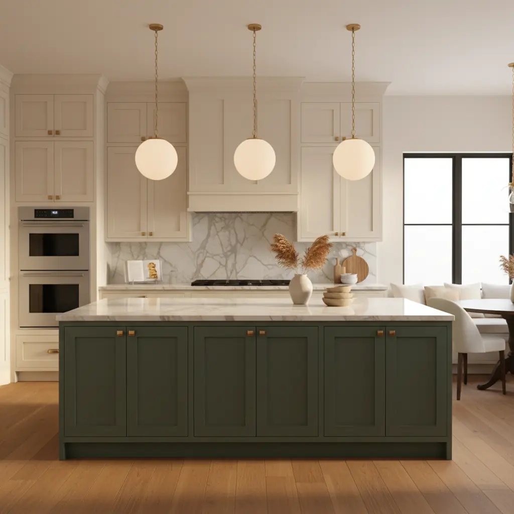
A segunda fórmula mais popular envolve uma ilha ousada com armários perimetrais neutros. Isso funciona excepcionalmente bem porque a ilha frequentemente se posiciona como o ponto focal no centro da cozinha, muito como uma peça de mobiliário autônoma. Tratá-la com uma cor diferente, muitas vezes mais ousada, reforça essa qualidade independente e atrai a atenção para sua função como centro de convívio. Uma cozinha perimetral branca ou cinza quente com uma ilha verde profundo, azul marinho ou grafite é uma das maneiras mais fáceis de introduzir um toque significativo de cor e personalidade sem sobrecarregar o espaço. Ela cria uma âncora, fundamentando o design.
Ambas as fórmulas são bem-sucedidas porque criam uma hierarquia visual clara. O olho entende imediatamente quais elementos são o elenco de apoio (as cores mais claras, muitas vezes recuadas) e quais são as estrelas (as cores mais escuras e ousadas). Problemas surgem quando a divisão duas cores é arbitrária, ou quando as cores escolhidas são muito semelhantes em valor, criando um efeito confuso, nem lá nem cá, que carece de definição e impacto visual.
Melhores Combinações de Cores Comprovadas por Designers
Escolher as cores certas é primordial para uma cozinha duas cores bem-sucedida. Aqui estão combinações que consistentemente entregam resultados deslumbrantes:
### Superiores Brancos com Inferiores Azul Marinho: O Clássico Atemporal
Armários superiores brancos com inferiores azul marinho é, sem dúvida, a combinação duas cores mais popular por uma razão — é clássica, sofisticada e virtualmente impossível de errar. Essa dupla exala uma elegância náutica, oferecendo uma estética nítida e limpa com uma profundidade que ancora. Use um branco suave e quente como Benjamin Moore White Dove ou Sherwin-Williams Alabaster nos armários superiores para evitar um contraste muito forte, permitindo que a luz reflita e fazendo a parte superior parecer expansiva. Para os inferiores, Benjamin Moore Hale Navy ou Sherwin-Williams Naval fornecem tons de azul ricos e profundos que são incrivelmente versáteis. Adicione ferragens de latão e uma bancada de mármore ou quartzo com veios sutis, e você terá uma cozinha que parecerá atemporal por quinze anos, misturando sem esforço o charme tradicional com o apelo moderno.
### Verde Sálvia e Branco: O Abraço da Natureza
Para uma combinação duas cores mais suave e acessível, verde sálvia e branco quente são feitos um para o outro no paraíso do design. Sherwin-Williams Evergreen Fog ou Benjamin Moore Saybrook Sage (HC-114) nos armários inferiores com armários superiores brancos quentes criam uma cozinha que parece fresca, natural e na moda sem ser excessivamente "tendenciosa". Essa combinação evoca uma sensação de calma e conexão com a natureza, tornando-a ideal para criar um espaço culinário sereno. Funciona particularmente bem em cozinhas com pisos de madeira quentes, abundante luz natural e texturas orgânicas. Combine-a com puxadores de latão sem laca para um acabamento que desenvolve uma bela pátina com o tempo, ou ferragens pretas foscas para um toque contemporâneo.
### Grafite e Madeira Quente: Modernidade Ousada
Para aqueles que buscam uma opção mais ousada e moderna que incorpore textura orgânica, grafite e madeira natural quente são uma excelente escolha. Imagine Benjamin Moore Wrought Iron (2124-10) ou Sherwin-Williams Iron Ore nos armários inferiores ou na ilha, combinados com armários superiores de carvalho branco natural (não pintados, mas com acabamento para mostrar o grão). Isso cria uma cozinha sofisticada e Scandinavian-moderna, afastando-se de um visual totalmente pintado. A madeira introduz calor e textura, evitando que o grafite pareça muito austero. Preto e carvalho natural é uma combinação similar levada adiante — dramática e marcante em cozinhas maiores com bastante luz natural. Considere também um armário inferior em greige (cinza-bege) com armários superiores em branco cremoso para um contraste mais suave, neutro e sofisticado, altamente adaptável a vários estilos de decoração. Ao explorar essas opções, ferramentas como o [gerador de paleta de cores com IA da Habitas](/blog/ai-color-palette-generator) podem ajudá-lo a visualizar essas combinações instantaneamente nas fotos da sua própria cozinha.
Ilha Versus Perímetro: Onde Fazer a Divisão
A decisão de onde implementar seu esquema duas cores é tão crítica quanto as próprias cores.
### A Ilha como Ponto Focal
Ao fazer um design duas cores com a ilha versus o perímetro, a ilha deve ser quase sempre a cor mais ousada e saturada. A ilha é frequentemente a peça central da cozinha — é onde as pessoas se reúnem, onde a comida é preparada e onde a atenção visual naturalmente se concentra. Torná-la a cor de destaque reforça seu status como o coração da cozinha. Um perímetro branco ou cinza claro com uma ilha verde profundo, azul marinho ou até um azul vibrante, por exemplo, faz a ilha parecer uma bela peça de mobiliário personalizada que ancora todo o ambiente. Essa estratégia funciona particularmente bem em espaços de conceito aberto, onde a ilha precisa chamar a atenção e definir a zona da cozinha.
### A Divisão Superior-Versus-Inferior: Uma Transformação Clássica
A divisão superior-versus-inferior funciona melhor quando a cozinha não possui uma ilha proeminente ou quando você deseja uma transformação mais dramática, de parede a parede. Neste caso, a linha visual onde os armários superiores encontram os inferiores torna-se uma característica de design significativa — a bancada e o backsplash atuam como uma quebra visual natural entre as duas zonas. Essa divisão também permite usar cores mais escuras de forma mais extensa na parte de baixo sem que a cozinha inteira pareça muito escura ou apertada, pois os armários superiores mais claros mantêm o nível dos olhos brilhante e arejado. É uma excelente maneira de introduzir profundidade em uma cozinha de corredor ou em qualquer espaço onde uma ilha não seja viável.
### Perímetro + Ilha + Despensa: Uma Zona de Cores Coesa
Uma terceira opção que está ganhando popularidade em 2026 é a abordagem de perímetro em um tom, ilha-mais-despensa em outro. Se sua cozinha possui uma despensa de copeiro, uma parede de despensa dedicada ou armários de armazenamento altos que são visualmente conectados, pintá-los na mesma cor de destaque da ilha cria uma zona de cores secundária coesa. Essa estratégia sofisticada funciona especialmente bem em cozinhas maiores e de plano aberto, onde a área da despensa se conecta visualmente com a ilha, criando uma narrativa de design harmoniosa e cuidadosamente selecionada. Garante que a cor de "destaque" seja distribuída cuidadosamente pelas principais áreas funcionais. Esse tipo de escolha de design sutil pode ser difícil de visualizar sem ajuda profissional, mas [projetos de ambientes gerados por IA](/blog/ai-generated-room-designs-realistic) podem mostrar como isso fica no seu espaço.
Ferragens, Bancadas e Backsplash: Unificando as Duas Cores
Uma vez que as cores e a divisão dos seus armários são determinadas, os elementos de apoio tornam-se cruciais para amarrar todo o esquema duas cores.
### Ferragens: O Fio Unificador
As ferragens são o fio que une uma cozinha duas cores. Usar o mesmo estilo e acabamento de ferragens em ambas as cores de armário cria uma consistência visual essencial através da divisão. Puxadores e maçanetas tipo concha de latão funcionam com praticamente todas as combinações duas cores, de brancos quentes e verdes a brancos nítidos e azuis marinhos, e são uma escolha segura e elegante. Ferragens pretas foscas funcionam excepcionalmente bem com combinações de tons frios (branco e grafite, branco e azul marinho) para um visual moderno e de alto contraste. Níquel polido ou cromo também podem funcionar para uma sensação mais tradicional ou de transição, especialmente com azuis e cinzas. Evite misturar acabamentos de ferragens entre as duas cores; um único metal, aplicado consistentemente, é a regra para um visual coeso e polido.
### Bancadas: O Ponto Neutro
As bancadas devem complementar ambas as cores de armário, o que geralmente significa escolher uma pedra ou quartzo neutro. Mármore branco e quartzo com veios sutis de cinza ou bege quente funcionam com quase todas as combinações, proporcionando uma superfície limpa e elegante que não compete por atenção. Bancadas de madeira maciça (butcher block) combinam lindamente com cozinhas brancas e verdes ou brancas e azuis marinhos, adicionando calor e uma mudança de material desejável que aprimora uma estética mais natural ou de casa de campo. Para um toque contemporâneo, concreto ou esteatito podem introduzir um acabamento elegante e fosco. Evite bancadas muito chamativas ou com padrões intensos em uma cozinha duas cores; já existem dois elementos visuais fortes competindo por atenção, e uma bancada dramática adiciona um terceiro, muitas vezes sobrecarregando o espaço. A simplicidade aqui garante que as cores dos armários permaneçam as estrelas.
### Backsplash: Coesão Sutil ou Toque de Personalidade
O backsplash é sua oportunidade de referenciar sutilmente ambas as cores dos armários ou introduzir um neutro unificador. Um simples azulejo branco tipo metrô funciona com tudo e mantém o foco firmemente nos armários. Para mais personalidade e textura, um azulejo zellige artesanal em um branco quente ou a versão mais pálida da cor do seu armário de destaque cria uma coesão sutil e uma bela profundidade. Se sua combinação duas cores for mais suave, um azulejo geométrico ou estampado com uma paleta de cores cuidadosamente selecionada que ecoa suas escolhas de armário pode adicionar um delicioso ponto focal. No entanto, o azulejo de cimento estampado pode ser complicado e requer uma cuidadosa correspondência de cores para evitar sobrecarregar uma cozinha que já possui duas cores fortes de armário. Para um apelo atemporal, um azulejo simples e texturizado geralmente supera um padrão ousado e chamativo em um ambiente duas cores. Para ajudar a escolher os elementos de apoio perfeitos, considere aproveitar insights dos [melhores estilos de design de interiores de 2026](/blog/best-interior-design-styles-2026) para garantir que suas escolhas se alinhem com a estética atual.
Além do Básico: Estratégias Avançadas de Duas Cores
Embora as fórmulas centrais sejam testadas e comprovadas, existem maneiras sutis de aplicar uma abordagem duas cores para resultados verdadeiramente personalizados.
### Incorporando Prateleiras Abertas
Prateleiras abertas podem ser uma excelente maneira de aliviar a carga visual dos armários superiores, principalmente se sua cor mais escura estiver em cima. Ao substituir alguns armários superiores por prateleiras que combinam com a cor inferior mais clara, ou mesmo em um tom de madeira natural, você pode criar leveza e exibir itens decorativos. Se você tiver armários inferiores mais escuros, considere prateleiras abertas de cor clara acima deles para manter o peso visual equilibrado. Isso se integra bem com [designs minimalistas modernos](/blog/all-white-room-design-tips) onde o espaço aberto é valorizado.
### Coifas e Embutidos
Não se esqueça da coifa! Pintar a coifa em uma das cores dos seus dois armários pode ajudar a integrá-la perfeitamente (se combinar com os superiores) ou torná-la um elemento de design distinto (se combinar com os inferiores ou a ilha). Da mesma forma, bancos embutidos ou nichos de café da manhã podem ser pintados na cor de destaque, criando um fluxo de design coeso que se estende além apenas da marcenaria. Isso é especialmente eficaz se sua cozinha se conecta a uma área de jantar.
### Uso Estratégico de um Terceiro Material
Embora uma terceira _cor_ seja geralmente desencorajada, um terceiro _material_ pode adicionar uma riqueza imensa sem fraturar o design. Pense em madeira natural. Uma prateleira aberta de madeira não acabada, uma base de ilha de madeira ou uma coifa de madeira é percebida como um material, não uma terceira "cor", e adiciona calor, textura e apelo orgânico sem complexidade. Isso funciona lindamente com paletas neutras duas cores como branco e cinza, ou branco e sálvia.
Erros Comuns e Considerações de Custo
Compreender o que evitar é tão crucial quanto saber o que fazer para uma cozinha duas cores bem-sucedida.
### Evitando Valores Incompatíveis
O erro mais comum que os designers observam é escolher cores de armário muito próximas em valor. Duas cores de tom médio (sálvia e cinza médio, por exemplo, ou dois tons de bege) criam um efeito confuso onde nenhuma das cores se destaca claramente como dominante ou de apoio. Cozinhas duas cores bem-sucedidas exigem contraste — uma cor deve ser significativamente mais clara ou mais brilhante que a outra. Se você apertar os olhos para suas amostras escolhidas e as duas cores parecerem semelhantes, você precisa de mais separação em clareza ou escuridão. Essa falta de contraste pode fazer uma cozinha parecer plana e sem inspiração. É aqui que ferramentas como Habitas se tornam inestimáveis, permitindo que você troque cores instantaneamente e veja o efeito em sua cozinha real.
### A Regra das Duas Cores: A Simplicidade é Fundamental
Usar mais de duas cores de _armário_ é quase sempre um erro. Adicionar uma terceira cor a prateleiras, uma capa de coifa ou um conjunto secundário de armários fratura a coerência visual e muitas vezes leva a um visual caótico e desconexo. A beleza do design duas cores reside em sua simplicidade e clara segmentação visual: duas zonas claramente definidas em duas cores claramente distintas. A exceção, como observado, é quando o terceiro elemento é um material natural como madeira, que é percebido como um elemento textural em vez de uma cor concorrente.
### Implicações de Custo dos Armários Duas Cores
Em termos de custo, uma cozinha duas cores é tipicamente de cinco a dez por cento mais cara do que uma cozinha de cor única. Esse aumento decorre do trabalho adicional envolvido no gerenciamento de duas cores separadas, garantindo transições limpas e exigindo um mascaramento mais cuidadoso durante a pintura. Uma reforma típica de cozinha custa entre [$25.000 e $60.000](https://www.forbes.com/home-improvement/kitchen/kitchen-remodel-cost/). O aumento percentual para o design duas cores se aplica independentemente de você estar comprando novos armários personalizados ou realizando uma repintura. Se você estiver reformando ou repintando armários existentes, uma abordagem duas cores é direta — você simplesmente isola os armários que receberão a segunda cor. No entanto, se você estiver encomendando novos armários, confirme com seu fabricante que eles podem lidar com uma divisão sem um tempo de espera significativamente maior ou custos ocultos. Trabalhar com uma plataforma como Habitas pode mitigar significativamente o risco de erros caros. Enquanto a contratação de um designer de interiores humano pode custar entre $500 e $10.000 para uma cozinha, usar uma [plataforma de design de interiores com IA vs. contratar um humano](/blog/ai-interior-design-vs-hiring-cost) pode economizar milhares, permitindo que você experimente inúmeras combinações, virtualmente, antes de se comprometer com quaisquer compras ou tintas. Habitas pode ajudá-lo a testar dezenas de combinações duas cores em uma foto de sua cozinha real em minutos, poupando-o de erros caros e ajudando-o a se comprometer com uma combinação com absoluta confiança.
Perguntas Frequentes
### Como escolho as cores certas para armários de cozinha duas cores?
Comece considerando a luz natural da sua cozinha, o piso e as cores de parede existentes. Armários superiores mais claros e inferiores mais escuros é uma abordagem segura e equilibrada, imitando a natureza. Pense no humor que você deseja criar: clássico (branco/azul marinho), sereno (sálvia/branco) ou moderno (grafite/madeira). Use um círculo cromático para entender combinações complementares e análogas, e sempre teste amostras de tinta na iluminação real da sua cozinha antes de se comprometer. Habitas pode ajudá-lo a visualizar essas escolhas em tempo real.
### É possível ter armários superiores escuros e inferiores claros?
Embora geralmente seja aconselhável ter armários superiores mais claros e inferiores mais escuros para estabilidade visual, um esquema de superiores escuros e inferiores claros _pode_ funcionar em contextos específicos. Essa abordagem não convencional geralmente requer tetos muito altos, luz natural abundante ou uma intenção de design dramática específica para evitar que o ambiente pareça pesado no topo ou opressivo. Funciona melhor com designs minimalistas onde os armários superiores escuros recuam, ou quando combinados com prateleiras abertas para quebrar a massa escura.
### Qual é o custo médio de armários de cozinha duas cores?
Um esquema de armários de cozinha duas cores normalmente adiciona um extra de 5-10% ao custo de uma reforma de cozinha de cor única. Isso se deve ao aumento da mão de obra para mascaramento e pintura de duas cores diferentes. Para uma reforma completa de cozinha que varia de $25.000 a $60.000, isso poderia significar um adicional de $1.250 a $6.000. O custo também pode variar dependendo se você está pintando armários existentes ou encomendando novos.
### Como incorporo um design duas cores em uma cozinha pequena?
Em uma cozinha pequena, a fórmula de armários superiores mais claros e inferiores mais escuros é especialmente eficaz, pois os armários superiores claros ajudam o espaço a parecer mais aberto e arejado. Opte por contrastes mais suaves em vez de bruscos, como branco off-white e um verde sálvia claro, para evitar sobrecarregar o espaço. Considere usar o efeito duas cores em uma parede de armários de destaque ou em uma pequena ilha, em vez de todo o perímetro, para introduzir profundidade sem fazer a cozinha parecer menor.
### Quais ferragens funcionam melhor para cozinhas duas cores?
As melhores ferragens unificam as duas cores dos armários. Escolha um único acabamento e estilo de ferragem (por exemplo, latão, preto fosco, níquel polido) que complemente ambos os tons. O latão oferece calor e versatilidade, o preto fosco proporciona contraste moderno e o níquel polido confere um toque clássico. A consistência nas ferragens em todos os armários é fundamental para um visual duas cores coeso.
### Cozinhas duas cores são uma tendência passageira?
Embora combinações de cores específicas possam flutuar em popularidade, o conceito de armários duas cores em si é um princípio de design atemporal, e não uma tendência passageira. Sua capacidade de adicionar profundidade, caráter e interesse visual, juntamente com sua versatilidade em se adaptar a vários estilos de design, garante seu apelo duradouro. Quando executada com combinações de cores clássicas e design cuidadoso, uma cozinha duas cores permanecerá elegante por muitos anos.